
The Worst
Galatasaray – Home Kit

You’d think that after so many poor Champions League performances we’d be used to seeing the interesting blend of colours Galatasaray parade on the home kit. That said, this season’s tweaked style of having fine back lines across the two segments of gold and dark red makes you reach for your 3-D glasses in an attempt to save headaches potentially prompted by the woeful pattern.
Hamburg – Away Kit
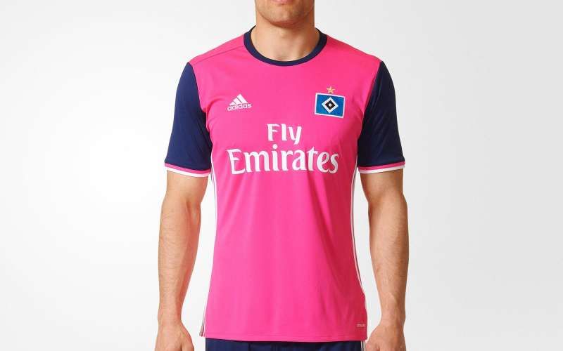
This is a controversial one. For lovers of pink, it’s awesome. For everyone else, you cannot help but ask why? ‘Shock pink’ forms the kit’s basis, accompanied by navy sleeves, but it looks more at place in a T20 cricket match than on the football pitch and, despite being inspired by the Hamburg kit of the late 70s, it tries to hard to utilise a bright colour effectively.
Bordeaux – Third Kit
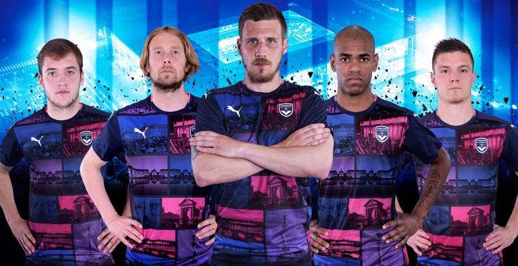
An amalgamation of navy blue and pink, within which lays photos of the city’s most iconic landmarks. It seems a touching sentiment in thought, but in execution it’s just plain ugly. It could do enough to damage the Frenchies’ reputation as fashion gurus.
Hearts – Away Kit
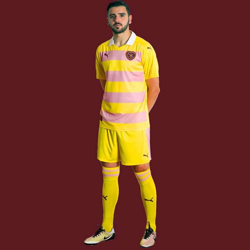
Mr Blobby? Fruit salad sweets? Whatever comical comparison you strike up, one thing is for certain; Hearts’ new away strip is beyond dire. The blend of bright yellow and a calming pink doesn’t belong on the football pitch. They could so easily have created a nice black, white or navy strip to counteract the maroon home attire.
Montpellier – Away Kit
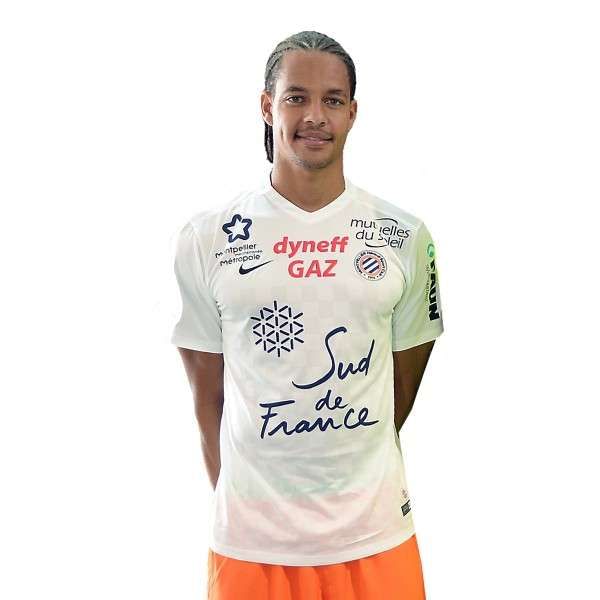
A white jersey with orange shorts has the potential to be ironically smart but any sense of elegance is blown out of the water by the overhaul of club sponsors across the front. There’s barely enough room for the club crest or player number.
Norwich City – Third Kit
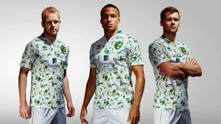
Looking like confetti thrown up into the air following the Canaries’ Premier League detonation at the end of last term, the smearing of green and yellow splashes across the front of this shirt makes for a horrendous eyesore. A plain white strip may not have been so bad but instead, the club have opted for a garish 80s look, not in any way helped by the inclusion of a 3-D crest. Really?
