7 football clubs whose change of crests angered their fans
Loyalty to a football club is hard to explain. It’s not just the players that matter, but also the colours and symbols that evoke a sense of belonging and community. They are markers that represent a lifetime of hopes and ambitions. So, you can imagine the ire of supporters when anything about their precious team is altered. It is in humanity’s nature to resist change and while they are sometimes good and necessary, they can also be pointless and downright ridiculous.
Over the year many football clubs have undertaken a makeover of their corporate image, rebranding their crests often to their own peril. While some clubs execute a job well done like Chelsea in 2005 and West Ham United more recently, there are those who have made a complete hash of it.
Here’s a look at seven football clubs who changed their crests and angered their fans:
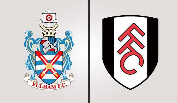
#7 Fulham
Fulham’s current crest came into effect in 2001 in honour of their promotion to the Premier League. However, their good fortune wasn’t the only reason behind their decision. Prior to their promotion, the club discovered that only 14% of their fans recognised the club’s crest. A humiliating statistic no doubt, the owner Shahid Khan set the wheels in motion and a new badge was designed.
In an attempt to modernise the club’s image a new crest was designed inspired by minimalist art bearing just the club’s initials. They parted with their traditional coat of arms in an attempt to make the badge look more distinctive and memorable. However, the supporters did not take too kindly to the way they went about launching the crest. Misleading information regarding a ‘big announcement’ on the website peeved off enough fans to make the move an unpopular one.
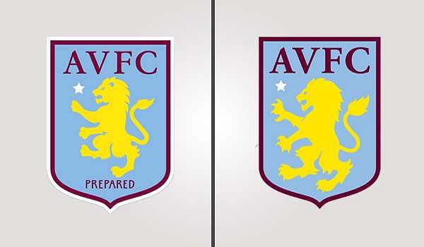
#6 Aston Villa
Aston Villa’s humiliation and despair knew no bounds when they were relegated at the end of the 2015-16 season to the Championship after their 28-year stay in the top division of English football. After scoring just 23 goals all season, the seven-time England champions left the Premier League in shame amidst fierce protests against owner Randy Lerner. In such an atmosphere, the club unveiled their new crest which displayed minimal changes from the previous one except for one major difference.
For years, Villa had the word ‘Prepared’ inscribed on their badge which had now been removed. Instead, the lion was made more prominent and appeared fierce with well-defined claws and teeth. The timing of the change could not have been worse as the club was nowhere close to being prepared. With life in the second division to look forward to, many took to Twitter to express their disbelief.
The club’s official statement justified the change as a move to highlight the lion which stands for valour, bravery and strength, an image that tested well with focus groups.
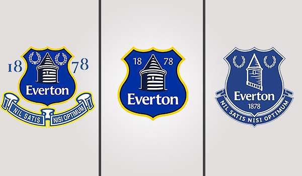
#5 Everton
Everton’s crest before 2013-14 was a complicated design which the Merseyside club said made it “difficult to reproduce for certain print, broadcast and digital media”. They announced the need to modernise and unveiled a brand new design which was more contemporary but dispatched with the laurel and wreath and the Latin quote, ‘nil satis nisi optimum’ which means “nothing but the best is good enough”.
The change created a massive backlash on social media supported by Liverpool mayor Joe Anderson, a lifelong Evertonian.
The Twitter handle @NoToNewEFCBadge was created in a matter of hours and an online petition was started. Over 22,000 people signed saying that they wanted the quote and the laurels to return. While they understood the need for modernisation, their opinion of the new badge was very poor.
Credit must be given to the club because they listened to their fans and while it was too late to do anything immediately, they promised to redesign the crest for the 2014-15 season. The club presented three options to around 13,000 fans and set up a voting process to pick the winner. The current crest restored the elements that were left out and is a faithful recreation of the older version without the yellow trimming.
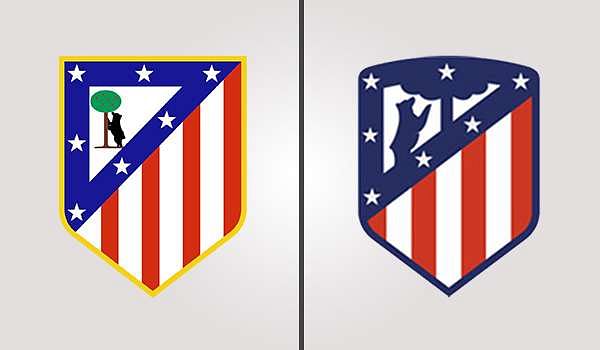
#4 Atletico Madrid
In December 2016 Atletico Madrid unveiled their new club logo at an event that also coincided with the announcement of their new stadium’s name. The La Liga club is set to leave the Vicente Calderon and move into the newly built 67,000-capacity stadium called the Wanda Metropolitano at the start of the 2017-18 campaign and chose the occasion to also reveal their new badge.
A roundish version of the old crest, creators of the design, international agency Vasava claimed it was a tribute to the side’s very first logo. Designed to symbolise the team’s traditional values while looking to the future, the revamped look had the support of captain Gabi Fernandez and manager Diego Simeone but it did not go down well with fans.
"In the world, such change is always happening," the Argentine said. "We have seen many clubs in the past in the same situation. When there are changes there will always be people who like it and people who don't.”
While many fans took issue with the change in orientation of the bear trying to climb the cherry tree, there were others who were displeased about not being consulted. With a round arch on the top, the new crest is a darker and magnified version of the old.
#3 Arsenal
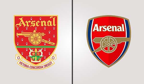
Arsenal revealed their new crest at Highbury in February 2002 in an attempt to make merchandising easier. The Gunners had been unsuccessful in copyrighting their previous Victoria Concordia Crescit badge leading to considerable loss and engaged London agency 20/20 in order to revamp their corporate image. Dispensing with the traditional Islington coat of arms, latin quote and Gothic script, it was replaced by a simple shield.
Even though the cannon remained, it now faced east instead of west, a decision that created an outcry among Arsenal supporters. Even though club Chairman Peter Hill-Wood tried to spin it as a ‘traditional badge with a futuristic outlook’ statement, the fans weren’t so easily fooled.
Gunners all over London could hardly believe the club had gone through a nine-month-long process without consulting a single fan. They didn’t take too kindly to part with a crest they had used since 1949 just for the sake of their new soon-to-be Emirates Stadium and made their displeasure known loud and clear.
#2 Manchester City
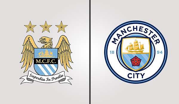
The blue side of Manchester is still very much a work-in-progress since it was acquired by Sheikh Mahmoud and in that vein, the club unveiled a new crest on Boxing Day in 2015 ahead of their clash with Sunderland. After an entire month of consulting with fans and providing them with lectures on the crest’s history, Manchester City have reverted to a design similar to their crest of the 1970s.
After gathering detailed information from supporters about how they wanted the crest to change, the new design was unveiled to be markedly different from the previous. Enclosed within a circle, the new design dispensed with the bird and incorporated '1894' the year of their formation. However, the removal of the words ‘Football Club’ did not go down well with fans.
Supporters saw it as a departure from their identity as a football team and interpreted it as a move towards a homogenised franchise along with the Sheikh’s other football interests around the world. The change in design also coincided with a change in Twitter handles when they went from @MCFC to @ManCity and a change in their web address from mcfc.co.uk to mancity.com.
#1 Juventus
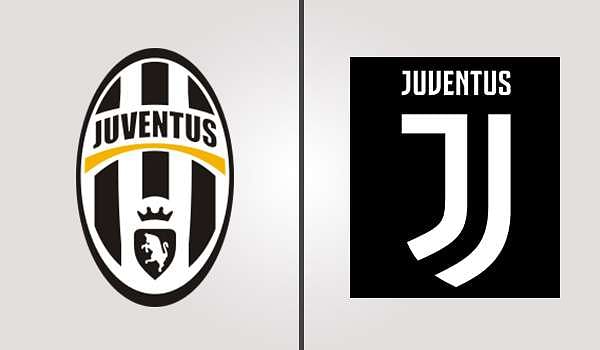
Juventus are the latest addition to the long list of clubs who changed their crests to much public discontent. The Italian champions unveiled the new badge at a star-studded event in Milan two days back where club president Andre Agnelli announced the year-long effort was a symbol of the “Juventus way of living”. Irrespective of what the top officials had to say, Bianconeri fans were furious about the unnecessary alteration.
Gone is the shield with the vertical black and white stripes and pretty much everything else that was part of the old badge. The iconic bull, a traditional symbol of Turin is missing too along with the dash of gold beneath the name. The new design is a complete break from tradition with a minimalist J ensconced in half a shield. The simplistic monochromatic logo has had the Twitterati fuming for days.
The new logo has been trolled mercilessly while some supporters have been beside themselves at the horror of having to don the badge from July 2017.
Quick Links
Staff Editor