
'%20x='0'%20y='0'%20height='100%25'%20width='100%25'%20%0A%20%20%20%20%20%20%20%20%20%20xlink%3Ahref='data:image/jpg;base64,/9j/2wBDAAYEBQYFBAYGBQYHBwYIChAKCgkJChQODwwQFxQYGBcUFhYaHSUfGhsjHBYWICwgIyYnKSopGR8tMC0oMCUoKSj/2wBDAQcHBwoIChMKChMoGhYaKCgoKCgoKCgoKCgoKCgoKCgoKCgoKCgoKCgoKCgoKCgoKCgoKCgoKCgoKCgoKCgoKCj/wgARCAALAAoDASIAAhEBAxEB/8QAFgABAQEAAAAAAAAAAAAAAAAABwQF/9oACAEBAAAAAEpTn1P/xAAUAQEAAAAAAAAAAAAAAAAAAAAB/9oACAECEAAAAD//xAAUAQEAAAAAAAAAAAAAAAAAAAAA/9oACAEDEAAAAH//xAAiEAABBAEEAgMAAAAAAAAAAAADAQIEBRESEyIxAAYQUmH/2gAIAQEAAT8Aubu0NaSZLrQ0VgZU0RCjLoHVoHO1uD6fr4v5d6sJ+Uko86jrZcsGxJPGGUo/q9zUVU8s/X6WwtBT5dVDNMGuWmIJFcmOvj//xAAXEQADAQAAAAAAAAAAAAAAAAAAAREx/9oACAECAQE/AKnih//EABQRAQAAAAAAAAAAAAAAAAAAAAD/2gAIAQMBAT8Af//Z'%3E%3C/image%3E%3C/svg%3E)
When Roman Abramovich bought Chelsea in 2004, he went no holds barred as he made massive investments and brought about radical changes to all facets of the club as he envisioned to make the club a global brand.
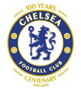
In the year 2005, Chelsea celebrated its centenary by announcing a new kit sponsor in Samsung and a brand new club crest which signalled the dawn of a new era at the club as it reflected the values and personality with which the club was going to operate henceforth.
Fast forward to the present day, Chelsea has made its own mark on the global arena and its Royal blue coloured crest has found its way into millions of hearts. It hasn't always been the same though as this is the 5th crest the club has used in its 112-year history. So let us have a look at how it evolved over the ages.
#1 The Pensioner crest (1905-1952)
When the club formed in 1905, the affluent area of Chelsea was famous for its Royal Hospital which was a nursing home for the veterans of British Army. When they could not house any more veterans, they started a policy of giving out pensions to these veterans.
As a sign of respect, the very first logo featured a Chelsea pensioner and this is how the nickname "Pensioners" was born.
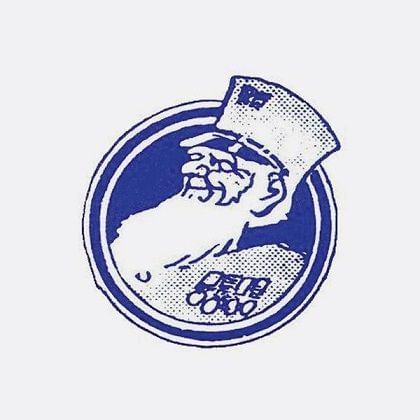
The crest was not used on the player jerseys. It was however used in the matchday programmes. The crest was a symbol of pride and respect towards the British veterans of the war, many of whom still visit the home fixtures at Stamford Bridge as 8 seats are permanently allotted for them every matchday.
Though it was the first one, it wasn't the most famous one as many took the crest and the club's nickname out of context to such a point that it became a tag that was ridiculed. Many wanted a change in the crest and this was when a former player and manager came into the picture.
#2 The Cipher (1952-1953)
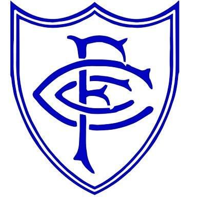
Enter Ted Drake, a former star player turned coach. He did not try to hide his opinion about the general public outlook of the Pensioner crest and nickname and he instigated a change in the design to keep up with the modernization of the club.
The new design was still under the works and hence a stop gap logo was used for one year during the 1952-53 season.
The new logo had the initials of the club intertwined in a cipher style. It was from this crest that a new nickname "The Blues" originated. This logo hasn't featured on the players' jerseys too and it was only used for match day programmes like the previous one.
Though they finished 19th in a 22-club league that season, this was a beginning of great things to come at the club. And with a ruthless manager in Ted Drake, the change in the logo was a small step in the bigger aim of changing the face of a club at the brink of modernization and the eventual success.
#3 Birth of the Lion (1953-1985)
The following season saw the birth of the most used Chelsea crest to date. The crest was designed to include many elements that defined the area of Chelsea.

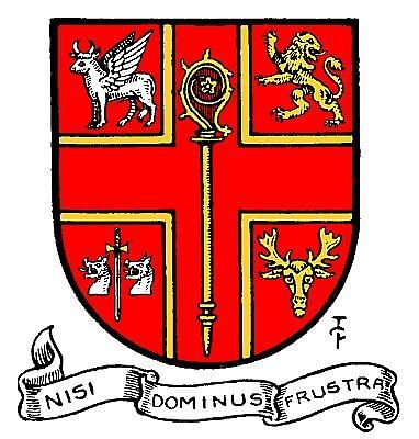
The lion in the crest was taken from the Arms of Earl Cadogan. And the staff is that of the Abbot of Westminster whose jurisdiction extended over Chelsea. The Three roses were used to represent the country of England and the two footballs were added to represent the game. The design was inspired by the civic coat of arms of the Metropolitan Borough of Chelsea.
This was the first Chelsea crest to be used on the jerseys of players. Due to the complexity of the design, simpler alternate designs were stitched onto the jersey initially. The crest also saw Chelsea winning its first league title in 1955 under Ted Drake.
The famous crest stayed for 33 years until the next Chairman Ken Bates took over the club in 1985.
#4 Ken Bates minimal design (1986-2005)
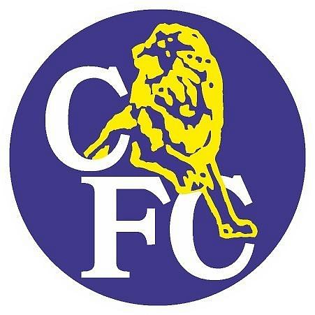
When Ken Bates bought Chelsea in 1982 for a sum of £1, he decided to change the crest that has served the club well for 33 years and replace it with a simpler one that would be easy to keep up with the merchandising business in football. Le Coq Sportif, a French sportswear company, designed a minimalist crest with a lion standing over the letters 'CFC'.
This design made it easy for merchandising and with Chelsea establishing itself in the English top flight over the next one decade, the crest became known across the world too. Many variations of this crest were used depending on the colour of the jersey.
Though it saw the resurgence of Chelsea on a global scale, it was very unpopular among the fans as it closely resembles the Millwall logo. After being used for 19 years this crest paved way for the most recent one as the centenary approached.
#5 Rebirth of the classic (2005-Present)
With Abramovich taking over in 2004, the fans demanded that the crest must be replaced with a new one. Many requested to bring back the crest from the Ted Drake era. There was a small problem though as the Earl of Cadogan demanded that Chelsea pay him up to use the design as it was inspired by elements from their coat of arms. Hence, Chelsea made small amendments to the classic crest and released the present version of it.
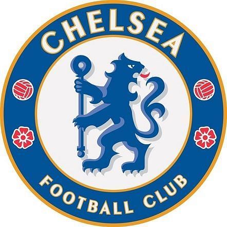
Today, this logo is recognized world wide as Chelsea have established themselves as an English and European heavy weight since the takeover in 2004. It is also arguably the best one from among the 5 crests till date and with the rate at which Chelsea are creating history since the dawn of the 21st century, it is easy to see why this one will remain for a long time to come.
