
'%20x='0'%20y='0'%20height='100%25'%20width='100%25'%20%0A%20%20%20%20%20%20%20%20%20%20xlink%3Ahref='data:image/jpg;base64,/9j/2wBDAAYEBQYFBAYGBQYHBwYIChAKCgkJChQODwwQFxQYGBcUFhYaHSUfGhsjHBYWICwgIyYnKSopGR8tMC0oMCUoKSj/2wBDAQcHBwoIChMKChMoGhYaKCgoKCgoKCgoKCgoKCgoKCgoKCgoKCgoKCgoKCgoKCgoKCgoKCgoKCgoKCgoKCgoKCj/wgARCAAGAAoDASIAAhEBAxEB/8QAFQABAQAAAAAAAAAAAAAAAAAAAAf/xAAVAQEBAAAAAAAAAAAAAAAAAAACA//aAAwDAQACEAMQAAAAq9KBT//EACEQAAEDAwQDAAAAAAAAAAAAAAMBAgQABREGEyJCEjJx/9oACAEBAAE/AL+K/musg4o+WPKXimpJgWr7dWj41a5MlLXDR4xtfssym64mF8U7KmXfVr//xAAWEQADAAAAAAAAAAAAAAAAAAAAESH/2gAIAQIBAT8AdP/EABYRAAMAAAAAAAAAAAAAAAAAAAABAv/aAAgBAwEBPwCkf//Z'%3E%3C/image%3E%3C/svg%3E)
Minecraft's official logo is one of the most iconic video game logos. Although it has been slightly tweaked over the years, it has largely remained the same. However, the game's community is so creative that they have changed the logo and put their own twist on it. Recently, Redditor u/ZIFIX posted a picture of Minecraft's logo that was made using different elements found in the game.
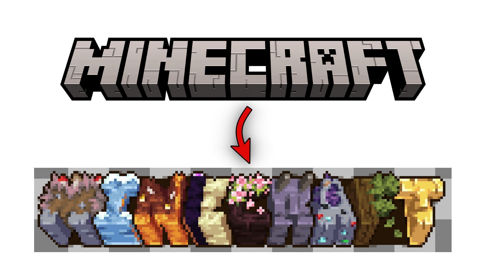
The name of the game itself was quite hard to read, but it can be understood that the original poster used several biomes, blocks, and other items to create it. Furthermore, they chose something that matches each letter in the word 'Minecraft'. For example, they made the letters 'M' with mycelium, 'I' with ice, 'N' with Nether, 'E' with End, C with cherry tree, 'R' with Ravager Mob, 'A' with Amethyst, 'F' with forest, and 'T' with the totem of undying.

Even though they are not all in-game elements, the overall logo looks quite unique, with different colors and textures.
Users react to Minecraft Redditor creating game logo with in-game elements
These kinds of posts always do well on Minecraft's official subreddit since players are fascinated to see unique art inspired by the block game. Within a day, it received more than 5k upvotes and lots of comments. People discussed the logo and how it could be improved.
Many Redditors pointed out that the logo was not readable. Since each and every letter had a different texture and protrusion, the letters were barely legible. One of the users, u/Local-Sprinkles9954, stated that without the caption (which clarified that it was the game's name) they would not have been able to decipher what was written.
A Redditor by the name of 'cubo_emaralhado' asked about the elements of the unique Minecraft logo and suggested that it can be improved in terms of readability. The original poster replied and revealed the in-game elements they chose to create the logo and agreed that it could be improved in the future.
After the original poster revealed the elements they used, Redditors discussed which other items in the game could act as a better element for the logo. Some were confused about the ravager mob being used as an element, and others suggested that redstone could have been used instead.
Another Redditor, u/withered_bonnie69420, suggested how the letter 'T' can denote trading with villagers, as it is a much more integral part of the game than using totems of undying.
Overall, the Minecraft community was fascinated by the game's logo, made with different aspects of the game, if not elements. Almost everyone suggested improving the readability and then discussed which in-game features would look better in the logo. Since the post is fairly recent, it continues to gather views, upvotes, and comments.
Obsessed with Crosswords, Wordle, and other word games? Take our quick survey and let us get to know you better!
