
'%20x='0'%20y='0'%20height='100%25'%20width='100%25'%20%0A%20%20%20%20%20%20%20%20%20%20xlink%3Ahref='data:image/jpg;base64,/9j/2wBDAAYEBQYFBAYGBQYHBwYIChAKCgkJChQODwwQFxQYGBcUFhYaHSUfGhsjHBYWICwgIyYnKSopGR8tMC0oMCUoKSj/2wBDAQcHBwoIChMKChMoGhYaKCgoKCgoKCgoKCgoKCgoKCgoKCgoKCgoKCgoKCgoKCgoKCgoKCgoKCgoKCgoKCgoKCj/wgARCAAHAAoDASIAAhEBAxEB/8QAFAABAAAAAAAAAAAAAAAAAAAABf/aAAgBAQAAAAAo/wD/xAAUAQEAAAAAAAAAAAAAAAAAAAAF/9oACAECEAAAADP/xAAUAQEAAAAAAAAAAAAAAAAAAAAF/9oACAEDEAAAAGf/xAAhEAABAwMEAwAAAAAAAAAAAAACAQMEAAUGERIhMTJCYf/aAAgBAQABPwDJMpulwhswhCEDIs+TbWwkLnd89E0pMlvZIijKIhXouE1r/8QAFhEBAQEAAAAAAAAAAAAAAAAAAQIA/9oACAECAQE/AGmqd//EABYRAQEBAAAAAAAAAAAAAAAAAAIAAf/aAAgBAwEBPwAnCDf/2Q=='%3E%3C/image%3E%3C/svg%3E)
Rayo Vallecano have come up trumps in the football kit stakes by releasing a kit with a diagonal rainbow stripe. Sounds garish and horrible right? But it looks fantastic and the back story behind it is even more perfect.The colours represent Cancer (Red), Disability (Orange),Depression (Yellow),Environment (Green),Child abuse (Blue) and Domestic violence (Pink).The rainbow as a whole is to fight against homophobia. Whats more, 7 from the sale of every shirt will go towards one of those causes mentioned above..@RVMOficial Foto de familia con las asociaciones y las equipaciones 15-16 pic.twitter.com/KOirFqurNo Rayo Vallecano (@RVMOficial) July 1, 2015It is an example of a club getting something exactly right, but what about those who got it wrong? Very wrong, in fact. We take a look at six of the weirdest football kits to ever make it into production.
#6 Porto - 2015/16
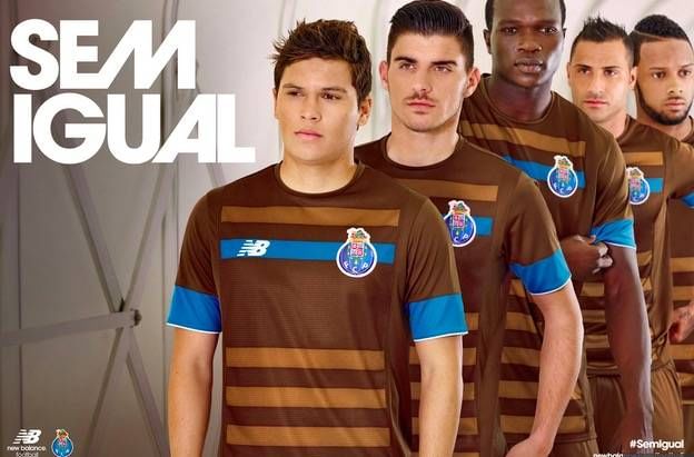
Porto’s latest offering – the away kit for the 2015/16 season – is a sight to behold. Quite what they were thinking when they came up with this chocolate brown effort is anyone’s guess.
The last time brown was seen on a football shirt – Coventry City in the mid-1970’s – a similar reception was forthcoming. The general manager of manufacturers New Balance, Mr. Richard Wright, said his company intended to make a “bold statement” with the design.
It’s fair to say that he’s definitely done that but perhaps not in the way intended. There is no history of brown ever playing a part of Porto’s kit history and so “cocoa brown with subtle stripes and striking blue trimming around the cuffs and across the chest” isn’t really what the doctor ordered.
And it certainly isn’t what the clubs’ supporters want. An online poll saw 88% of those asked giving it a huge thumbs down. Brown and blue, dear me!
#5 Cultural Leonesa - 90th anniversary kit 2014
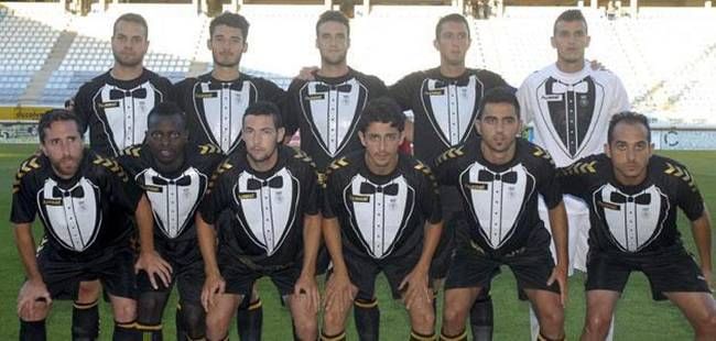
It’s always good when celebrating an anniversary to look your best. Perhaps that’s why Cultural Leonesa decided on wearing a tuxedo inspired kit at the beginning of their 2014 season. Dressed to impress for their 90th anniversary, even the goalkeeper was in on the act, in a super white number.
You might mock them, but the story behind the shirt is as decent a gesture as Rayo’s. As kit maker Hummel’s marketing manager Henning Nielsen noted: “The club wanted to help the mining industry in the region, which is having some really tough times.
“We wanted to go in and explore the club's heritage and find what has local character, and incorporate that into the design. The club is celebrating its 90-year anniversary, so instead of having a formal reception with wine and drinks and snacks the club decided to do something – another way with a bit of character."
The way that the club set about helping the local mining community was to give 10% of the proceeds to charities for mining families based in the region. Initial supporter, and shirt collector, reticence was dismissed once the story behind the kit became public.
It is still available to purchase but is now a strictly limited edition.
#4 Club Deportivo Lugo - 2014/15 (Home and away)
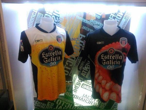
Where on earth do you even begin with CD Lugo’s kits from last season? Being sponsored by a local beer company, you suppose it might be inevitable that some executive in the boardroom jokingly mentions a glass of beer as a sponsor logo.
Well, there must have been too much of it being sunk when it was agreed to turn the entire home shirt into exactly that. Complete with bubbles and a head, it’s every pub punters dream.
And if you didn’t think it could get any worse, an octopus tentacle on the away shirt just takes the biscuit. Or the octopus. Representative of the preferred delicacy of the region, justice has been done because it is the worst selling shirt in the club’s history and the home shirt isn’t far behind.
At least common sense has prevailed amongst the clubs supporters.
#3 Colorado Caribous - 1978
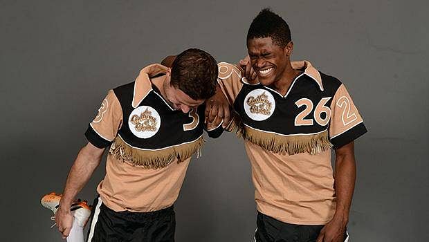
The 1970’s was a disaster for fashion generally and there were some god awful football kits at the time. Birmingham City’s “German flag” kit is one that particularly springs to mind. But you’d have to walk a million miles to find a shirt any more horrendous than the Colorado Caribous “Cowboy” effort from 1978.
Formed and dissolved after just one season in the NASL, the Caribous were, apparently, trying to “evoke the spirit of the pioneers of the western frontier.”
Well they certainly evoked something but it had nothing to do with pioneers. A coffee and cream coloured body with black arms was a pretty awful combination to start with but the icing on the cake were the tassles around the midriff.
Yes, you read that correctly. A football shirt with tassles on it. The only thing that was missing was the stetson and spurs. Yee ha!
#2 VfL Bochum - 1997
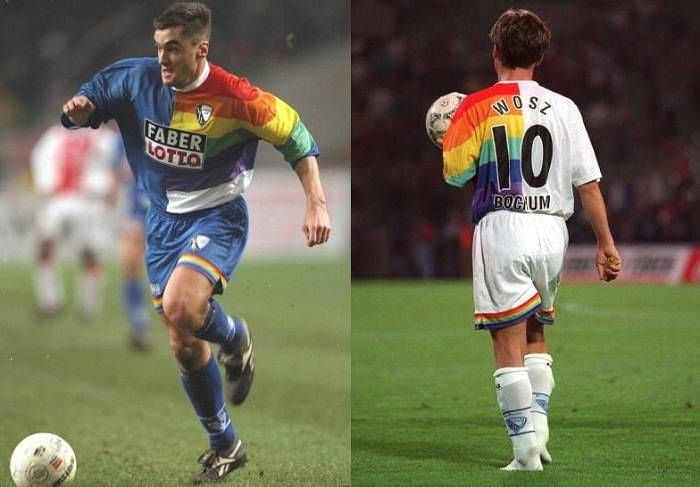
Rayo weren’t the first to introduce the rainbow on their kit. And VfL Bochum in 1997 were spreading the love and the colour right across their range. Home, away and goalkeeper shirts all got the multi-coloured treatment.
Faber, who were the company that also ran the German national lottery, had been Bochum’s club sponsors for a while, but decided they needed to increase their visibility to maximise profits from shirt sales. Quite why they settled on a rainbow is unclear, but it certainly had the desired effect. It was the clubs’ most popular shirt in years.
What’s also remarkable about the kit is the machinations behind getting it made. It is unclear who actually manufactured the kit because there is no trace of their logo anywhere on the kit.
As with all kit sponsors, the company logo can only be a certain size so Faber made it look like they were the manufacturers and hence were able to splash their colours over at least a quarter of the shirt!
#1 1860 Munich - 150th anniversary kit (2010)
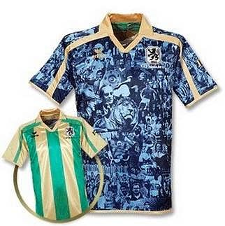
1860 Munich celebrated their 150th anniversary back in 2010 so naturally wanted to celebrate the date appropriately. What better way than a kit that everyone would remember for years. And boy is that one remembered – for all of the wrong reasons.
The shirt is supposed to be full of the club’s biggest moments in their history but ended up looking like one big mish-mash of black and sky blue. You can barely see the club badge and manufacturer logo because the shirt is far too busy.
Obviously the saying “less is more” wasn’t in the dictionary in that part of Germany.
If that overall design weren’t bad enough, to top it off with the ‘70s inspired collar and gold shoulder piping really sees this one plumb the depths. For a shirt that was meant to bring happiness, it did anything but.
What makes it worse is that this shirt was reversible. And the green and gold alternative was so much better!
