
The Rio Olympic has an official logo and the font of which was selected from a total of 138 entries. A logo must always reflect the nature of the host country and create a unique identity for the Games in the entire world. An attractive logo always helps as it is easier for the marketing of the event.
Brazil has been able to produce such a logo that has helped the Games in achieving popularity around the globe. Here’s everything you need to know about the logo for the 2016 Games:
How the logo was made:
After winning the bid to host the Rio Olympics in 2009, Brazil’s Olympic Committee had announced a competition where different designing companies from the country were invited to produce a demo design of the logo for the Rio Olympic Games. Around 138 companies took part in the competition and it was Brazil’s Tátil Design de Ideias which won the bid to create the official logo.
Tátil is a firm based out of Rio De Janeiro and works on the concepts and designing of logos for various organisations throughout the world. They have previously worked with WalMart, Coca-cola and Fiat.
The creative director of Tátil, Frederico Gelli, said that the reason for their concept getting selected was that “the logo was not designed for designers, but for everybody in the world.” He added, “It represents Brazil’s energy and how we receive people.”
After the selection of the concept, the firm went through rigorous hard work and made a separate 10-member designer team which would design the final logo in secrecy.
After more than 150 experiments with the concept of the logo, Gelli and his colleagues finally found the right logo for the Rio Games.
What does the logo reflect?
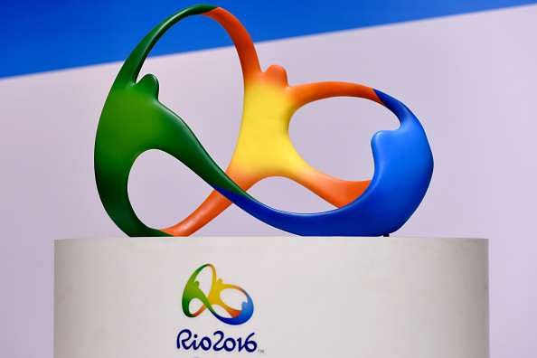
The logo has been formed by putting together a variety of elements which give the logo a unique look. Gelli states that he got the idea for the logo when he was swimming in Rio’s Ipanema Beach. He further added that when he came up from under the water and saw the Dois Irmãos (Two Brothers Hill, above), he had said to himself, “we are in the middle of sculpture city, we need to make a harmonizing logo.”
According to Gelli, the curves in the logo’s shape come from the mountains in Rio de Janeiro.
Tatil’s main idea was to represent Rio’s “Cariocas” – its citizens. The logo reflects that the Brazilians were born from a mixture of ethnicities and have kept their faiths intact. The makers believe that all the Brazilian people share the same sky, the same ocean and the same happiness with the world. The designing firm further says that the human warmth that is a part of the Carioca nature and the Olympic spirit, has been shaped into the logo.
Hence, the firm designed a logo that shows how everyone is standing hand in hand even with the difference in culture (which is depicted by the difference in color).
What do the colors in the logo depict?
Gelli says that the colour choices of the logo have been inspired by the Brazilian environment. In their online case study, Tatil, the designing company, reports that all the colors have a meaning in them. They report, “Yellow symbolises the sun and our warm, vivacious and happy nature. Blue expresses the fluidity of the water that surrounds us, and our easygoing way of life. Green represents our forests and hope, a positive vision that inspires us to go even further.”
How did the font match with the logo?
The Olympic Games have always had an official font as well. The font is different from any other font which already exists in the world. The official Rio font, however, was produced by an English company named Dalton Maag. They got the task to make the font 18 months after Tatil had finished the logo. They had to make 3 letters – R, I and O and 4 figures – 2, 0, 1 and 6. This had to match with the logo of the Games. Hence, both the firms had a secret meeting where Tatil enlightened Dalton Maag about the project.
Maag came up with 24 different ‘logotypes’. A logotype refers to the font that will be written with the official logo of the Games. Maag’s designers liked the 24th logotype which was selected as the official font of the Games. All the text in the stadiums and events during the Olympics will be in the official font of the Games.
