
'%20x='0'%20y='0'%20height='100%25'%20width='100%25'%20%0A%20%20%20%20%20%20%20%20%20%20xlink%3Ahref='data:image/jpg;base64,/9j/2wBDAAYEBQYFBAYGBQYHBwYIChAKCgkJChQODwwQFxQYGBcUFhYaHSUfGhsjHBYWICwgIyYnKSopGR8tMC0oMCUoKSj/2wBDAQcHBwoIChMKChMoGhYaKCgoKCgoKCgoKCgoKCgoKCgoKCgoKCgoKCgoKCgoKCgoKCgoKCgoKCgoKCgoKCgoKCj/wgARCAAHAAoDASIAAhEBAxEB/8QAFgABAQEAAAAAAAAAAAAAAAAAAAMF/8QAFQEBAQAAAAAAAAAAAAAAAAAAAwT/2gAMAwEAAhADEAAAANSodX//xAAfEAABAwQDAQAAAAAAAAAAAAADAQIRAAQFEiEiMZH/2gAIAQEAAT8AtsblCCS7AUQbYLGq8T3dz7do4SGrEL7SYjHPTYjspu7l2qCiftf/xAAXEQEAAwAAAAAAAAAAAAAAAAABAAIS/9oACAECAQE/AG2Wf//EABcRAAMBAAAAAAAAAAAAAAAAAAABAgP/2gAIAQMBAT8Are2f/9k='%3E%3C/image%3E%3C/svg%3E)
College football includes an outstanding array of uniforms, with some mesmerizing and others leaving a lot to be desired.
Here's a look at five of our favorite outfits and five that we would never wear.
Top 5 best college football alternate uniforms
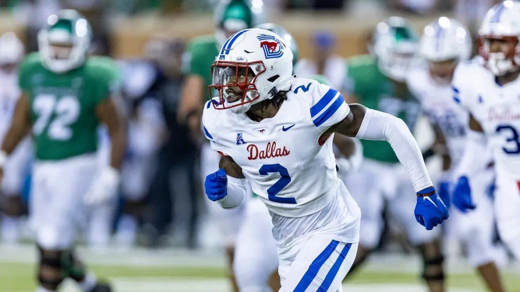
#5, SMU: "Dallas" 2019
A homage to the 1970s aesthetic, this uniform was part of an attempt to rebrand the Mustangs as the Dallas college football team. This white uniform with blue lines was flawless.
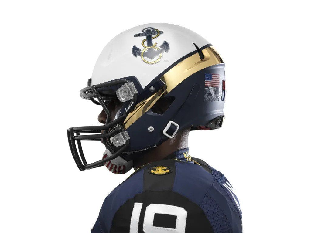
#4, Navy vs. Army 2013
Anchors Aweigh! A beautiful tribute to the storied and proud service to which Annapolis belongs. With the rank insignia for Midshipmen on the shoulders and a detailed anchor drawing on the helmet, this is a uniform Robert Staubach and Admiral Nimitz alike would have been proud of.
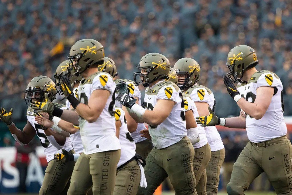
#3, Army vs. Navy 2019
America's First Team! That's the motto of the US Army's 1st Cavalry Division, the unit to which this particular uniform pays homage. With a calvary men's insignia on the helmet, the unit patch on the shoulders and standard issue-inspired pants, this a beautiful tribute to one of the Army's premier combat units. George Patton would approve.
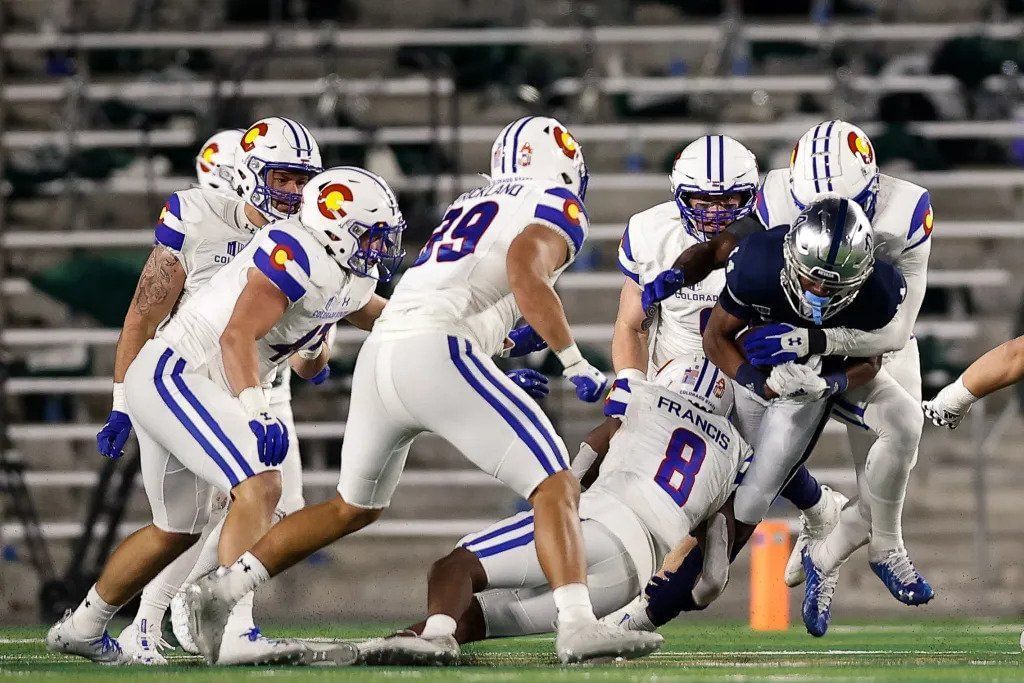
#2, Colorado State: "Colorado Pride" 2017
Inspired by the Colorado state flag, the white and blue uniform just stands out in the field. Nothing like their original uniform, the idea was a hit with fans connecting with their state's pride.
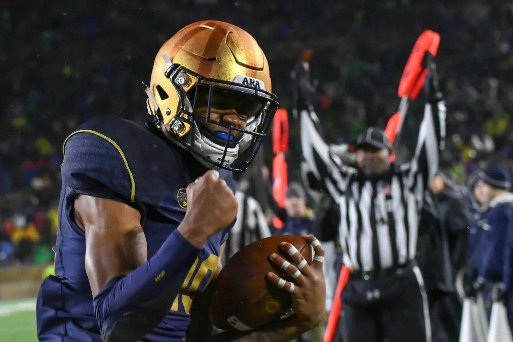
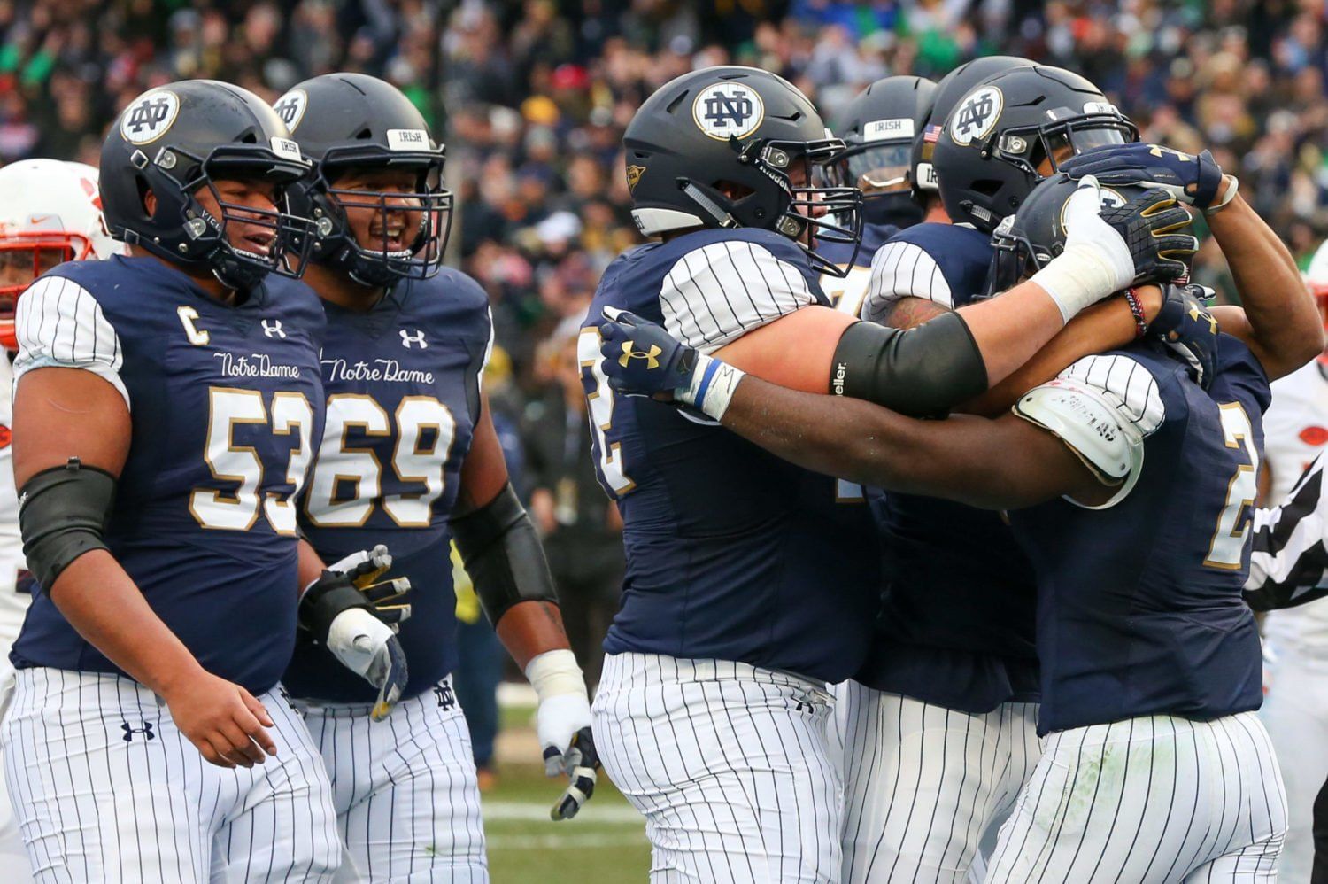
#1, Notre Dame: Knute Rockne 2017
A tribute to coaching legend Knute Rockne, the gold helmets were made to look like old-school leather helmets. Rockne's famous speech was imprinted on the shoulders of the Fighting Irish players.
Top 5 worst college football alternate uniforms
#5, Florida: Alligator 2017
What was anyone thinking when they decided to give the Gators a uniform replicating the actual skin of an alligator? Ugh, cringe.
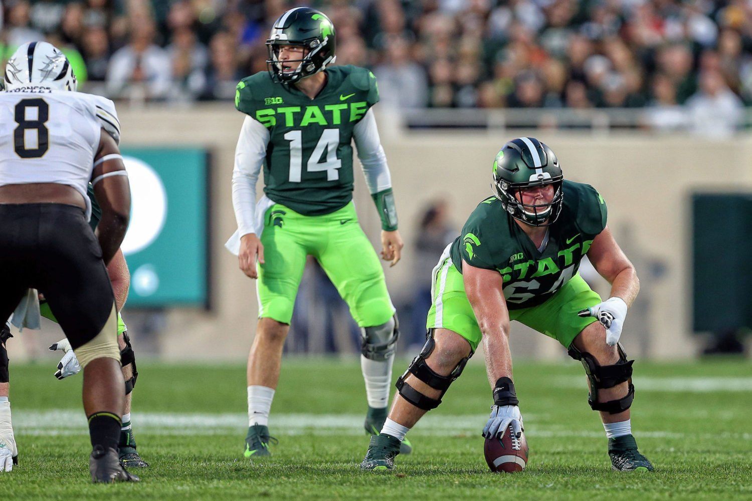
#4, Michigan State's Neon
Blade Runner called, and it wants its aesthetic back. Jokes aside, neon signs might look great in gritty cyberpunk films and games, but they have no place in a college football uniform.
#3, Notre Dame: Yankees
Trying to pay homage to the most successful team in baseball went wrong for the Fighting Irish. The thing looks like a pajama.
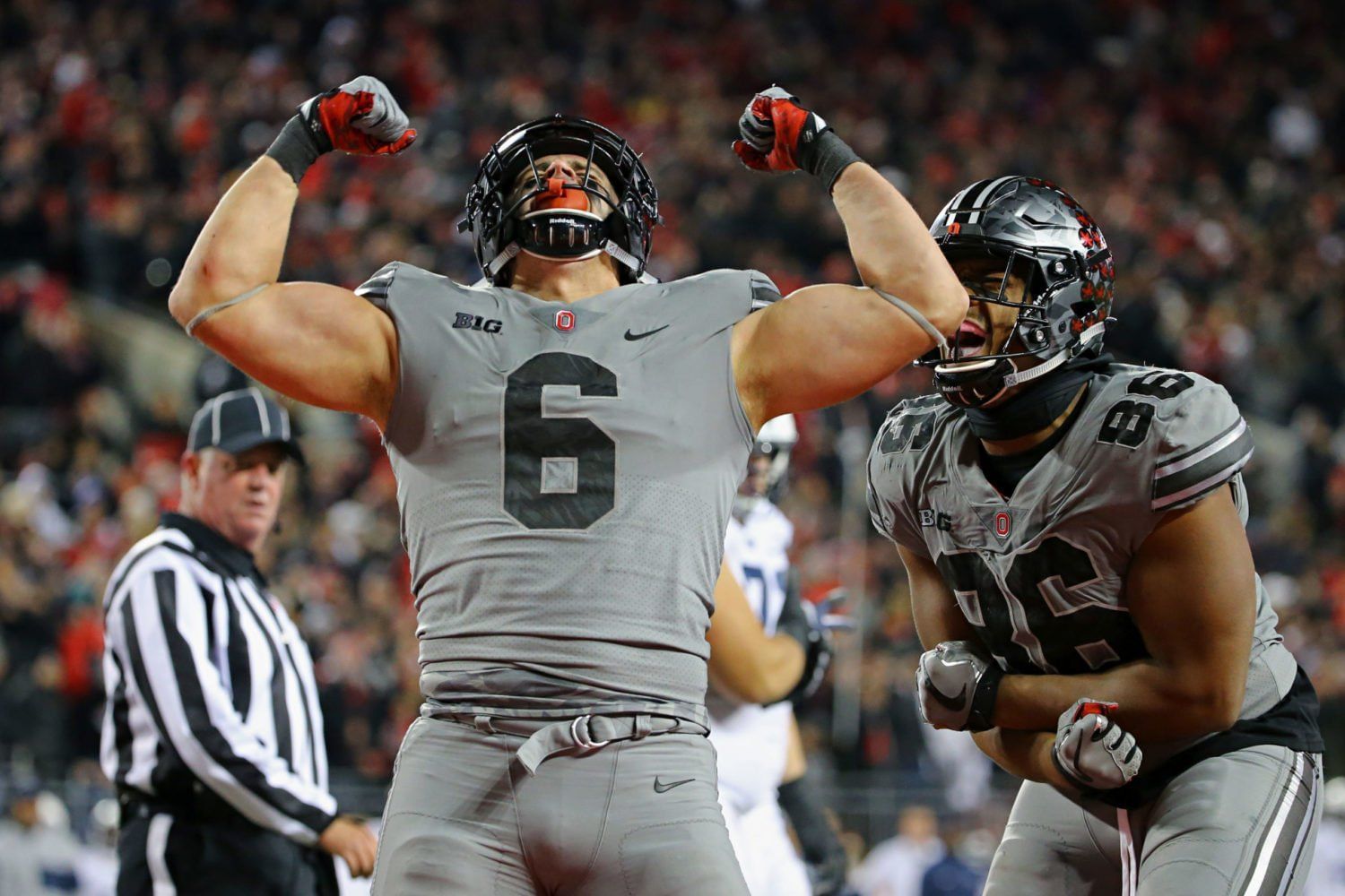
#2, Ohio State: Greys 2017
The idea was to look cool, like a wolfpack. What we got looks like what an Under Armour commercial looks like.
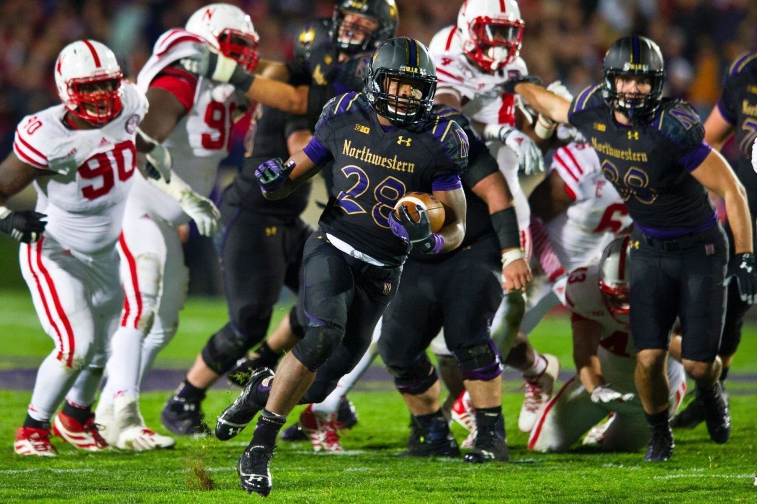
#1: Northwestern's Gothic 2014
It's the letters, the letters. Nothing further to say.

Notre Dame Fans? Check out the latest Notre Dame depth chart, schedule, and roster updates all in one place.