

'%20x='0'%20y='0'%20height='100%25'%20width='100%25'%20xlink%3Ahref='data:image/jpg;base64,/9j/2wBDAAYEBQYFBAYGBQYHBwYIChAKCgkJChQODwwQFxQYGBcUFhYaHSUfGhsjHBYWICwgIyYnKSopGR8tMC0oMCUoKSj/2wBDAQcHBwoIChMKChMoGhYaKCgoKCgoKCgoKCgoKCgoKCgoKCgoKCgoKCgoKCgoKCgoKCgoKCgoKCgoKCgoKCgoKCj/wgARCAAGAAoDASIAAhEBAxEB/8QAFgABAQEAAAAAAAAAAAAAAAAAAAYH/8QAFQEBAQAAAAAAAAAAAAAAAAAABAX/2gAMAwEAAhADEAAAAMdvAd3/xAAhEAACAQMDBQAAAAAAAAAAAAABAwIABBEFBhIIEyFR0v/aAAgBAQABPwDa7o3sLazuVcw9kV8+5IYyfQp/TpuMuYV6powhnxks+K//xAAXEQEAAwAAAAAAAAAAAAAAAAABAAIh/9oACAECAQE/AKus/8QAGREAAgMBAAAAAAAAAAAAAAAAAQIABCJB/9oACAEDAQE/ALWEQA8n/9k='%3E%3C/image%3E%3C/svg%3E)
One of cricket’s most controversial endings was once scripted by the Australian skipper Greg Chappell when he asked his brother Trevor Chappell to bowl the last ball underarm to eliminate any chance of his opponents to win off the last ball.
While the jury is out on how disgraceful that act was, cricket itself has come a long way. Now captains do not really need to come up with ingenious, potentially risky ideas, but can come prepared with a wide range of information regarding opposition batsmen and bowlers
At their behest is a huge mountain of data that could tell them where a batsman doesn’t hit the ball when under pressure, which part of the ground he doesn’t prefer, what length of delivery makes him uncomfortable, what kind of bowlers prevent him from pulling off sensational strokes and more such information.
Analytics has turned out to be cricket’s most important backend support, especially in the last few years. From Moneyball teams to cricketing powerhouses, cricket teams from around the world are taken in by the advantages offered by analytics. No batsman is safe and neither is any bowler.
There are no secrets in the game anymore. Sample this - Batsmen now know the go-to delivery of their opposition’s best bowler, they know their accuracy rates, their stock deliveries and preferred lengths and lines. Bowlers know where a batsman gets dismissed the most number of times. Bowlers also know where a batsman is comfortable and which line/length/style of bowling troubles him.
Analytics tells teams when batsmen shift gears or when batsmen are consistent and when they are shaky at the crease. All these details have turned cricket from a game that relied on guts, nerves, and instincts, to a game that is played in the mind, with tactics and strategies pre-planned for each opposition player.
The viewer’s experience has been greatly enhanced too. Whether it is cricket commentary sites or TV channels, analytics is used to give viewer’s a much better view of the dynamics involved in this game, rich with details, complicated rules and a wide plethora of possibilities with every ball.
Worms, wagon-wheels, pie-charts, Hawk-Eye, Manhattan, ball-groupings, etc. are some of the many analytical and visually enhanced data-sheets that help teams.
Bowler pitch map
Take the example of a graphic that shows all the different deliveries that the bowlers have bowled in an innings and where the batsman had made contact with them. With a quick glance, one can pick up where most of the deliveries have been bowled, in terms of line and length.
The colour coding helps everyone gauge the scoring deliveries. For example, the red ball shows dots.
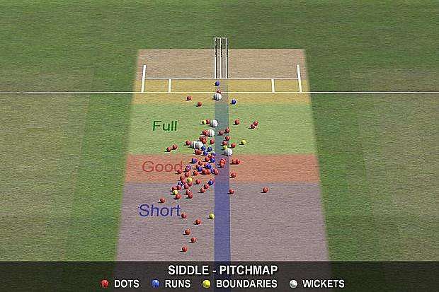
The blue and yellow balls display scoring shots on the off-side and leg-side. The predominance of these colours visually informs viewers that the batsmen has managed to score off a large chunk of deliveries, something that’ll please their batting coach. It also shows another important piece of information that the bowling coach wouldn’t be happy with – the number of deliveries which offered width to the batsman.
Finally, the positioning of the white ball, the wicket-taking delivery, shows the balls that have troubled the batsman most. Interestingly, the same analysis can be performed for every batsman to get a better idea of what line and length he deals with well and in what areas is he vulnerable.
Batsman strike rate graph
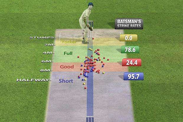
The graphic above shows where the ball landed and how the batsmen dealt with them. The graphic clearly tells you that a major chunk of the balls scored off were deliveries short of length.
The pitch-graphic also shows the lack of discipline with the bowlers as they have sprayed the ball all over the place, from wide outside off-stump to outside leg-stump. Similarly, the length has varied quite a lot from halfway down the track to about 4 meters.
Interestingly, the graphic also shows that the bowlers managed to deliver very few balls in the block-hole, something the bowling coach will rue.
The Wagon Wheel
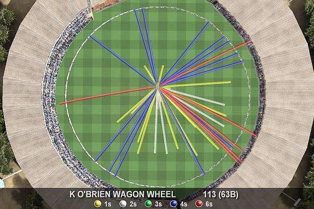
The wagon-wheel is one of the most powerful and visually-descriptive analytics chart used by broadcasters and teams alike. In one glance, the wagon-wheel tells viewers the scoring areas for the batsman. It also shows the viewers where most 1s, 2s, and 3s have been scored, and which parts of the ground attracted the most boundaries.
A wagon-wheel could tell viewers if the batsmen drove a lot or flicked the ball through square leg a lot. It also provides information if the ball was played fine often or if it was bludgeoned to the cow-corner.
It can also tell viewers where the sixers were scored and where the fours went, if the batsman played in the V with a straight bat or if they played late with an angled bat. These details could be valuable for any future strategies.
Speed worms
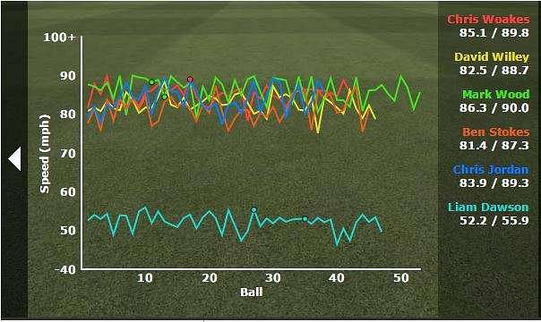
The speed worms are the ideal way of assessing the bowler’s speeds through the day. For example, Chris Jordan has varied his speeds a lot more than Mark Wood, who was consistent with his speeds in the higher 80s.
The chart also shows that the bowlers didn’t vary their pace too much and stuck to constant speeds. The same is true about the spinner Liam Dawson as well, who didn’t vary his delivery speeds beyond a 3-4 mph range.
Hawk eye
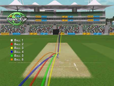
The HawkEye graphic above is an excellent way of comparing two things:
1. The movement of the ball from the time it left the bowler’s hand to the time it passed the batsman
2. The bounce of the ball after it pitched.
Bowling coaches can use the same information to see where the bowler is releasing the ball, something that is often associated with the rhythm of a bowler and his overall accuracy.
Some bowlers deliberately vary their release point, changing it from high-up to more side-arm to change the angles and use the crease more often. The movement of the ball and the bounce can visually and accurately be gauged.
The same infographic can also show variable bounce on the pitch, especially when different deliveries released from the same point and pitched at the same point, bounce to different heights.
Manhattan
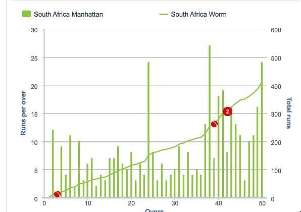
The Manhattan is one of the most popular charts, which shows how a team has scored across the innings. In one glance, we can spot the big overs the batsmen made, the overs where the scoring was less, the periods in the game where they managed to exploit and the effects of losing a wicket on scoring speeds.
The Manhattan chart can help compare the progression of two teams over by over. It can help compare teams across stages of the game.
Everything is under scanner these days. Gone are the days when the numbers were the only demonstration of a bowler’s value and there was no way of identifying what happened in the game. Now, every ball is documented, including information on its trajectory, landing area, how it was scored off and how it was different from the other deliveries on the basis of a wide variety of parameters.
While some may say that this complicates the game by introducing to the viewers too many unknown and novel parameters, a deeper look shows how analytics ideally complements the beautiful game.
Cricket has never been as popular as football for a very simple reason – it is a long game and more importantly, there are too many rules and complications.
However, analytics helps brings interest to the game by making it exciting for viewers. It can make the game more scientific and competitive without really robbing it of the unpredictability brought by brilliant performances!

Looking for fast live cricket scores? Download CricRocket and get fast score updates, top-notch commentary in-depth match stats & much more! 🚀☄️