

'%20x='0'%20y='0'%20height='100%25'%20width='100%25'%20xlink%3Ahref='data:image/jpg;base64,/9j/2wBDAAYEBQYFBAYGBQYHBwYIChAKCgkJChQODwwQFxQYGBcUFhYaHSUfGhsjHBYWICwgIyYnKSopGR8tMC0oMCUoKSj/2wBDAQcHBwoIChMKChMoGhYaKCgoKCgoKCgoKCgoKCgoKCgoKCgoKCgoKCgoKCgoKCgoKCgoKCgoKCgoKCgoKCgoKCj/wgARCAAGAAoDASIAAhEBAxEB/8QAFgABAQEAAAAAAAAAAAAAAAAAAAYH/8QAFQEBAQAAAAAAAAAAAAAAAAAABAX/2gAMAwEAAhADEAAAAMdvAd3/xAAhEAACAQMDBQAAAAAAAAAAAAABAwIABBEFBhIIEyFR0v/aAAgBAQABPwDa7o3sLazuVcw9kV8+5IYyfQp/TpuMuYV6powhnxks+K//xAAXEQEAAwAAAAAAAAAAAAAAAAABAAIh/9oACAECAQE/AKus/8QAGREAAgMBAAAAAAAAAAAAAAAAAQIABCJB/9oACAEDAQE/ALWEQA8n/9k='%3E%3C/image%3E%3C/svg%3E)
When India won its first ever World Cup, the teams wore white kits and the innings lasted for 60 overs, ten more than the current quota of 50 overs a side. Thanks to Kerry Packer’s World Series Cricket tournament, things began to change drastically in the limited overs format. Teams began to ditch their traditional white coloured jerseys for a more colourful one.
Perhaps, the Australians ended up having the most attractive jersey of the lot. A gold top matched by an equal share of yellow in the track suits blew the spectators’ mind. From the traditional golden yellow to the sophisticated baggy-green , the team from down under have let no stone unturned in producing quality kits.
Over the past few years, we have seen a lot of changes in the Aussie jerseys in terms of colour and design. Let’s take a closer look at the evolution of the Australian jersey over the past two decades:
#1 The iconic 1992 World Cup kit
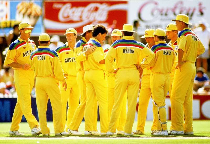
The first World Cup (1992 version) to be played under artificial lights was a memorable tournament. All the participating teams had similar jersey designs and broke an insane amount of records while playing in this kit. Twenty-four years later, kit makers still struggle to come up with better designs. A bright yellow top with rainbow stripes on the sleeves, the kit was a showstopper. With a massive recall value for the simplicity in their designs, the 1992 World Cup jersey was simply a must have.
As far as cricket was concerned, the tournament was a miserable one for the hosts. Four losses in eight group stage matches gave Australia zero chance to qualify for the semi-finals. While Martin Crowe was adjudged as the Player of the Tournament, a certain 26-year-old youngster named Wasim Akram made all the headlines. He was unplayable and ended the tournament with 18 scalps under his belt.
#2 The 1996 and 1999 World Cups
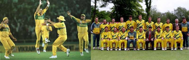
The two kits used similar colours. A yellow top with a few wayward designs made the 1999 kit less desirable. Also, the choice of lemon yellow instead of the traditional golden-yellow was a miss. However, they reverted to their original jersey choice for the 1999 World Cup, and it was a thing of beauty.
The dark green tinge in the midst of a sea of gold was eye catching. Australia finished runners-up in Group A after defeats against Sri Lanka and West Indies. They brought their A-game in the knock-out stages as they thrashed New Zealand and the West Indies. But, they fell short in the finals as they lost to Sri Lanka for the second time in the tournament.
In what was Steve Waugh’s last World Cup (1999 version), the team from down under started off slowly with defeats against New Zealand and Pakistan. They fought valiantly in the super six’s and ended up dismantling Pakistan in the finals to lift the illustrious cup for the second time.
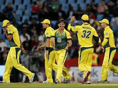
#3 2003 World Cup
The kit comprised of a golden-yellow T-shirt with shades of green and white on the sides. It was similar to the one used in the Champions Trophy. With matching trousers, the kit looked a bit odd as there was no room to spot the difference. A school uniform would be an apt example. The 2003 World Cup was the first one for Ricky Ponting as team captain.
The Aussies won every single match en route to their third World Cup. They comprehensively defeated the Indians in the finals thanks to a blistering hundred from their skipper. However, it was India and Kenya who headlined every news channel. While the latter reached the semi-finals for the first time, the former went on to reach the finals; A feat which no Cricket fan thought would be possible.
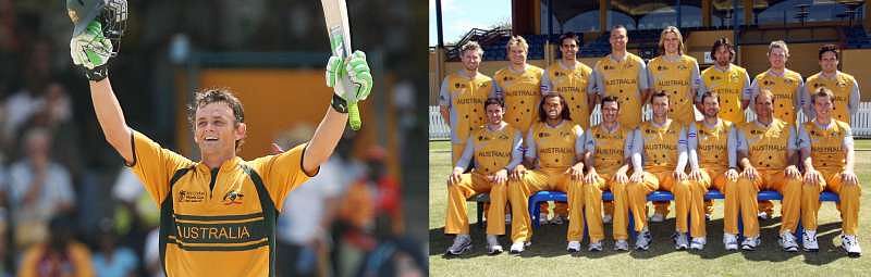
#4 Commonwealth Bank Series
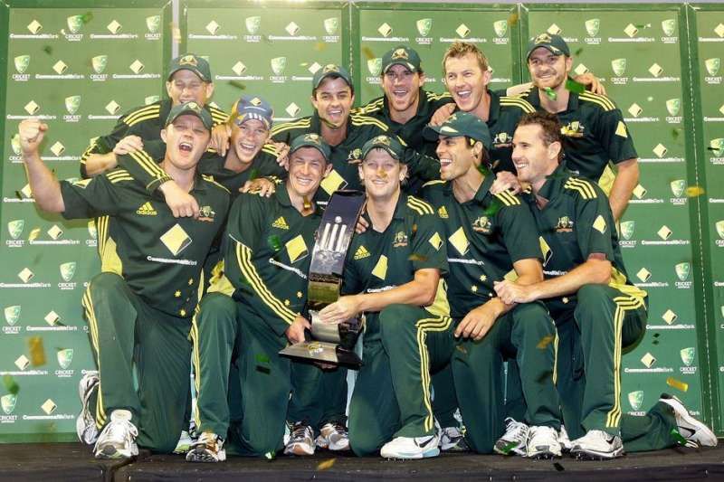
The Aussies used to play with two kits a while back. They reserved their traditional yellow kits for the games away from home. For the home series, they wore a full baggy-green kit matched with three sets of yellow strips running till the trousers. The traditional stars were placed on the lower left side of the top, making it aesthetically pleasing.
Boy, was this kit good! Inspired by their gorgeous jersey, the Aussies played like true champions and hardly lost a series (barring the 2008 series against India and Sri Lanka). Aussie legend Adam Gilchrist scored his final international century against Sri Lanka wearing this very kit!
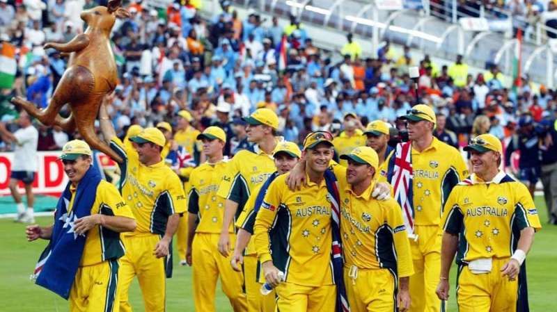
#5 2007 World Cup jerseys
The kit used in the T20 World Cup looked hideous as the grey sleeves made no sense. The choice of yellow backfired as a more baggy-green approach would have suited the sleeve colour. However, the one used for the fifty-over World Cup was decent. The full-gold strip with baggy green outlines was a breath of fresh air. The year 2007 can never be forgotten by a cricket fan.
The fifty over format saw Australia lifting the World Cup for a record fourth time, thanks to a brilliant 149 from Adam Gilchrist. However, the introduction of the T20 World Cup later that year made all the headlines. Australia was off to the worst possible start as they were beaten by minnows Zimbabwe in the opening fixture. They lost to eventual champions India in the semi-finals.
#6 2011 World Cup
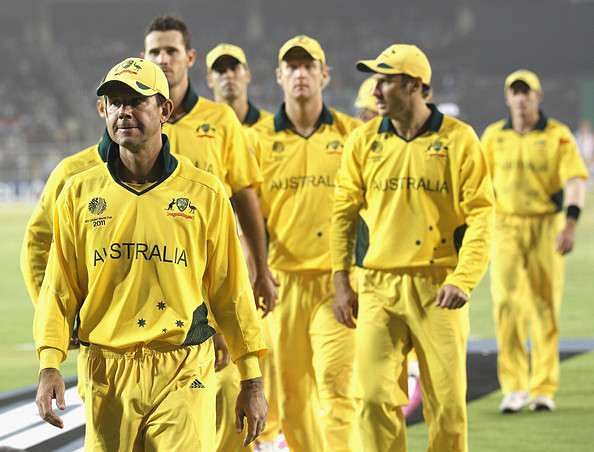
In what was Ricky Ponting’s swansong international tournament, Australia failed to live up to their pre-tournament billing as ‘overwhelming favourites’. They finished third in their group after being thrashed by Pakistan. The draw did them no favour, as they were pitted against the mighty Indians in the quarter-final stage.
Despite decent performances with both bat and ball, they were no match as Yuvraj Singh and Suresh Raina chased down the target with relative ease. Coming back to their kit, the full-sleeved plain yellow jersey lacked in designs and looked more like a winter sweater. Overall, it was a forgettable tournament for the five-time World Cup winners.
#7 2012 T20 World Cup
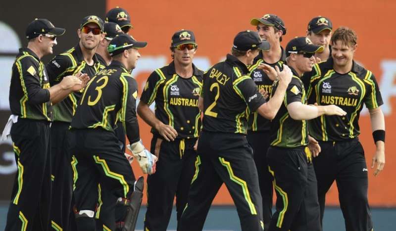
This kit made news for all the right reasons. A standard black kit with different shades of yellow looked marvellous. The green and yellow stripes were a fantastic addition. It was the best kit used in the tournament. Australia had a decent outing after an early exit in the fifty over format. They sailed into the super eight stages thanks to victories against West Indies and Ireland.
They also topped their group in the super eights. However, they were blown away by a Christopher Henry Gayle special in the semi-finals. More positive news awaited the Aussies as Shane Watson ended the tournament as the highest run scorer (249 runs) and also won the “Player of the Tournament” award.
#8 2014 T20 World Cup
Just like the team’s performance, the kit was also disappointing. Australia finished fourth as they could only beat Bangladesh in a relatively easy group. One win in four games sent the team from the Southern Hemisphere back home in the Super Ten’s stage.
The kit did them no favours. A huge chunk of green surrounded by a sea of lemon-yellow made the kit less appealing. The thick green borders on the back of the trousers piled up the misery. The only positive for the Australians in the tournament was veteran spinner Brad Hogg’s form. He also became the oldest player to play an international T20 game at the age of 43 years and 34 days.
#9 2015 World Cup

Australia and bright yellow, definitely a better love story than Twilight! The team from down under kept their jersey simple. A bright yellow top with the single-button collar made it super sporting. The defaced Blue Ensign (symbols on their national flag) was wonderfully incorporated into the shirt. A shade of green towards the side did no harm to an already eye-catching kit.
Overall, it was a great kit. The co-hosts finished as runners-up in Group A behind New Zealand. Ruthless displays against Pakistan and India in the knock-out stages sent them to the finals against the unbeaten kiwis. The kangaroos rose to the occasion and won a record fifth World Cup, giving a perfect send-off to outgoing captain Michael Clarke.
#10 2016 T20 World Cup
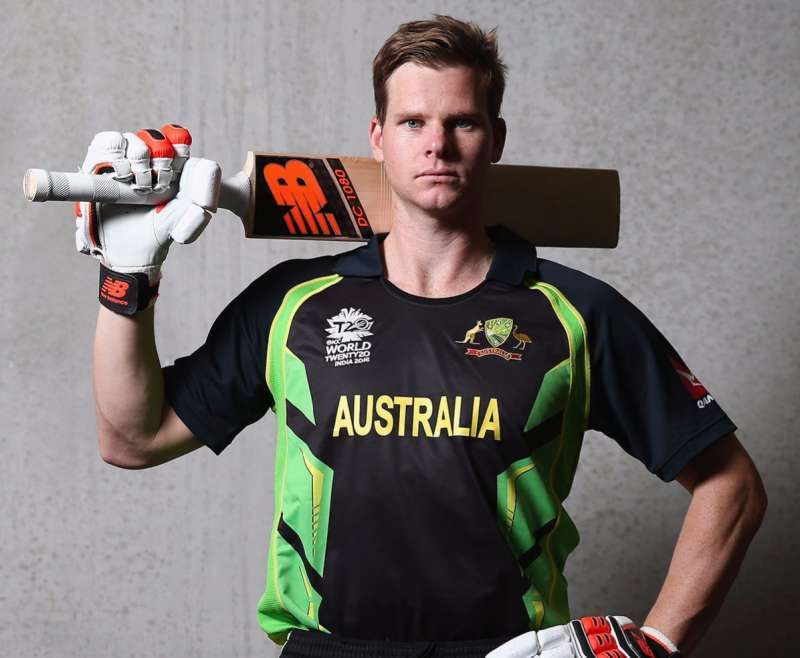
The Aussies reverted to the full black dress code which they followed in the T-20 series against India earlier this year. The best facet about this jersey was the absence of the ridiculously large sponsor logo. The sleeves were coloured baggy green which brought in a touch of nostalgia. The bright green and yellow designs on the sides elevated the jersey to a whole new level.
The lack of sponsor logos on the jersey made it that much more likeable. Australia started the tournament on a disappointing note as they were defeated by local rivals New Zealand. They bounced back with successive victories against Bangladesh and Pakistan. However, a Virat Kohli masterclass sealed their fate before the knock-out stages.

Looking for fast live cricket scores? Download CricRocket and get fast score updates, top-notch commentary in-depth match stats & much more! 🚀☄️