
'%20x='0'%20y='0'%20height='100%25'%20width='100%25'%20xlink%3Ahref='data:image/jpg;base64,/9j/2wBDAAYEBQYFBAYGBQYHBwYIChAKCgkJChQODwwQFxQYGBcUFhYaHSUfGhsjHBYWICwgIyYnKSopGR8tMC0oMCUoKSj/2wBDAQcHBwoIChMKChMoGhYaKCgoKCgoKCgoKCgoKCgoKCgoKCgoKCgoKCgoKCgoKCgoKCgoKCgoKCgoKCgoKCgoKCj/wgARCAAGAAoDASIAAhEBAxEB/8QAFgABAQEAAAAAAAAAAAAAAAAAAAYH/8QAFQEBAQAAAAAAAAAAAAAAAAAABAX/2gAMAwEAAhADEAAAAMdvAd3/xAAhEAACAQMDBQAAAAAAAAAAAAABAwIABBEFBhIIEyFR0v/aAAgBAQABPwDa7o3sLazuVcw9kV8+5IYyfQp/TpuMuYV6powhnxks+K//xAAXEQEAAwAAAAAAAAAAAAAAAAABAAIh/9oACAECAQE/AKus/8QAGREAAgMBAAAAAAAAAAAAAAAAAQIABCJB/9oACAEDAQE/ALWEQA8n/9k='%3E%3C/image%3E%3C/svg%3E)

The WC 2018 kicks off later today with hosts Russia taking on Saudi Arabia. As with every World Cup, the build-up is almost as exciting as the tournament itself and that begins with the announcements of the squads as well as the kits.
This World Cup promises to offer the fans the best in terms of jerseys. There is a fascinating mix of tradition, colors, and cultures, resulting in kits that are simply mesmerizing. In my opinion, there is not a single truly bad kit, something which cannot be said of previous World Cups.
Many teams have decided to draw inspiration from past kits to pay homage to teams of yesteryear.
On that note, here's looking at the 10 best kits on show at Russia 2018.
Note: the rankings are entirely subjective so you can let us know which ones you feel should have been on the list by sounding off in the comments section.
#10 France (Home)

It's the patterns on the sleeves that really get me. What in the world are they supposed to represent? I for one have been unable to figure it out but it's pretty striking nevertheless. The dark and royal blue colors that make up most of the jersey are pretty similar to previous France jerseys. This particular kit is also one of very few to sport a neat little button near the neck. The national motto “Liberte, Egalite, Fraternite” is also emblazoned on the front.
The red socks and white shorts are nice finishing touches, giving it a more classical feel.
#9 Sweden (Away)
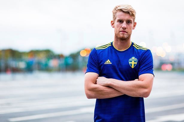
Sweden are one of many teams set to sport blue kits in the WC 2018. Their away jersey is a refreshing shade of blue without any piping on the side which is present on the home kit. It does, however, have a nice mix of squares and lines running right through with a dash of yellow on the shoulders and neck. Couple that with bright canary yellow shorts and you have the perfect outfit for a nice outing at the beach, not quite what you'd want to wear up north in Russia. However, to each his own as they say.
#8 Mexico (Home)
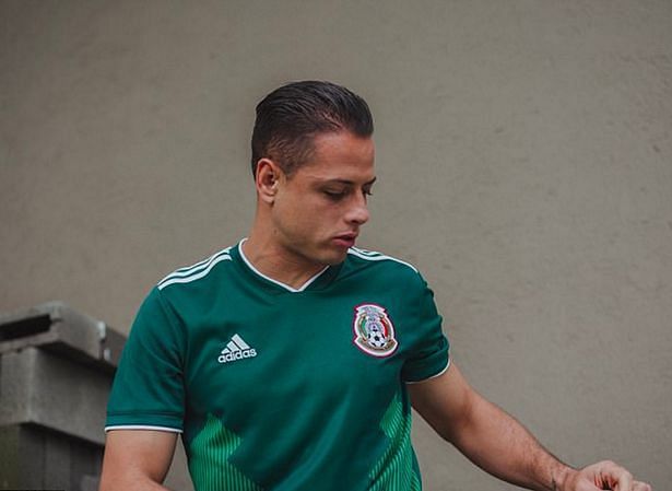
Mexico have remained true to their roots with their kit for the WC 2018. A dark shade of green with a white trim around the neck and collar and a funky lighter shade of green on the sides. On the neck is ingrained the words 'Soy Mexico'. While previous Mexican jerseys have been a lot more eye-catching, this one still remains top-notch.
#7 Spain (Home)
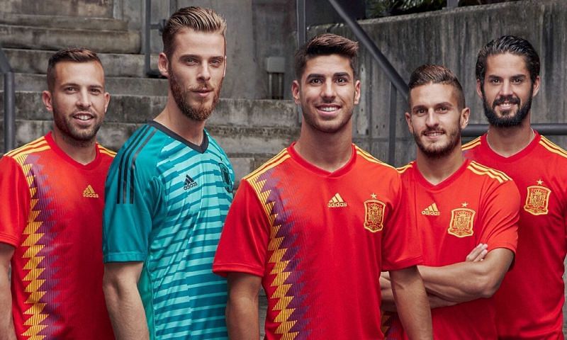
Yet another throwback - this time to '94, a period Spain won absolutely nothing. However, Adidas have made a few nice additions to the kit, including the blue (or is it purple?), red and yellow diamonds on the side which really make the kit what it is. The use of purple has caused controversy back home due to its association with the Republican Flag, but that aside, this kit is a winner and the Spanish fans will be hoping the national team return home winners as well.
#6 Croatia (Home)

When you think Croatia, the first thing that comes to mind is the red and white checks. This time around, Nike have somehow managed to make the checkerboard pattern even larger and the boxes just scream out at you.
The away kit has a similar design as well, but the red and white are replaced by navy blue. The Nike logo and the country's flag have been embedded neatly in two squares on opposite sides but what ruins the kit slightly is the position of the jersey number - quite off-centre.
#5 Germany (Away)

Unlike many of the other kits which were just replicated from past designs, Germany's seems to have actually drawn inspiration from the West Germany strip of 1990. However, there are significant contrasts.
There are a lot of kaleidoscopic patterns which merge well together and are rather mesmerising, much like Germany's style of play at times. The color too is downright pleasing on the eye.
Follow Sportskeeda for 2018 World Cup Scores, Latest News & Updates, Match Analysis, Detailed Stats, Fantasy Tips, Controversies, Match Predictions and much more.
#4 Japan (Home)
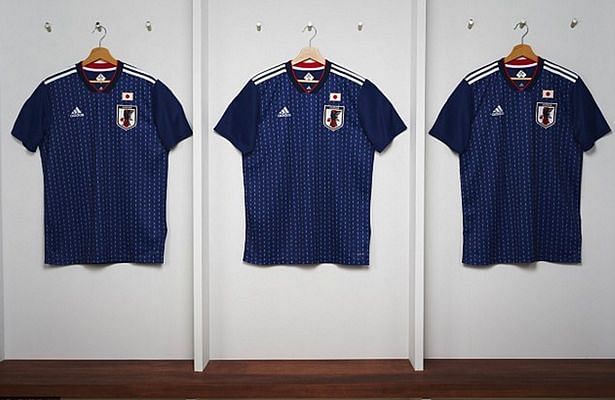
Finally some innovation. Japan's kit does not pay homage to jerseys of the past, but instead to the traditional Samurai armour. The light blue broken stripes placed on a much darker blue fabric along with the dabs of red and white represent the national flag.
ADIDAS sure got this one right.
#3 Belgium (Away)
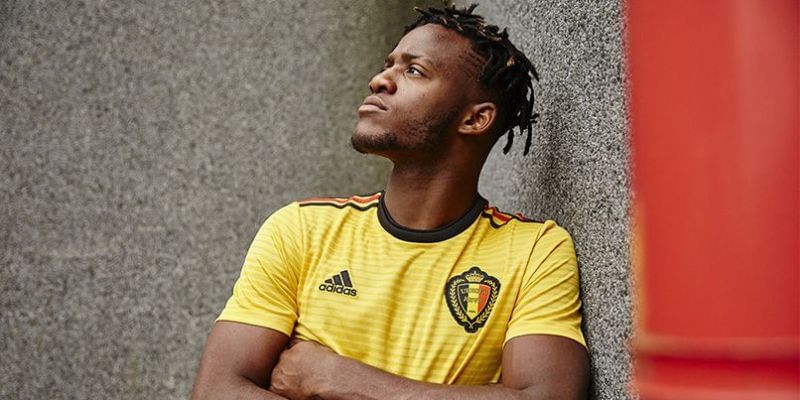
Belgium's away jersey is a tribute to the country's flag. Black and red stripes run along the length of the collar and form the backdrop of a largely, almost canary, yellow kit. The kit does look slightly Watford-ish though and Roberto Martinez will hope the likes of Kevin De Bruyne and Eden Hazard do not channel their inner Roberto Pereyra and Richarlison.
#2 Colombia (Home)
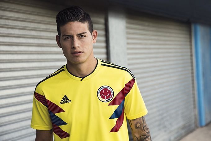
This might divide opinion. Many felt Colombia straight up aped their 1990 kit which was not that great in the first place, but there is just something about this wild yellow kit that stands out. There are red and blue panels on each sleeve to form a striking ensemble.
While the jersey does look more like something a superhero would wear, maybe the likes of Falcao and James Rodriguez could give their fans their own version of a Superhero story by lifting the trophy in Russia.
Follow Sportskeeda for 2018 World Cup Scores, Latest News & Updates, Match Analysis, Detailed Stats, Fantasy Tips, Controversies, Match Predictions and much more.
#1 Nigeria (home)
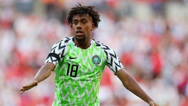
This is a thing of beauty, isn't it? Nigeria's home kit sold out within minutes of it launching and for good reason.
While the away kit is meant to represent their energetic culture, the home kit is what has gotten us all so excited. It is inspired by Nigeria's 1994 kit, which was slightly darker. With the addition of the lime green and white and black wing pattern on the sleeves, there is no doubt that this is the #1 kit we will get to witness in the 2018 World Cup.
With such a snazzy get up, Nigeria better perform on the field if they don't want to end up looking foolish.
