

The history of every club in the world will be the subject of interest for its supporters, not just the formation of the club, but its relationship with the local area, how they came to wear the club colours and the significance.
That also extends to one of the most important facets of a club's brand; it’s crest or logo. Perhaps, more than anything else, the crest is something that binds players with their loyal followers. They talk of ‘playing for the badge’ and how often have we seen players kiss it after scoring.
It’s worn on the chest, normally the left side, and the reason for that is because it’s supposed to cover the heart vis a vis ‘the club in my heart.’
Some clubs, for marketing purposes or otherwise, change the crest on a semi-regular basis and are often accused of destroying a club’s heritage by the traditionalists.
Let’s take a look at the story of the crests from five of the biggest clubs in the world.
#1 Real Madrid
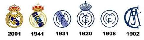
Of all of the world’s top teams, Real Madrid not only have one of the most simplistic designs, but Los Blancos have barely changed it during their history. In fact, only twice in the last 76 years has there been any amendment to it.
The first logo, in 1902, was a simple MCF in a grand interlocking lettering style, standing for Madrid Club de Futbol. After six years a circle was added and the lettering placed within, giving most prominence to the letter M.
King Alfonso XIII gave the club his seal of approval during 1920 and thus Real (essentially ‘Royal’) Madrid was born. As such, the club were then allowed to have the crown adorning its logo and were then known as Real Madrid Club de Futbol.
In 1931, when the monarchy was deposed, the crown had to be removed, the name reverted to Madrid Club de Futbol and a mauve diagonal stripe was added to represent the Castilo region.
Just 10 years later, after the Spanish Civil War had finished, it changed again. This time, the crown was back, and for the first time in the club’s history, the badge was in full colour. Real Madrid Club de Futbol also returned as the official name.
Since then, only an emboldening of each facet of the badge and changing the mauve stripe to blue has occurred or, if you live in the middle east, the cross from the top of the crown is missing – for purposes of marketing on the shirt for those in the region that don’t believe in Christianity.
#2 Barcelona
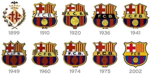
Barcelona’s first crest was actually the coat of arms of the city. The bat on the top of the Crown of Aragon is a heraldic symbol dating back to the middle ages. The diamond is cut into four triangles, two of which represent the Catalonian flag and two which are the flag of St. George, the Patron Saint of Catalonia. A branch from a laurel tree and another from a palm tree envelope the diamond. This badge was used by the club from its inception in 1899 until 1910.
At that stage, the club set its members a challenge – to come up with a new crest. Carles Comamala was credited with winning the competition and his new version was adopted. Comamala actually played for the club between 1903-1912.
Since then, the basic premise of the design hasn’t really changed. It is essentially a shield in terms of its shape, has the Blaugrana stripes along the bottom, representing club colours, along with a football. The flags of Catalonia and St. George take their place in the top half of the design.
The main changes, aside from more aesthetically pleasing rounded edges, is to the lettering in the bold stripe across the middle of the badge.
FCB explains itself but for those who need it spelling out; Futbol Club Barcelona. This was of writing it is Catalan. When General Franco came to power, he insisted that the Castillian version of the name be used, hence between 1949 and the dictator's death in 1974, the badge was rendered with C de FB or CFB – Club de Futbol Barcelona.
#3 Manchester United
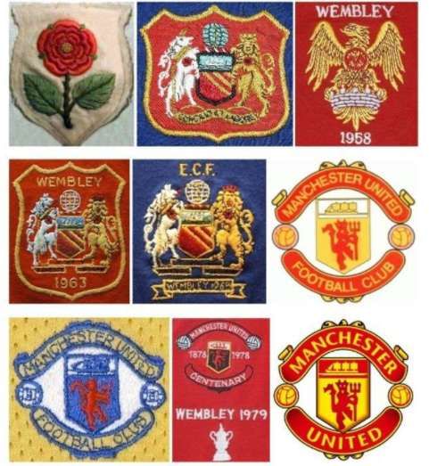
Known as Newton Heath when they first came into existence, the first badge that the club ever used was just a plain old Lancashire Rose.
Until fairly recently – around the 1970s – did Manchester United change their badge to anything other than Manchester’s coat of arms. The ship on the crest represents the Manchester Ship Canal whilst the globe on top of the earlier badges – normally only used in cup finals or big games – represented the trading power across the world of the city.
The Antelope – wearing a gold chain – and the Lion – wearing a Castle crown, are meant to represent engineering and the fact that the city was born from a Roman settlement known as Castle-field.
A red Lancashire rose also adorned both animals.
When the club decided to update the badge, it did so by keeping the ship but placing it above a ‘red devil’ – a nickname the club had inherited during the mid-1960s. The words ‘Manchester United’ appeared in a scroll above, and ‘Football Club’ in a scroll below. A football was added on either side.
It wasn’t until the 1972/73 season that this crest would feature permanently on the shirt and in 1998, aside from streamlining of the design to make it look more modern, the only change was to lose the words ‘Football Club’ – the top scroll now dominated by the word ‘Manchester’ with the bottom boldly proclaiming ‘United.’
#4 Arsenal
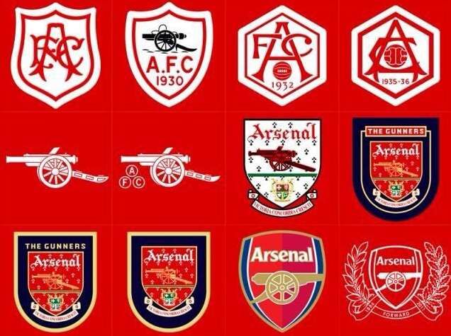
The north Londoners have gone through a multitude of changes of their club badge. The first known badge (not pictured) was of three cannons pointing north and was unveiled in 1888. They signified the club's original name of Woolwich Arsenal, as in an arsenal of weapons, hence the cannons.
For the move to Highbury in 1913, the original badge would be dropped and replaced by a curved shield that had the letters AFC in red, on a white background. In the 1930’s the crest would change again on three occasions, first with a cannon reintroduced – pointing west, a date (in this case 1930), and AFC in more simplified type. For reasons unknown, this was replaced again in 1932 by an interlocking AFC, a ball and a date. Again, all red lettering on white background.
For the 1935/36 campaign, the ball was moved from the bottom of the shield to the middle, between the AFC lettering. This would remain unchanged until 1949 when the club decided to bring back the cannon, this time set above the coat of arms of the Metropolitan Borough of Islington. The word Arsenal appeared at the top, and the bottom of the crest was decorated with a ribbon which had the words inscribed ‘Victoria Concordia Crescit’ or “Victory comes from harmony,’ added.
During the 1970s, style dictated a more basic concept, hence if you look at Arsenal kits from the era (1970 cup final for example), there’s just a cannon to represent the crest.
As the 1980s arrived, a new version of the old 1949 crest appeared, this time in full colour, with green, gold and red variants. This would stay the same until 2002 when a much more simplified version of the badge was made – again for marketing purposes. The cannon now pointed east with the background halves in two separate shades of red, along with a navy blue surround.
In 2011/12, to celebrate the club’s 125th anniversary, the same badge was kept but was now plain white, and added to it was a laurel branch with 15 leaves – to represent the 15 people who established the club, together with an oak branch with 15 leaves which would represent an acknowledgement of the founders who met in the Royal Oak pub to bring the club into existence. After that season, the club reverted back to the 2002 version.
#5 Liverpool
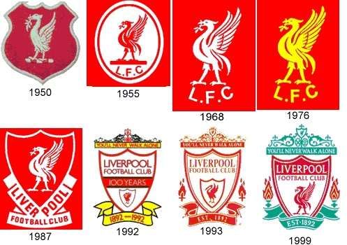
From 1892 until 1953, Liverpool used the city’s coat of arms as it’s club crest. The emblem featured Neptune and Triton, flanked by two liver birds and the words ‘God hath granted us this ease’ above it. In 1950, a single white liver bird on red background was used on the Cup Final kit. LFC was added at the bottom in 1955 as the badge was placed inside an oval.
In 1968, then manager Bil Shankly had the oval removed and the plain white liver bird and LFC returned. This was then coloured yellow from 1976-1985. A shield design was first used in 1978, the liver bird placed inside and the words ‘Liverpool Football Club’ sculpting the bottom of the crest.
For the centenary year, that shield was reduced in size and placed inside a larger shield of the same shape. A yellow ribbon at the bottom including the dates 1982-1992 in red lettering. The Shankly Gates were added at the top together with ‘You’ll Never Walk Alone’ – the club anthem. ‘Liverpool Football Club’ and a ‘100 Years’ stripe appeared inside the shield.
From the following season and until 1999, the 100 years stripe was removed, ‘Est 1892’ was the wording that now adorned the ribbon at the bottom, and two ‘eternal flames’ were added, one on each side of the crest, in memory of victims of the Hillsborough disaster.
In 1999 and until 2012, green was made a signature colour of the crest and the liver bird was again given more prominence. The look and feel of the badge didn’t change much otherwise.
From 2012-2017, the club decided to strip things right back and returned to the liver bird with LFC underneath. Simple, effective. The colour of the emblem (red, white or yellow) has changed depending on the kit used.
For the 2017/18 season, a ‘125 years’ has been added below the LFC and the dates 1892 and 2017 are placed either side of the liver bird.
Part 2 will be published soon.
