

#4 Arsenal
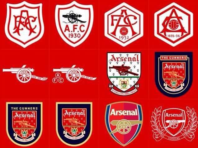
The north Londoners have gone through a multitude of changes of their club badge. The first known badge (not pictured) was of three cannons pointing north and was unveiled in 1888. They signified the club's original name of Woolwich Arsenal, as in an arsenal of weapons, hence the cannons.
For the move to Highbury in 1913, the original badge would be dropped and replaced by a curved shield that had the letters AFC in red, on a white background. In the 1930’s the crest would change again on three occasions, first with a cannon reintroduced – pointing west, a date (in this case 1930), and AFC in more simplified type. For reasons unknown, this was replaced again in 1932 by an interlocking AFC, a ball and a date. Again, all red lettering on white background.
For the 1935/36 campaign, the ball was moved from the bottom of the shield to the middle, between the AFC lettering. This would remain unchanged until 1949 when the club decided to bring back the cannon, this time set above the coat of arms of the Metropolitan Borough of Islington. The word Arsenal appeared at the top, and the bottom of the crest was decorated with a ribbon which had the words inscribed ‘Victoria Concordia Crescit’ or “Victory comes from harmony,’ added.
During the 1970s, style dictated a more basic concept, hence if you look at Arsenal kits from the era (1970 cup final for example), there’s just a cannon to represent the crest.
As the 1980s arrived, a new version of the old 1949 crest appeared, this time in full colour, with green, gold and red variants. This would stay the same until 2002 when a much more simplified version of the badge was made – again for marketing purposes. The cannon now pointed east with the background halves in two separate shades of red, along with a navy blue surround.
In 2011/12, to celebrate the club’s 125th anniversary, the same badge was kept but was now plain white, and added to it was a laurel branch with 15 leaves – to represent the 15 people who established the club, together with an oak branch with 15 leaves which would represent an acknowledgement of the founders who met in the Royal Oak pub to bring the club into existence. After that season, the club reverted back to the 2002 version.
