'%20x='0'%20y='0'%20height='100%25'%20width='100%25'%20xlink%3Ahref='data:image/jpg;base64,/9j/2wBDAAYEBQYFBAYGBQYHBwYIChAKCgkJChQODwwQFxQYGBcUFhYaHSUfGhsjHBYWICwgIyYnKSopGR8tMC0oMCUoKSj/2wBDAQcHBwoIChMKChMoGhYaKCgoKCgoKCgoKCgoKCgoKCgoKCgoKCgoKCgoKCgoKCgoKCgoKCgoKCgoKCgoKCgoKCj/wgARCAAGAAoDASIAAhEBAxEB/8QAFgABAQEAAAAAAAAAAAAAAAAAAAYH/8QAFQEBAQAAAAAAAAAAAAAAAAAABAX/2gAMAwEAAhADEAAAAMdvAd3/xAAhEAACAQMDBQAAAAAAAAAAAAABAwIABBEFBhIIEyFR0v/aAAgBAQABPwDa7o3sLazuVcw9kV8+5IYyfQp/TpuMuYV6powhnxks+K//xAAXEQEAAwAAAAAAAAAAAAAAAAABAAIh/9oACAECAQE/AKus/8QAGREAAgMBAAAAAAAAAAAAAAAAAQIABCJB/9oACAEDAQE/ALWEQA8n/9k='%3E%3C/image%3E%3C/svg%3E)
Each season sees clubs design new football kits, but some of them stand out more than the others, and not always for the right reasons. Here are the 5 worst kits of the 2013-14 football season.
5. Fenerbahce SK (home kit)

If they hadn’t got disqualified from European football for match-fixing, then this kit could have been another good reason for UEFA not allowing Fenerbahce to participate in their competitions. With florescent colours on their home jersey, the Turkish side have not gone for the subtle, and unfortunately for them, have gone horribly wrong.
4. FC Copenhagen (home kit) and AC Milan (third kit)
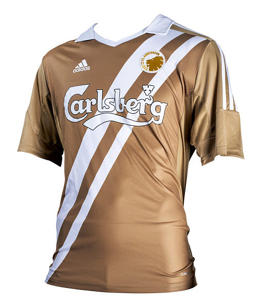
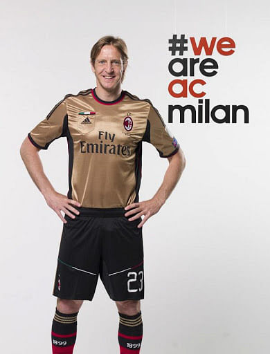
AC Milan and Copenhagen took the adage “Go for gold” a little too literally with these jarring kits that seem like a rendition to the 80s. The colours are not those that you’d associate with a football team, and these revolting jerseys are insulting towards the clubs’ usually brilliant kits.
Swansea City (away kit)
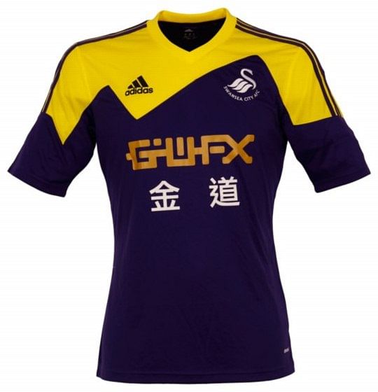
The colours do not match. The design is not the best, and the whole effect isn’t the most pleasing. Swansea were one of the Premier League’s most-appreciated teams last season because of their attractive football, but will have trouble finding support when they travel away from home this time around.
Marseille (away kit)

Denim. No, seriously. Denim. Marseille chose to design a denim kit, full with a jeans-style pocket on the right-hand side of the shirt. The Ligue 1 side are known for trying different things with their kits, but this one falls flat, and honestly looks like a travesty.
Liverpool (away and third kit)
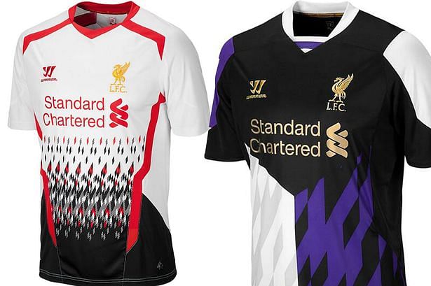
I’m not sure what they were thinking with this, but Warrior Sports has made a jersey that puts Liverpool’s previously elegant jerseys to shame. If this was an effort to make their kit look new-age, the attempt failed miserably. Instead, it has ended looking something like this: