
A new season brings with it new players, new managers, new teams and new kits. Some clubs have even planned to sport new crests.
On that note let’s take a look at a few of the English teams that have changed their logos for the upcoming 2016/17 campaign.
Also Read: Ranking all the La Liga kits for the 2016/17 season
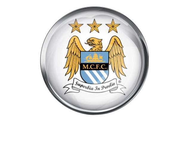
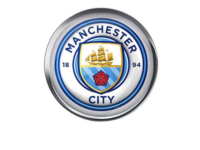
Manchester City
Manchester City decided to switch to a more classic design after consultations with their fans. The new crest has a few differences from the original. To mark the year of the Blues’ birth, the year ‘1894’ has been added. Another major change was the dropping of the word ‘FC’ and omission of the words ‘Football Club’.
The unveiling of the new logo received mixed reactions from the fans. While some were particularly impressed, others were disappointed with the omission of the word ’FC’ stating that the club had lost a major part of their history.
Old
New
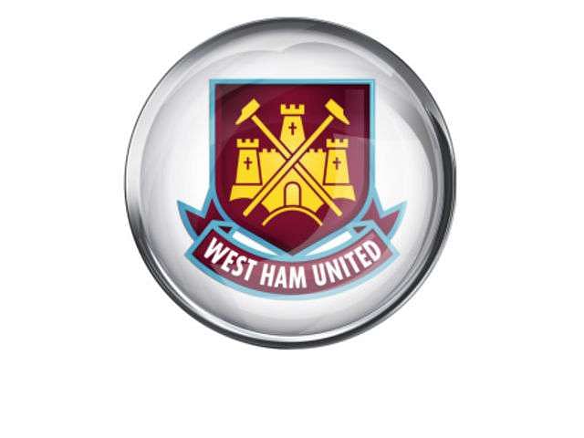
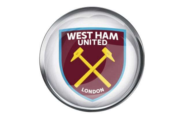
West Ham United
After a fans’ vote, West Ham decided to add the word London and remove the Boleyn castle after they moved to a new stadium. The essence of the crest remained the same, though.
Old
New
Sheffield Wednesday:
The new Sheffield Wednesday crest was chosen by owner Dejphon Chansiri and is identical to the original crest used way back in the 50s. It includes the White Rose of York as a tribute to their home county of Yorkshire. In addition, the club’s Latin motto 'Consilio et Animis' which translates to 'By Wisdom and Courage' was also included.
Glenn Loovens, club captain was delighted with the additions, saying "This is such an exciting time to be part of Sheffield Wednesday. As players, we are proud to represent our badge and this new crest captures perfectly the history of the club as well as defining a new era."
Old
New
Aston Villa
Aston Villa removed the word ‘Prepared’ from their crest. Also, a slight design tweak to the Lion and position of the star was made. Reportedly, the club spent around £80000 for the modifications.
Old

New

Nottingham Forest
Nottingham Forest revert to their traditional bright red badge after using a golden crest to commemorate their 150th season
Old

New

Birmingham City
Birmingham City, who celebrated their 140th-year last season, revert back to their original crest next season.
Old

New
Queens Park Rangers
QPR have changed their badge for the second time in 8 years. After an exhaustive consultation with fans which lasted 6 months, the club has brought back the traditional hoops and the club’s initials. The 2008 coat of arms was replaced by a much more simple, moderate design that incorporated features of their 4 previous crests.
QPR co-chairman Fernandes said in an interview with the official website, “The introduction of a new Club crest has always been a dream of mine since I arrived here nearly five years ago and I'm absolutely delighted with the final result.”
Old

New

