With a classy home kit that serves the aesthetics just fine, you would expect New Balance to be a maker of wise decisions.
Well, kick that notion in the head, will you?
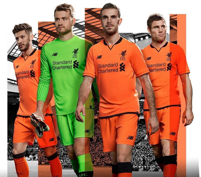
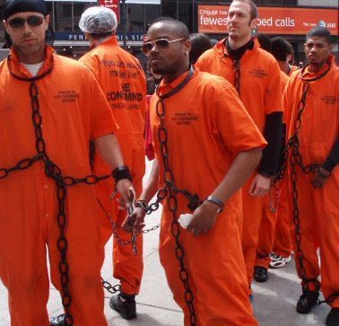
Inspired by what looks like penitentiary fabric Liverpool will don the orange colour intermittently this season. To be fair, it is keeping in tradition with their previous year's kit which was, in all certainty, inspired by the Matchday stewards' outfit. They seem to be on a journey where they're exploring and honouring the various layers of the social strata.
Ad
Oh wait, what?
But if I were a Scouser, I'd stay the eff away from looking like a bottle of Gatorade.
And of course, nobody is going to want to kick the ball around looking like you came to pick up the garbage, eh?
×
Feedback
Why did you not like this content?
Was this article helpful?
Thank You for feedback
About the author
Shambhu Ajith
Shambhu is a European and international football journalist at Sportskeeda who focuses on previews, listicles and news articles. An ardent Manchester United supporter since before his teenage years, he started following the Red Devils by age 10 watching MUTV on television. Shambhu is also a highly-revered rapper and a playback singer on Spotify, having a whopping 1 million monthly listeners.
For his articles, Shambhu believes in triple-checking every piece of information, relying on trusted websites like Transfermarkt and Opta, and staying away from speculative publications. He believes that his law degree helped him to be more articulate and meticulous with his content and one of his core strengths is seamlessly involving emotion in his write-ups owing to the love for the sport. For Sportskeeda, has done exclusive interviews with Spanish legends Gaizka Mendieta and Fernando Morientes so far, and his articles boast of a huge readership of close to 50 million.
Shambhu's favorite footballer is Lionel Messi, and the Argentine attaining glory in 2022 is his favorite FIFA World Cup moment. He believes only Kylian Mbappe and Erling Haaland could replicate Messi and Cristiano Ronaldo's rivalry in the years to come. His favorite manager is Sir Alex Ferguson due to the Scot's unmatched longevity at the top.

'%20x='0'%20y='0'%20height='100%25'%20width='100%25'%20%0A%20%20%20%20%20%20%20%20%20%20xlink%3Ahref='data:image/jpg;base64,/9j/2wBDAAYEBQYFBAYGBQYHBwYIChAKCgkJChQODwwQFxQYGBcUFhYaHSUfGhsjHBYWICwgIyYnKSopGR8tMC0oMCUoKSj/2wBDAQcHBwoIChMKChMoGhYaKCgoKCgoKCgoKCgoKCgoKCgoKCgoKCgoKCgoKCgoKCgoKCgoKCgoKCgoKCgoKCgoKCj/wgARCAAHAAoDASIAAhEBAxEB/8QAFAABAAAAAAAAAAAAAAAAAAAABf/aAAgBAQAAAAAsn//EABQBAQAAAAAAAAAAAAAAAAAAAAT/2gAIAQIQAAAAP//EABQBAQAAAAAAAAAAAAAAAAAAAAP/2gAIAQMQAAAAT//EAB8QAAEEAgIDAAAAAAAAAAAAAAECAwQRAAUSMRQhQv/aAAgBAQABPwDZIkTtu+lxch59hKHUPyHAsAKs1Rs0Ck4YuqWSqbOm+Ufb1OOgc/rpVd5//8QAGREAAQUAAAAAAAAAAAAAAAAAAQACAxES/9oACAECAQE/AI3aFlf/xAAZEQACAwEAAAAAAAAAAAAAAAABAgAiYcH/2gAIAQMBAT8AeqAjeT//2Q=='%3E%3C/image%3E%3C/svg%3E)