

'%20x='0'%20y='0'%20height='100%25'%20width='100%25'%20xlink%3Ahref='data:image/jpg;base64,/9j/2wBDAAYEBQYFBAYGBQYHBwYIChAKCgkJChQODwwQFxQYGBcUFhYaHSUfGhsjHBYWICwgIyYnKSopGR8tMC0oMCUoKSj/2wBDAQcHBwoIChMKChMoGhYaKCgoKCgoKCgoKCgoKCgoKCgoKCgoKCgoKCgoKCgoKCgoKCgoKCgoKCgoKCgoKCgoKCj/wgARCAAGAAoDASIAAhEBAxEB/8QAFgABAQEAAAAAAAAAAAAAAAAAAAYH/8QAFQEBAQAAAAAAAAAAAAAAAAAABAX/2gAMAwEAAhADEAAAAMdvAd3/xAAhEAACAQMDBQAAAAAAAAAAAAABAwIABBEFBhIIEyFR0v/aAAgBAQABPwDa7o3sLazuVcw9kV8+5IYyfQp/TpuMuYV6powhnxks+K//xAAXEQEAAwAAAAAAAAAAAAAAAAABAAIh/9oACAECAQE/AKus/8QAGREAAgMBAAAAAAAAAAAAAAAAAQIABCJB/9oACAEDAQE/ALWEQA8n/9k='%3E%3C/image%3E%3C/svg%3E)
#2 The design was changed last year
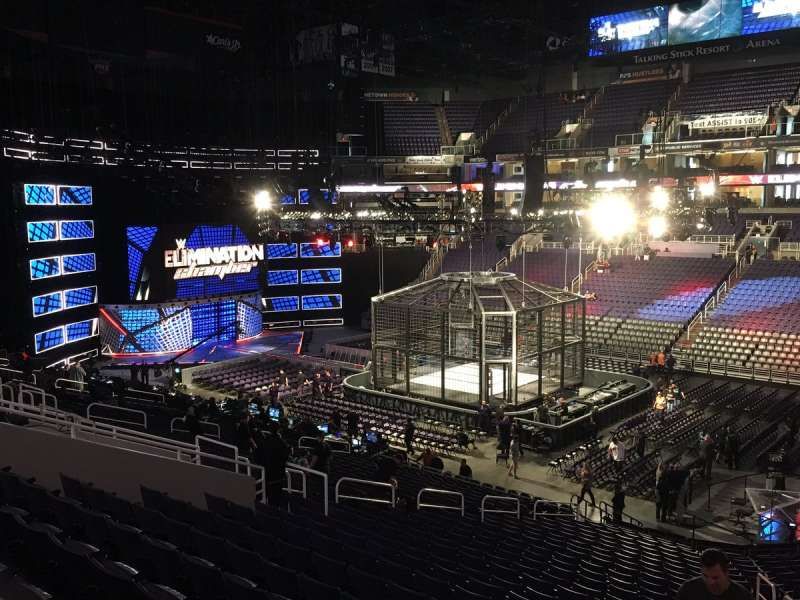
The first thing the fans noticed in the Elimination Chamber 2017 was the somewhat drastic change in the design of the structure.
The structure as a whole was more of a square with sharp edges, instead of the usual rounded, circular design. The huge WWE Logo on top of the cage and the LEDs lighting up the pods were an aesthetic addition and looked great! However, the other main talking point was the very apparent padding on the floor of the Chamber, just outside the ring. After all, the Elimination Chamber is promoted as a brutal and 'career-altering' matchup and many fans felt that it took away the menacing feel of the structure.
10 WWE Stars Who Are Now Banned - Find Out Now!
Personally, I feel the safety of wrestlers must be primary, but the WWE could have done a better job hiding the padded floors.

Make Sportskeeda your preferred choice for WWE content by clicking here: Source preferences
