
'%20x='0'%20y='0'%20height='100%25'%20width='100%25'%20%0A%20%20%20%20%20%20%20%20%20%20xlink%3Ahref='data:image/jpg;base64,/9j/2wBDAAYEBQYFBAYGBQYHBwYIChAKCgkJChQODwwQFxQYGBcUFhYaHSUfGhsjHBYWICwgIyYnKSopGR8tMC0oMCUoKSj/2wBDAQcHBwoIChMKChMoGhYaKCgoKCgoKCgoKCgoKCgoKCgoKCgoKCgoKCgoKCgoKCgoKCgoKCgoKCgoKCgoKCgoKCj/wgARCAAGAAoDASIAAhEBAxEB/8QAFQABAQAAAAAAAAAAAAAAAAAABgf/2gAIAQEAAAAAhJf/xAAUAQEAAAAAAAAAAAAAAAAAAAAC/9oACAECEAAAAB//xAAUAQEAAAAAAAAAAAAAAAAAAAAD/9oACAEDEAAAAF//xAAiEAACAQMDBQEAAAAAAAAAAAACAwQBBhEABRMSITEyQWL/2gAIAQEAAT8A225LZjbZRD7VU11AWJlV9S5Sp7F1eQz+dTJEV0t7I8KiEGZECuUi4xz2HP3Gv//EABYRAQEBAAAAAAAAAAAAAAAAAAECAP/aAAgBAgEBPwCZDf/EABYRAQEBAAAAAAAAAAAAAAAAAAECAP/aAAgBAwEBPwC7UN//2Q=='%3E%3C/image%3E%3C/svg%3E)
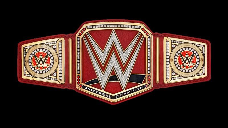
It's been over a year since the WWE Universal Championship was revealed to the public at SummerSlam 2016, where it was immediately made fun of for being a pretty ugly design to the point where that overshadowed Finn Balor's win to a certain extent.
Since then, WWE has made no efforts in changing the belt's design, so clearly, they like it enough to have ignored the backlash.
Thankfully for them, some of that has died down and people aren't as upset about it as they used to be—possibly because the current title-holder is Brock Lesnar, which means we don't get to see it as often as we would if someone on the normal roster were defending it on a more regular basis.
Nevertheless, that doesn't mean the title isn't still something that could use some tweaks to make it look better.
WWE has no plans for these former AEW wrestlers? Here's why!
With that in mind, here are some ideas of how WWE can change just a few things down the line to make the Universal Championship belt much more aesthetically pleasing—at least, from my perspective, since all tastes are subjective.
#1 Keep the WWE logo standardized
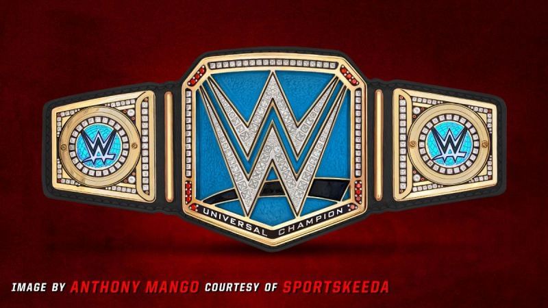
My problem with the title is primarily based on one thing: too much red.
The design itself is something that likely wouldn't change, as the WWE Championship, Raw Women's Championship and SmackDown Women's Championship all follow the same pattern, so when making changes, you have to keep that in mind.
The simplest, easiest way to have a more uniform title design is to change the swoosh under the W to be the standard red one that all three other titles have and to put a black or dark grey background behind the W to make it pop.
Then, for this to stand out, the red strap would be different than the typical black strap the WWE Championship has, but it wouldn't be an overkill of red.
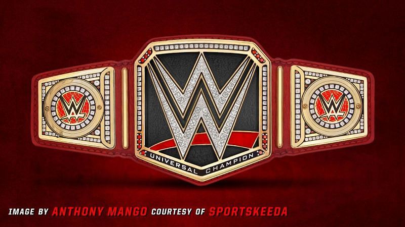
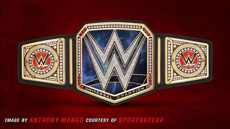
#2 Replacing the red strap with a black one
Since my biggest complaint is that there's too much red all over the place, the biggest offender of this is the red strap.
This redesign is my actual favourite and something that I think requires minimal effort, keeps things classy, and also gives it a distinct red pop behind the W to differentiate it just enough.
The Raw Women's Championship makes the mistake of having the red version of the WWE logo on top of a red background, so if you're going to keep the red behind the W, the black swoosh is definitely a must.
For my money, this is what they should have gone with from the start, and you'll see that every future design on this list has a black strap as well.
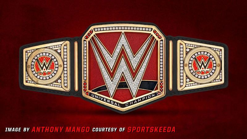
#3 Copy the WWE Championship

This may look familiar. Essentially, it's exactly the same as the current WWE Championship but with "Universal Champion" text underneath it.
There are two sides to the argument with this, with one being that the world titles on the two brands should be equals to each other and don't need to stand out as different, so why would it have to have a different design?
Alternatively, if you're opposed to the idea of it looking exactly the same, the way to get around that is to alter the WWE Championship itself.
It's somewhat strange that the WWE title on SmackDown has a red and black design as opposed to something with blue, doesn't it?
If the Universal Championship had the WWE Championship's current belt layout, then the SmackDown WWE Championship could be tweaked to look like this as a response:
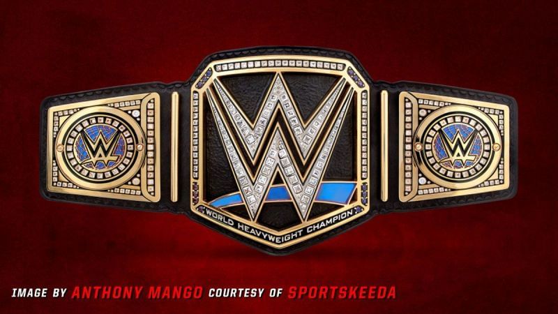
#4 Trade it to SmackDown
Continuing that trend, what would then happen if the WWE and Universal Championship belts were traded to the opposite brand?
While we'll never see the Raw Tag Team Championship representing SmackDown or the SmackDown Women's Championship on Monday Night Raw, we've already had the Intercontinental and United States titles swap between shows and there's nothing Raw or SmackDown specific about either world title save for the Universal Championship's red strap.
If the rumours are true, WWE originally wanted the Universal Championship to be on SmackDown from the start, and if that's the case, the blue strap would look pretty ugly.
Instead, if SmackDown ever receives the Universal Championship, it should follow the second redesign's colour scheme of having just a blue background behind the W to keep things simple and to make that pop from the black strap surrounding it.
#5 Embrace the gimmicky name
Just for the sake of fun, what if WWE decided to go all-out with the belt's name?
From the moment it was announced, people chuckled at the idea of the "universal" title, with Daniel Bryan even joking on Talking Smack about how they'll make a Milky Way Tag Team Championship and such.
Keeping the black strap instead of the red one is, of course, a must, but this is even more pronounced when talking about the darkness of space, which is why the swoosh under the W would remain black.
Since some colour needs to be present outside the gold, the background behind the W could be a mixture of purples, blues, pinks and other hues with a true cosmic design that evokes the beauty of outer space itself.
Oddly enough, as crazy of a concept as it might be, I don't dislike this as much as I do the current design for the Universal Championship, so even this would be a step up in my mind.
Which one is your favourite, and do you have any other redesign ideas you'd prefer to the current Universal title? Tell us in the comments below!
Send us news tips at fightclub@sportskeeda.com

How WWE has messed up John Cena's last run - Check here!
