
'%20x='0'%20y='0'%20height='100%25'%20width='100%25'%20%0A%20%20%20%20%20%20%20%20%20%20xlink%3Ahref='data:image/jpg;base64,/9j/2wBDAAYEBQYFBAYGBQYHBwYIChAKCgkJChQODwwQFxQYGBcUFhYaHSUfGhsjHBYWICwgIyYnKSopGR8tMC0oMCUoKSj/2wBDAQcHBwoIChMKChMoGhYaKCgoKCgoKCgoKCgoKCgoKCgoKCgoKCgoKCgoKCgoKCgoKCgoKCgoKCgoKCgoKCgoKCj/wgARCAAHAAoDASIAAhEBAxEB/8QAFAABAAAAAAAAAAAAAAAAAAAABf/aAAgBAQAAAAAsn//EABQBAQAAAAAAAAAAAAAAAAAAAAT/2gAIAQIQAAAAP//EABQBAQAAAAAAAAAAAAAAAAAAAAP/2gAIAQMQAAAAT//EAB8QAAEEAgIDAAAAAAAAAAAAAAECAwQRAAUSMRQhQv/aAAgBAQABPwDZIkTtu+lxch59hKHUPyHAsAKs1Rs0Ck4YuqWSqbOm+Ufb1OOgc/rpVd5//8QAGREAAQUAAAAAAAAAAAAAAAAAAQACAxES/9oACAECAQE/AI3aFlf/xAAZEQACAwEAAAAAAAAAAAAAAAABAgAiYcH/2gAIAQMBAT8AeqAjeT//2Q=='%3E%3C/image%3E%3C/svg%3E)
The off-season wait is the toughest and longest phase of the year that a football fan has to endure. They make themselves busy reading the gossips and rumours conjured up, in all probability, by the imagination of laid off individuals with too much time on their hands. But hey, whatever gets you through your day, right?
The faithful stand by in anticipation of the brand new kits so they can strut that stuff like a statement the next time they catch the weekend action in a pub. But uh, sometimes best-laid plans can go to pot and you have to hide your new acquisition in your suitcase of guilt and keep it as far as you can from the shores of embarrassment.
Also read: Top 5 kits in Europe- 2017/18
Here are the 5 clubs and their kits from around Europe's finest which have received a lot of flak and a massive amount of face-palms.
#5 Feyenoord's away kit
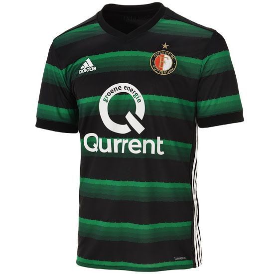
Marvel at the terrace farming technology the Dutch champions are endorsing on their away kit this term. It would do wonders in the market if your fans are Farmville enthusiast.
Unoriginal (inspired by Portland Timbers' away kit) and bordering on the hideous, Feyenoord's hopes of their kit standing out will be rewarded for all the wrong reasons.
I mean, we're all getting a bit tired of Adidas' 3 stripes but sometimes it makes me wish they stick to dipping them in plain paint and stitching those 3 stripes over the shoulders because they clearly don't sparkle in the creative domain.
#4 Real Madrid's third kit

In simple words, you gotta be wary of your source of inspiration. When you base your design on an abysmal piece of work from the past and yell 'Throwback time', you can never be too sure what is going to get thrown around. Inspired by the 1997-98 kit with the quarterly graphic print, Real Madrid have opted for shades of teal and blue for their third kit.
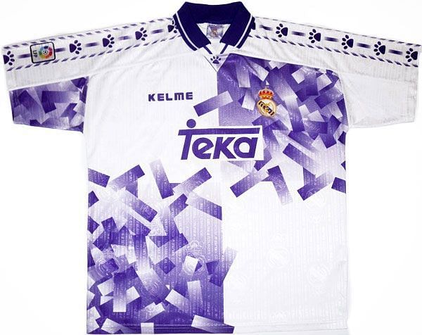
It comes out looking like a picture of a poorly constructed lego house or a crossword puzzle nobody wants to solve. If one of your lads wore even a casual t-shirt looking like that, you'll probably have second thoughts about being seen in public with him.
But Real Madrid are certain to wear this to their nights out in Europe and in all fairness the t-shirt could give them an edge because their opponents are going to want to look away.
#3 Chelsea's away kit
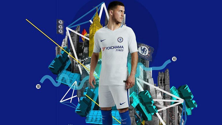
Now I think I have figured out what happened here. See, you're not supposed to be calling your employees back into the hustle when they've clearly specified that they're on a sabbatical. So I understand why the Chelsea kit was just dipped in white paint, WordArt-ed on and sent straight to the store.
Where is the variety, Nike? They have just ventured into the as ordinary as a paper bag mile and found their Avalon. So they've replaced the sponsor names on their plain template and made another set of not-so-very fascinating kits for Spurs and City like a lousy teenager who woke up on deadline day.
Let's hope Chelsea's game this season will be in stark contrast with the depression their players will be putting on. And that is saying a lot. Like a second consecutive title for Conte lot.
#2 Liverpool's third kit
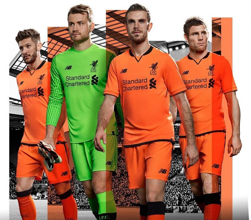
Why Liverpool, why?
With a classy home kit that serves the aesthetics just fine, you would expect New Balance to be a maker of wise decisions.
Well, kick that notion in the head, will you?
Inspired by what looks like penitentiary fabric Liverpool will don the orange colour intermittently this season. To be fair, it is keeping in tradition with their previous year's kit which was, in all certainty, inspired by the Matchday stewards' outfit. They seem to be on a journey where they're exploring and honouring the various layers of the social strata.
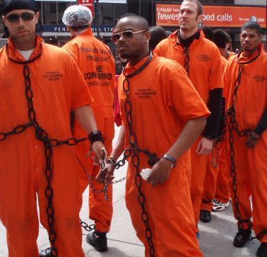
But if I were a Scouser, I'd stay the eff away from looking like a bottle of Gatorade.
And of course, nobody is going to want to kick the ball around looking like you came to pick up the garbage, eh?
#1 Borussia Dortmund- Third kit
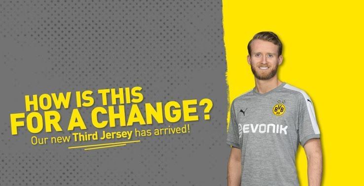
The Yellow Wall might just instinctively sing lullabies on Dortmund's games away from home this season. If their away kit doesn't remind you of slumber, I don't know what will. Even primary school kids don't want to be seen outside their homes in their pyjamas. So what's up with these grown ups wearing a morbid shade of grey when, oh, only the entire world is going to be watching them?
They've retained (more like dropped a spot) the yellow and it is criminally restricted to the crest so as to ensure that the thunder of the grey is not stolen.
Well, Puma, when Dortmund suggested something for the night they surely weren't aiming at bedtime fabric.
