
'%20x='0'%20y='0'%20height='100%25'%20width='100%25'%20%0A%20%20%20%20%20%20%20%20%20%20xlink%3Ahref='data:image/jpg;base64,/9j/2wBDAAYEBQYFBAYGBQYHBwYIChAKCgkJChQODwwQFxQYGBcUFhYaHSUfGhsjHBYWICwgIyYnKSopGR8tMC0oMCUoKSj/2wBDAQcHBwoIChMKChMoGhYaKCgoKCgoKCgoKCgoKCgoKCgoKCgoKCgoKCgoKCgoKCgoKCgoKCgoKCgoKCgoKCgoKCj/wgARCAAHAAoDASIAAhEBAxEB/8QAFgABAQEAAAAAAAAAAAAAAAAAAAQH/8QAFAEBAAAAAAAAAAAAAAAAAAAAAv/aAAwDAQACEAMQAAAAwWIC/8QAIRAAAAUDBQEAAAAAAAAAAAAAAQIDBAUAERIjMUFS0uH/2gAIAQEAAT8AiQh28PIJP00HLlcuitie6Q8Df4NEji4FvIMtuqviv//EABYRAQEBAAAAAAAAAAAAAAAAAAEAEf/aAAgBAgEBPwBdv//EABURAQEAAAAAAAAAAAAAAAAAAAAR/9oACAEDAQE/AI//2Q=='%3E%3C/image%3E%3C/svg%3E)
Throughout the league’s history, some NHL rebrands have garnered more attention than the games themselves. These rebrands, whether for marketing or practical purposes, have left some fans unsure about their favorite team’s vision.
As a side note, this ranking does not consider rebranding stemming from team relocation. For instance, the shift from the Atlanta Thrashers to the Winnipeg Jets does not make the cut as the team underwent a complete overhaul due to its move from one city to another.
So, let’s take a closer look at the five worst NHL rebrands of all time, featuring one that happened out of practical necessity.
Ranking the 5 worst NHL rebrands of all-time
#5 Vancouver Canucks
The Vancouver Canucks entered the NHL in 1970 along with the Buffalo Sabres. While the Sabres have largely maintained their brand identity throughout their existence, the Canucks underwent a serious transformation in the early 1980s.
The team moved away from its traditional black, yellow, and red trim and skate-blade logo to a geometrically inspired outfit. The look didn’t sit very well with fans, prompting the team to ditch the look shortly after.
#4 New York Islanders
The New York Islanders joined the league in 1972 and have kept their traditional look for most of the franchise’s lifetime.
However, the Islanders were at the forefront of one of the worst NHL rebrands of all time. The club moved on from its traditional NY Islanders logo and replaced it with a fisherman wielding a hockey stick.
The shift in the late 90s was not well-received by fans, prompting the team to return to its traditional look, the one that raised four Stanley Cups in the early 1980s.
#3 Calgary Flames
The Calgary Flames retrained the team’s original identity when it moved from Atlanta to Alberta. The Atlanta Flames and their flaming A logo became the Calgary Flames with a flaming C logo.
In the early 2000s, the team decided to move away from the look. That decision led to one of the worst NHL rebrands, as the classic flaming C gave way to a steed with flaming nostrils. The look lasted for a handful of seasons, with the club reverting to its original look.
#2 Pittsburgh Penguins
The Pittsburgh Penguins of the late 90s moved away from the classic skating penguin in front of a yellow triangle to a full black sweater with the word PITTSBURGH draped diagonally across the front.
The NHL rebrand, while not visually appalling, did not sit well with fans. The experiment lasted a couple of seasons before going back to the traditional black, white, and yellow colors and skating penguin.
The team cranks out the jersey every once in a while. But its nothing more than a throwback at this point in the team’s existence.
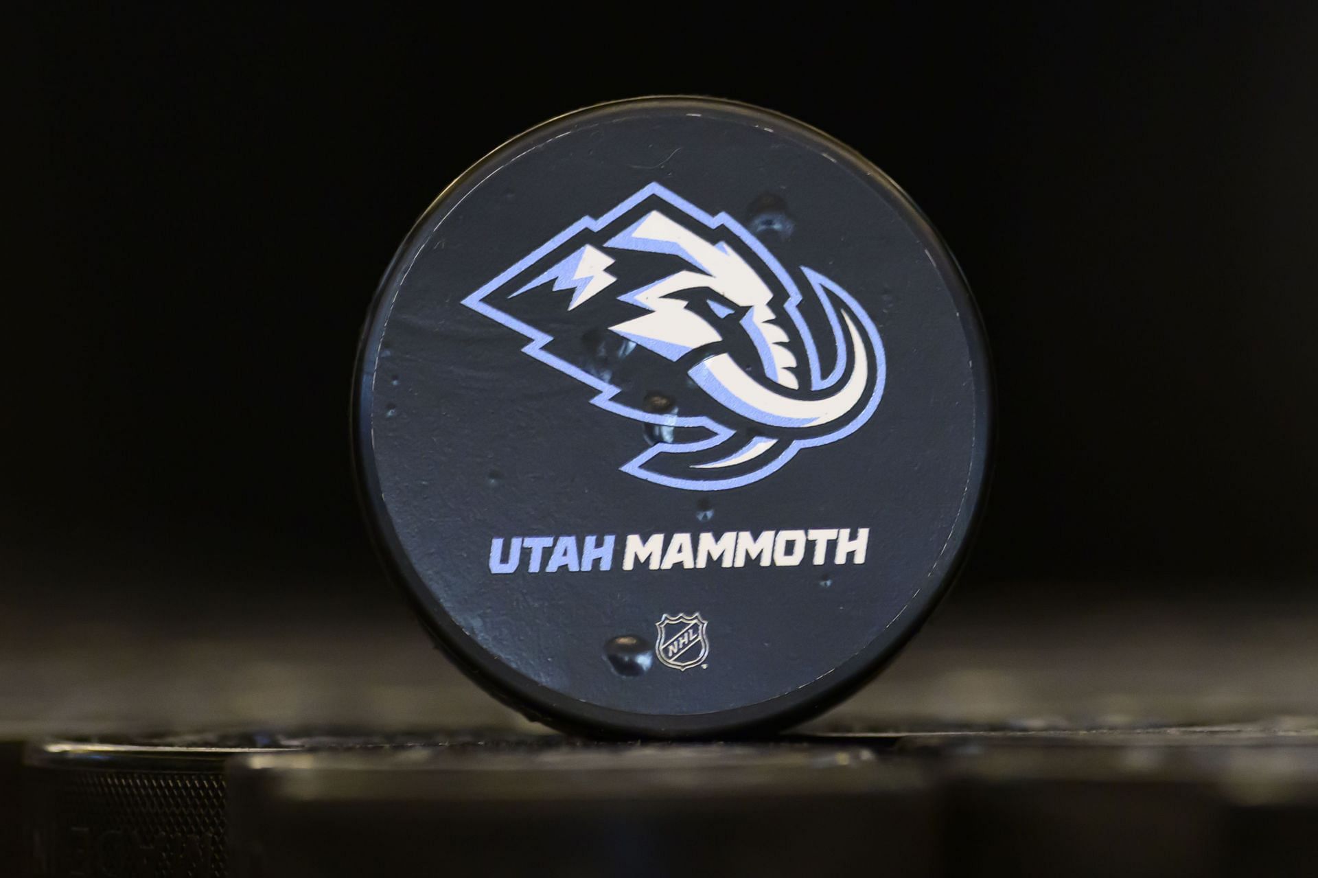
#1 Utah Mammoth
The Utah Mammoth, formerly known as the Utah Hockey Club, underwent a major transformation after playing its inaugural season in Salt Lake City. Among NHL rebrands, moving from the Hockey Club, which was bad enough to begin with, to the Mammoth is about as bad as it gets.
Fans were mostly disappointed at the chosen name. Other proposed monikers for the Utah franchise failed to gain any traction, leaving “Mammoth” as the best the franchise’s administration could come up with.

Wayne Gretzky’s wife Janet responds to critics questioning his loyalty to Canada, Bobby Orr's support following 4 Nations drama