
'%20x='0'%20y='0'%20height='100%25'%20width='100%25'%20xlink%3Ahref='data:image/jpg;base64,/9j/2wBDAAYEBQYFBAYGBQYHBwYIChAKCgkJChQODwwQFxQYGBcUFhYaHSUfGhsjHBYWICwgIyYnKSopGR8tMC0oMCUoKSj/2wBDAQcHBwoIChMKChMoGhYaKCgoKCgoKCgoKCgoKCgoKCgoKCgoKCgoKCgoKCgoKCgoKCgoKCgoKCgoKCgoKCgoKCj/wgARCAAGAAoDASIAAhEBAxEB/8QAFgABAQEAAAAAAAAAAAAAAAAAAAYH/8QAFQEBAQAAAAAAAAAAAAAAAAAABAX/2gAMAwEAAhADEAAAAMdvAd3/xAAhEAACAQMDBQAAAAAAAAAAAAABAwIABBEFBhIIEyFR0v/aAAgBAQABPwDa7o3sLazuVcw9kV8+5IYyfQp/TpuMuYV6powhnxks+K//xAAXEQEAAwAAAAAAAAAAAAAAAAABAAIh/9oACAECAQE/AKus/8QAGREAAgMBAAAAAAAAAAAAAAAAAQIABCJB/9oACAEDAQE/ALWEQA8n/9k='%3E%3C/image%3E%3C/svg%3E)

The WWE Universal Championship belt is ugly, plain and simple. It has a very simple design, consisting of nothing more than a giant WWE logo both on its main plate and side plates. The gaudy red color does nothing to make it any better, and instead makes it look more like a toy. In fact, this belt design is so bad that as soon as it was unveiled at SummerSlam 2016, fans immediately groaned and chanted ‘that belt sucks’ during its inaugural title match.
The fault here lies with WWE’s creative departments, who came up with the ‘brilliant’ idea of making a world championship look like this. Aesthetics matter significantly, and people find it hard to care about a title when it looks so bad (just look at the Divas’ Championship, which became infamous for looking like a pink butterfly).
If WWE ever want this belt to be taken seriously, they should start with redesigning it completely. But to make things easier, they don’t need a new design; instead, they should consider these old WWE Belt designs as possible options.
Insane Vince McMahon ideas that got canceled - Watch Here!
#4 The ‘Big Green Belt’
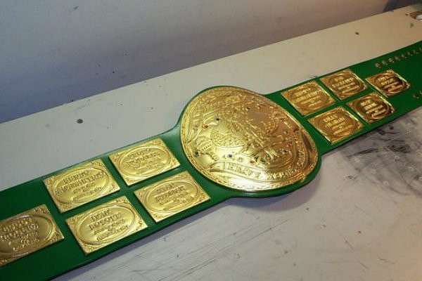
This rarely-mentioned piece of WWE history was used between 1978 and 1985. The reason it isn’t mentioned so much is because it’s one of the ugliest championship belts ever. Not only was the choice of green an awful one for a belt, but the general design was terrible as well.
It looked like the unholy offspring of a wrestling belt and a trophy since big trophies tend to name previous owners of the said championship on them. Worn by Bob Backlund during his reign, this belt looked utterly ridiculous around his waist, especially with the redundant ten side plates that described the former champions.
Yet this design is still better than the Universal Championship design used in WWE right now. Why? Legitimacy. This belt actually held the names of its former holders and looked like a prize worth fighting for.
If you’re competing in a sport and the top prize lists the people that once held it, that gives it some credibility and prestige, which is more than what can be said about the Universal Championship.
#3 The WWWF Championship design
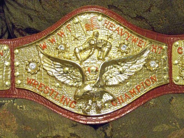
WWE like to color-coordinate things. Everything on RAW has to be red, down to its main championship. The Universal Championship’s red color was a focal point for fan criticism, because that color was the only real feature that distinguished this title from the WWE Championship. But there is a way for WWE to have their red color while using a different design: reintroduce the belt that represented the WWWF Championship.
That belt, worn during the days of WWE’s early greats (like Bruno Sammartino and Pedro Morales) had an image of the continental United States and two shield-shaped side plates. On these shields were two grapplers staring each other down, which gave a clear reminder that this was a belt made to be defended in a wrestling ring.
Not only does that belt have historic lineage, but it actually looks like a prize worth fighting for. That is certainly a lot more than what can be said about today’s Universal Championship, which is clearly meant to be mass-marketed towards children whose parents have deep purses. After all, why else would WWE smear their logo over the entire thing?
#2 The Undisputed WWE Championship (2002-2005 version)
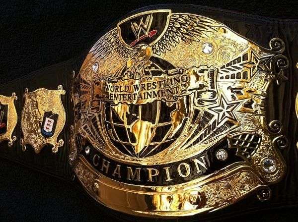
The Undisputed WWE Championship was a belt held in WWE during the first half of the 2000s. Held by such wrestlers as Brock Lesnar, Hulk Hogan, The Rock, and Eddie Guerrero, this belt had a much simpler design than many of its predecessors.
The amount of hold imagery was reduced and the side plates became smaller. However, this belt’s imagery is much easier to read, which exposes more of the artwork and detail put into its design.
The best thing about this belt is that it strikes a balance in what it represents. The centerpiece has both the globe and the eagle images, both of which were traditional items on WWE titles.
The company’s name is written on the centerpiece, but it isn’t the focal point of the title (that honor belongs to the word ‘CHAMPION’ written in large letters on the bottom). Finally, there is the famous WWE ‘scratch’ logo as a small image on the centerpiece and on the side plates, which show the promotion the title belongs to.
This is almost the perfect design for a world championship because of that critical balance. All the key points are represented with this title’s imagery: the concept of wrestling, the company name, their logo for marketing purposes, and that they’re the champion, meaning they’re the best the company has to offer. Contrast this with the Universal Championship, which has none of that imagery and consists of a giant logo and nothing else.
#1 The Winged Eagle Title
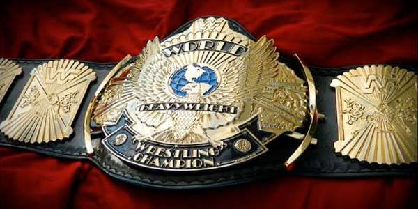
The ‘Winged Eagle’ WWF/E Championship belt was the most aesthetically-pleasing world title belt WWE ever had. The design made light shine brilliantly off the gold plates, and from a distance, it looked like a piece of art strapped around a wrestler’s waist. It looked like a real trophy or championship. If you were seen with this championship, it looked like you were a true champion.
It also helped that this belt bore the words, ‘World Heavyweight Wrestling Champion’ on it. Even if you knew absolutely nothing about wrestling, if you saw someone wearing this and read those words, you’d understand things almost instantly.
Synonymous with wrestler Hulk Hogan, this is the belt Hogan wore during the golden age of Hulkamania. It is quite possibly the most iconic wrestling championship of all time, and bringing it back would do a lot to make RAW’s biggest title feel important.

