The English Premier League is still a few weeks away and all 20 teams are in the thick of transfer madness. In the absence of any actual football, all teams have been treating fans with little bits of what’s to come. And in that spirit, clubs and their kit sponsors have been unveiling their strips for the season in all kinds of places and in all manner of forms.
Here, we look at all the kits released so far in order of worst to best:
(Feel free to disagree!)
20. Burnley
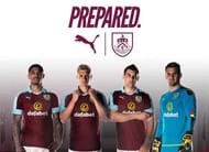
Burnley return to first division English football with a kit similar to West Ham’s, even though their kit sponsors are Puma and not Umbro. The blue collar around a white trimmed neckline adds a nice touch to a predominantly claret shirt. The blue trim on the shorts and claret trim on the socks aren’t all that bad either.
Burnley’s away kit is a lot more disappointing. It’s mainly blue with claret panels on the shoulder that run down the length of the sleeves, the shorts are white and that’s what gets them bottom place on this list.
19. Hull City
Umbro have done a good job with Hull City’s home kit for their return to the top flight of English football. Their kit sponsors have added a white trim on the y-neck shirt collar and sleeves and the look of the broad amber and black stripes should be quite appealing to fans who must be looking forward to a year of first division competition for their team.
Their away kit is also inspired by their traditional colours with an all-black strip with minimalist amber accents on the sleeve. While some might feel it may be too simple, the jersey has a touch of class that will hopefully shine through the football they play in the year to come.
18. Crystal Palace
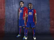
Macron is the kit sponsor for Crystal Palace this year and they’ve departed from tradition a little bit by making the home strips predominantly blue. Now, Palace’s home jerseys have been red and blue for years but never have they focused so much on the blue before. All credit to Macron for coming up with strips that are different from yesteryears.
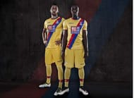
The away kit is a yellow with a blue and red sash down the front. Fans and players alike should be happy with the use of yellow since it’s considered to be their lucky away colour. The sash too is a throwback to the past as it’s always been included in their kits since 1975.
17. Stoke City
Changes have been afoot at Stoke City this season already. The Britannia Stadium has been renamed the Bet365 Stadium and their new kit sponsors are Macron instead of Warrior Sports. These changes have not translated to their strips for the season though.
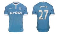
The Potters have stuck to the same old red and white stripes for their home kit with a white stripe in the middle. However, they made up for this lack of imagination and creativity with their away kit. While it has no particular design as such, the light blue colours of the strip with white trimming makes for a nice change for Potters fans. Overall, a really smart away jersey that fans might happily buy.
16. Sunderland
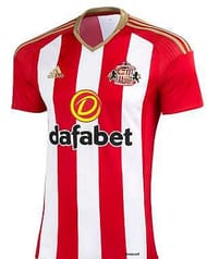
Like Stoke City, Sunderland too has held on to their white and red vertical stripes for the home kit. Another boring jersey for another season. It’s barely different from their last season’s kit. Only noticeable change? The sleeves are now completely red and the signature Adidas trimming on the shoulder and collar are gold instead of black.
The only reason Sunderland’s kit features one spot above Stoke’s is because of their away kit. Sunderland really broke out of their stodgy old mould and went for a striking set of away strips. The Black Cats have a bold pink and purple away jersey – the shirt has pink and purple horizontal bands that have alternate coloured diagonal stripes on them.
The shorts are completely purple with pink trimming on the side.
Seems like Sunderland are determined to turn heads, if not through their football then definitely through their away kit.
15. Bournemouth
Bournemouth were quite impressive last season and anyone who takes a look at their kit for the 2016-17 season will wonder if they’re so scared about relegation that they barely changed their strips. There is a negligible difference to their kit this season from the last.
The black and red horizontal stripes on their shirt seem to go all the way to the end, unlike their last campaign. Cherries fans will wonder why they should buy the new kit at all.
Their away kit looks like someone put more thought and effort into it. Instead of a black and blue combination from last season, they have a light and navy blue combination this time around. The shirt is light blue with navy stripes and white trimming on the sleeves, bottom of the shirt and shorts and socks.
Overall nothing great, but definitely an improvement on their home kit.
14. Watford
Watford released their new home and away kit for the season on their social media channels with pictures of their captain Troy Deeney sporting the new strips. The Hornets’ kit has been manufactured by their new technical sponsor Dryworld – a company that is just six years old.
They seem to have done away with the stripes of last season and replaced it with kits of solid colour. While the strips themselves are nothing special – the home kit is yellow and black and the away strips are all white, the black collar with red trimming is a really smart touch on both sets of jerseys.
13. West Ham United
West Ham United have stayed faithful to their roots and chosen a claret and blue for their Umbro home kit. The club got together a number of their new signings and first team players at their brand new stadium, the Queen Elizabeth Olympic Park to unveil their strips for the new season in front of about 500 fans.
While the claret and blue combination is nothing new for the Hammers, rather, it’s gotten a little boring in fact, the white shorts really aren’t doing them any favours. Their away kit looks equally ugly with the colour combination of their home kit reversed.
P.S. – Don’t miss out the new crest on their strips which supporters had voted for in 2014 – the image of Boleyn castle is gone now that they’ve moved out of Boleyn Ground and into the Olympic Park. The minimalist hammers still remain.
12. West Brom
West Brom have done a good job with both their kits this season. The home kit is true to tradition with the addition of a light blue trim on the neck and sleeve – something that most fans now haven’t seen in their lifetime – overall a very well thought about the set of strips.
Their away strips are even better. They might be all black but the bright blue pin-stripes do more than enough to make the combination click. Unlike with other team kits, Adidas have retained the traditional triple stripes on the sleeve for West Brom.
11. Swansea City
Swansea are a little unfortunate as their traditional home kit colours are white. You have to admit, there’s not much that can be done with all-white strips. But their new kit sponsors Joma have done their best to come up with attractive jerseys that Saints supporters will want to buy.
The home kit is all white and possibly the simplest in the last few years. The detailing on the jersey is black with a round buttoned collar. However, what they couldn’t accomplish with the home kit, they managed with the away. The away kit is an attractive combination of electric and navy blue.
The electric blue shirt fades into navy shorts making for a striking set of strips that fans will love to get their hands on.
10. Liverpool
Liverpool’s home kit is pretty much the same like before. The shirt and shorts are a uniform red with yellow accents and trimming. The new strips were unveiled in front of fans at Pier Head by first team players from both the men’s and women’s teams. The shirt has a very simplistic design with a round button-down collar.
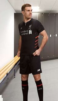
Liverpool’s away kit looks really good this time around. The black strips with red and silver trimming on the front has been inspired by the programme design from their first European Cup victory in 1977 and pays tribute to the team that brought glory to the club.
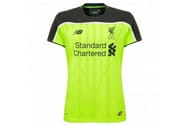
They got their third kit horribly wrong – a fluorescent yellow set of strips that no one will look at during an afternoon game on a hot sunny day. Mignolet’s dull grey strip isn’t any better either.
9. Arsenal
Arsenal and Puma released the new season’s kit through a series of images and videos featuring Santi Cazorla, Olivier Giroud and Hector Bellerin. And after that first look Gunners’ fans will be hoping they hold up better than Switzerland’s kit from Euro 2016.
There’s nothing outrageously new about the Gunners’ home kit except maybe for that single dark red stripe running down the front of the shirt.
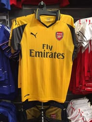
While their away kit hasn’t officially been revealed, just like many other goof ups this season so far, pictures of their second kit were leaked when a store in Sydney, Australia put them on sale. Thanks to their mistake fans now know the kit is a major throwback to better and more successful campaigns.
The yellow shirt is accented by dark grey trimming and collar with a thin yellow stripe through it.
8. Manchester United
There’s not much going on with Manchester United’s home kit this season but that being said, it does look quite smart on the Red Devils who featured in the promotion. With Adidas’s signature stripes running down the side of the shirt, the two tone red shirt is quite attractive and a departure from what we’ve seen on the United players in more recent years.
The away kit on the other hand is far removed from anything United fans are accustomed to. Adidas seem to be experimenting with mélange for football players as seen in the United away strips. United have reverted to the colour blue this time with the club crest in red.
They revealed their third kit most recently – a white shirt with black trimming and shorts -meant as a tribute to their humble beginnings as a team of railway workers.
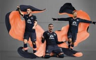
7. Everton
Umbro deserve all the credit for coming up with a great home kit for the Toffees while staying true to their traditional colours at the same time. The clean cut and round-necked shirt looks better for the white trim on the neck and sleeves. The bit of yellow on the shirt and shorts trimming is a quirky addition that fans have to love.
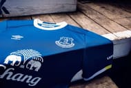
The away kit might be simple – an all navy blue strip with salmon trim – but Umbro had a very good reason for the design. The kit is meant as a tribute to the 1980-81 season when they won the league title for the first time.
6. Southampton
Surprise! Surprise! Another season is just around the corner and a third club has released a red and white vertical striped kit. But their new sponsors Under Amour changed things up a little with a striking white panel on the front of the jersey. The twisted loop around the Virgin logo adds a nice touch to the whole ensemble.
To the more keen observer, don’t miss out on the red and white trimming along the side of black shorts.
The away kit is thankfully different from the home kit and likely to be more appealing to fans looking to buy the new season’s strips. It’s a predominantly black kit with a grey panel above the chest similar to their home kit and grey trimming on the sleeves.
5. Chelsea
After a horrible title defense, Chelsea must be keen on leaving last season behind and they have started doing so with new strips that fans have never seen the likes of before. In their last year with Adidas, Chelsea have broken away from the mould of earlier home kits and gone with something new.
While the solid blue Chelsea colours remain the same, there are now rampant lions displayed all over the front of the shirt. While it isn’t outright ugly, the jersey will take some getting used to for fans. The away kit is vastly different from the home. The kit is in an unusual fabric, mélange with alternate grey and black stripes with luminous yellow trimming and a two-colour crest in a similar colour combination.
Chelsea unveiled their third kit too which is perhaps the most similar to last season's strips – an all white kit with Chelsea blue trimming on the neck and sleeves.
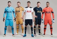
4. Tottenham Hotspur
The Spurs have a theme running through all their three kits this season – the colour gold. Not because they won anything last season but as a connection to the cockerels in the stands at White Hart Lane. The home kit is a white and blue similar to their strips last season with a gold trimming on the collar and sleeves.
The away kit is a rich dark blue with gold trimming. Don’t miss out on the smart combination of gold stripes on the sleeves. The third kit is completely gold with dark blue pin-stripes – makes for quite an attractive combination. The Spurs strips this season deserve to feature high on this list because of its overall smart and clean style.
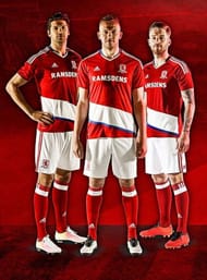
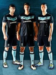
3. Middlesbrough
Middlesbrough is in the Premier League after a long time and they have a kit to match the occasion. The team has chosen their traditional red for the home kit and after a number of years included blue and white trim to their jersey as well. While not everyone might warm up to the kit, the strips are guaranteed to stand out and all credit to Adidas for trying something different.
Adidas did one even better with Middlesbrough’s away kit. The predominantly navy kit has bright blue stripes down the side of the shirt and the chevron in different shades of blue is the best part about the strips. Picture the kit with the bright blue socks and the Middlesbrough men are sure to attract attention during their games.
2. Manchester City
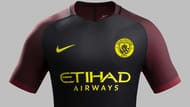
The number of clubs at the Barclays Premier League sponsored by Nike has gone down over the years and it seems inexplicable considering how good a job they did with City’s home and away kits this season. The home kit is the traditional light blue but instead of using white, they went with a dark blue for the trimming, inspired by the use of the colour in the brand new crest.
City unveiled their away kit in style – in the middle of the Great Wall of China. Their away kit would have looked better than the home if it hadn’t been for the bright yellow stockings. The predominantly black shirt with burgundy sleeves and yellow text is a nod to away kits from earlier years.
The black shorts with yellow trim look good too only to be ruined by the effect of bright yellow socks.
1. Leicester City
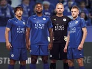
The heroic champions of last season are first on this list too. They stayed true to their roots with an all-blue home kit. What makes it special is the jacquard print on the shirt and the gold stripes on the shirt and shorts – strips worthy of champions.
The away kit is all red with a round neck and collar. The diagonal stripes running down the front fade from a dark red to a lighter shade creating a unique effect not usually seen on strips.
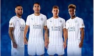
The third kit might arguably be the best of the lot – an all white shirt and shorts with thin blue stripes. There’s something very appealing about such a neat and no-fuss look.

