
Unlike in football where jerseys change every season, cricket jerseys are a lot more seasonal. Barring the odd update to a design that has existed for a long time, it is only around the time of a major tournament that some major upgrades are provided to the jersey.
With that in mind, there are certainly some interesting jerseys being adorned by the various countries competing in the ICC Champions Trophy 2017. While some are the cynosure of all eyes, others are a reminder of what nightmares feel like in reality. Beauty might lie in the eye of the beholder but certain things are far more obvious than just that.
Here are the ratings for the jerseys worn by the teams competing in the Champions Trophy:
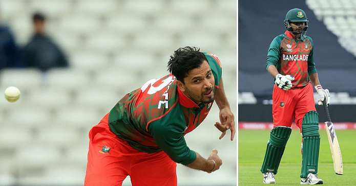
#8 Bangladesh - 2/10
There are three teams who have two jerseys for this year's tournament. None of those three teams have managed to nail their away (second) jersey and undoubtedly the worst of the trio is Bangladesh, whose jersey is quite simply, very difficult to describe. Designs in a shade of red that quite simply reeks of what the depths of hell would look like on a dark green backdrop is certainly not a sight for sore eyes.
Quite simply, it isn't a sight for any eyes. Yet, somehow, someone thought that was the way to go not just in the front of the jersey but also at the back. And pants in red have never looked worse as they do along with this jersey.
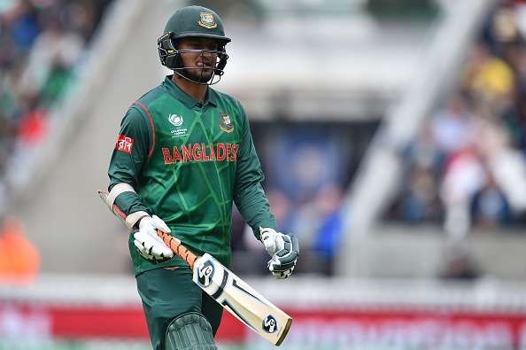
That is even before coming to their home jersey, which if not as much of an abomination, is still not great. Playing with different shades of the same colour isn't easy and the home jersey has made it look a lot harder than it should. The intricate design in a colour that is lighter than the entire jersey provides some relief but unfortunately not enough to offset the jarring juxtaposition of two different shades of green that just doesn't work.
Perhaps Bangladesh were counting on how bad their jersey looks to distract their opposition but that certainly isn't working so far.
#7 Sri Lanka - 2/10
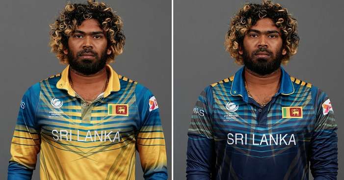
Sometimes, when you leave a child unattended in a room, you observe the havoc that can be created in just a short while. The Sri Lankan jersey is perhaps the perfect example of that. It is difficult to decide what is worse, the fact that they have two jerseys or that both of them look like they were painted on by a toddler who just had yellow and blue colours at his/her disposal.
The dark blue backdrop in their home jersey is certainly endearing but that's where the appreciation of the jersey stops as it just looks unappealing to the eye. That someone thought that this was the way to go highlights a heightened sense of design that is beyond the comprehension of mere mortals like us. In any case, the less said about the reasoning behind the design, the better.
#6 Pakistan - 6.5/10
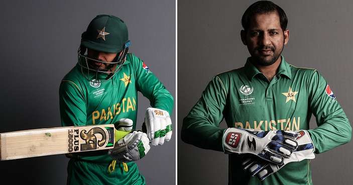
It's a shame that Pakistan's performance in the opening game against India wasn't as good as their jersey. Perhaps the only bright spark from their otherwise dismal performance against arch-rivals India, is the fact that even in defeat, they looked good, courtesy of their jersey.
While Pakistan have had their fair share of experimenting when it comes to their jersey, the one that they are sporting in the Champions Trophy is refreshingly unique. The simplicity of the design and the traditional look that it provides despite having a modern feel is one that should make Pakistan fans happy.
Even if performances on the field don't look as good, the fans can at least be content with the fact that they have one of the better-looking jerseys in the tournament.
#5 South Africa - 7/10

One look at Faf du Plessis in South Africa's jersey for the Champions Trophy and you'd think he's an Abercrombie model and not an international cricketer at the peak of his powers. The way in which he effortlessly pulls off the stylish South African jersey only highlights that he has a career in fashion if he ever calls time on his cricketing career.
It is easy to get off point while looking at Faf, let's get back to the matter at hand. The jersey, well, the home jersey, at least (SA have two to play with in this tournament), the one they wore in the opening game against Sri Lanka accentuates the beauty in which tradition has been infused with modernity. While the background is still the traditional green colour, it has been enhanced by an intricate design that runs through the front of the jersey.

In fact, it is one of the best jerseys that the country have worn and the only reason why they are not higher on this list, is because of their other jersey. The one that looks like someone forgot to paint the whole picture or just remembered this wasn't right halfway through and left it as it was. The strong yellow backdrop also evokes memories of the Australian jersey, which is the last thing a South African fan would want.
#4 Australia – 8/10
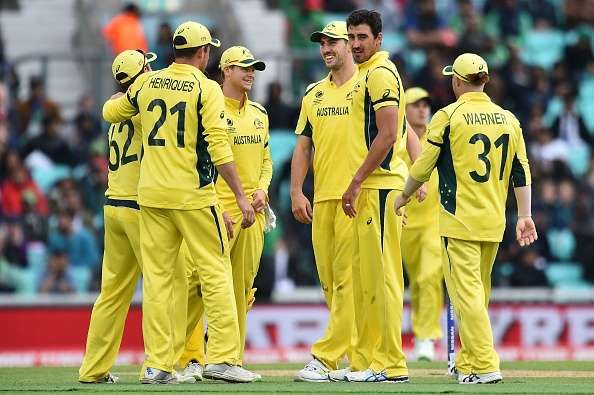
There is no country that loves experimenting with their jerseys more than Australia. They have tried just about everything and that has ranged from the sublime to the ridiculous. Their Champions Trophy kit certainly falls under the sublime category as they have opted to learn from their rivals, New Zealand, and their mantra of simpler is better.
The traditional yellow jersey with a tinge of baggy green on either side harks back to an era of Australian dominance where the mere sight of a yellow jersey invoked fear. And with the likes of David Warner, Steve Smith and Mitchell Starc, the current crop does the same and the simplicity of their jersey helps instil that fear on the field.
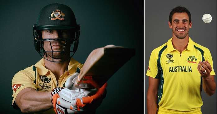
Unfortunately, they haven't been able to wear them on the field for very long as both their games have been washed out. Steve Smith will be hoping that their luck changes or they might well find themselves out of the tournament.
#3 India – 8.5/10
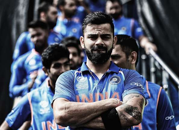
India's jerseys have only been getting better and better over the years. In the recent past, the trend of infusing a modern touch into a traditional jersey has certainly caught on and the current Indian jersey that is being worn in the Champions Trophy is a testament to that.
Playing with the colour blue isn't always easy. You need to be gentle with the designs that you incorporate and the colours that you add on as it doesn't take much for the whole thing to go pear-shaped. But the current jersey not only brilliantly incorporates modernity to India's traditional blue colours but also makes it look stylish and eye-catching as well.
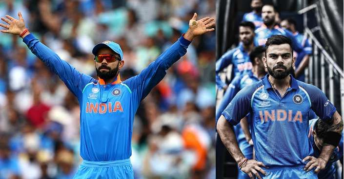
The subtle play on the different shades of blue works brilliantly and provides an aesthetic pleasure. The different textures and intricate design, while absent from a distance, highlight just how much effort has gone into the current jersey. The orange collar is another nice touch, which adds a sense of contrast to the jersey which is otherwise totally similar.
#2 New Zealand – 9/10
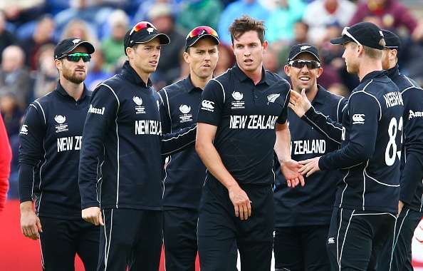
Simplicity has always been at the forefront of jerseys worn by the Blackcaps. And the one they adorn in the Champions Trophy is no different. From a distance, it looks simple, elegant and stylish – their traditional colors without nothing big to spoil the simplicity of the jersey.
But a closer inspection highlights the beauty of the jersey. While it looks nothing more than just a plain black jersey from a distance, look closer and you notice an intricate design at the top and near the bottom of the jersey. Without spoiling the simplicity and beauty of the original design, New Zealand have managed to tweak it and look more stylish in the process.

Kane Williamson and his boys will be hoping that they get to sport their jerseys in the tournament a while longer and progress beyond the group stages.
#1 England – 10/10
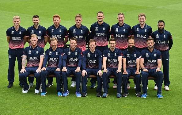
They say when you look good, the world seems a better place. Ask the England players, who are not only the proud wearers of the best jersey in the competition but also the first team to qualify for the semi-final, and they will probably tell you the same thing.
While England aren't new to trendy new designs or innovative kits, they have their fair share of failures as well (the bright red jersey, I am not looking at you). The one they are wearing in the Champions Trophy though is stunning, not just due to its simplicity but also its ability to evoke a sense of calm.
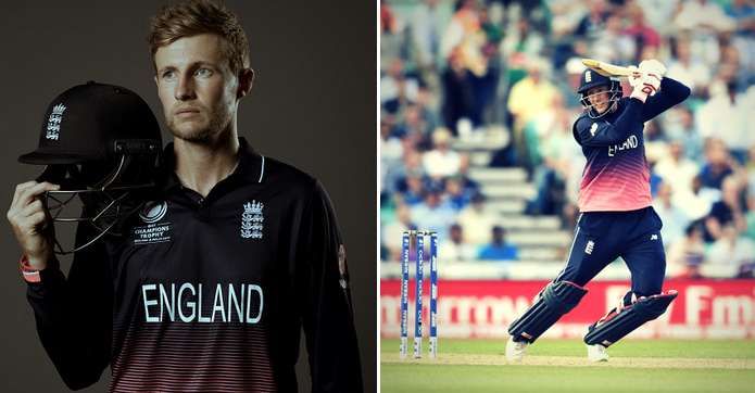
And calm is what England have been on the pitch as they have beaten all before them in the tournament and looked good doing so as well. After all, you have to be a particular kind of good to pull off wearing a jersey that has the color pink. Even without going into the intricacies of design, it is easy to fall in love with the England jersey.

Follow IPL Auction 2025 Live Updates, News & Biddings at Sportskeeda. Get the fastest updates on Mega-Auction and cricket news