'%20x='0'%20y='0'%20height='100%25'%20width='100%25'%20%0A%20%20%20%20%20%20%20%20%20%20xlink%3Ahref='data:image/jpg;base64,/9j/2wBDAAYEBQYFBAYGBQYHBwYIChAKCgkJChQODwwQFxQYGBcUFhYaHSUfGhsjHBYWICwgIyYnKSopGR8tMC0oMCUoKSj/2wBDAQcHBwoIChMKChMoGhYaKCgoKCgoKCgoKCgoKCgoKCgoKCgoKCgoKCgoKCgoKCgoKCgoKCgoKCgoKCgoKCgoKCj/wgARCAAGAAoDASIAAhEBAxEB/8QAFQABAQAAAAAAAAAAAAAAAAAABAb/2gAIAQEAAAAAFd//xAAUAQEAAAAAAAAAAAAAAAAAAAAA/9oACAECEAAAAH//xAAUAQEAAAAAAAAAAAAAAAAAAAAC/9oACAEDEAAAAH//xAAiEAACAgEDBAMAAAAAAAAAAAACAwEEBQAGESMkMUE0UmH/2gAIAQEAAT8AJJodkU7feSK1iu1Vo7MSTHOkpE/E8CEwPr8jjWK3pmKeLp1uy6KQX8efQ8fbX//EABgRAAMBAQAAAAAAAAAAAAAAAAECEQAD/9oACAECAQE/ADzVoWF3/8QAGBEAAgMAAAAAAAAAAAAAAAAAAAESIUH/2gAIAQMBAT8ATnTw/9k='%3E%3C/image%3E%3C/svg%3E)
The art style for the GTA series has evolved from something resembling cartoon caricatures to something more realistic.
It's worth noting that this article focuses on the official artwork for the GTA series throughout the years. This is an entirely different topic from the in-game art direction, especially since official artwork focuses on content outside the game.
The games' content has been more or less the same throughout the generations, so it's interesting to see how something like official artwork can change in the same time span.
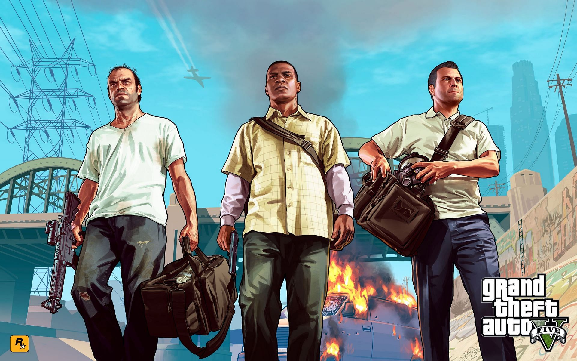
How GTA's art style has changed over the years
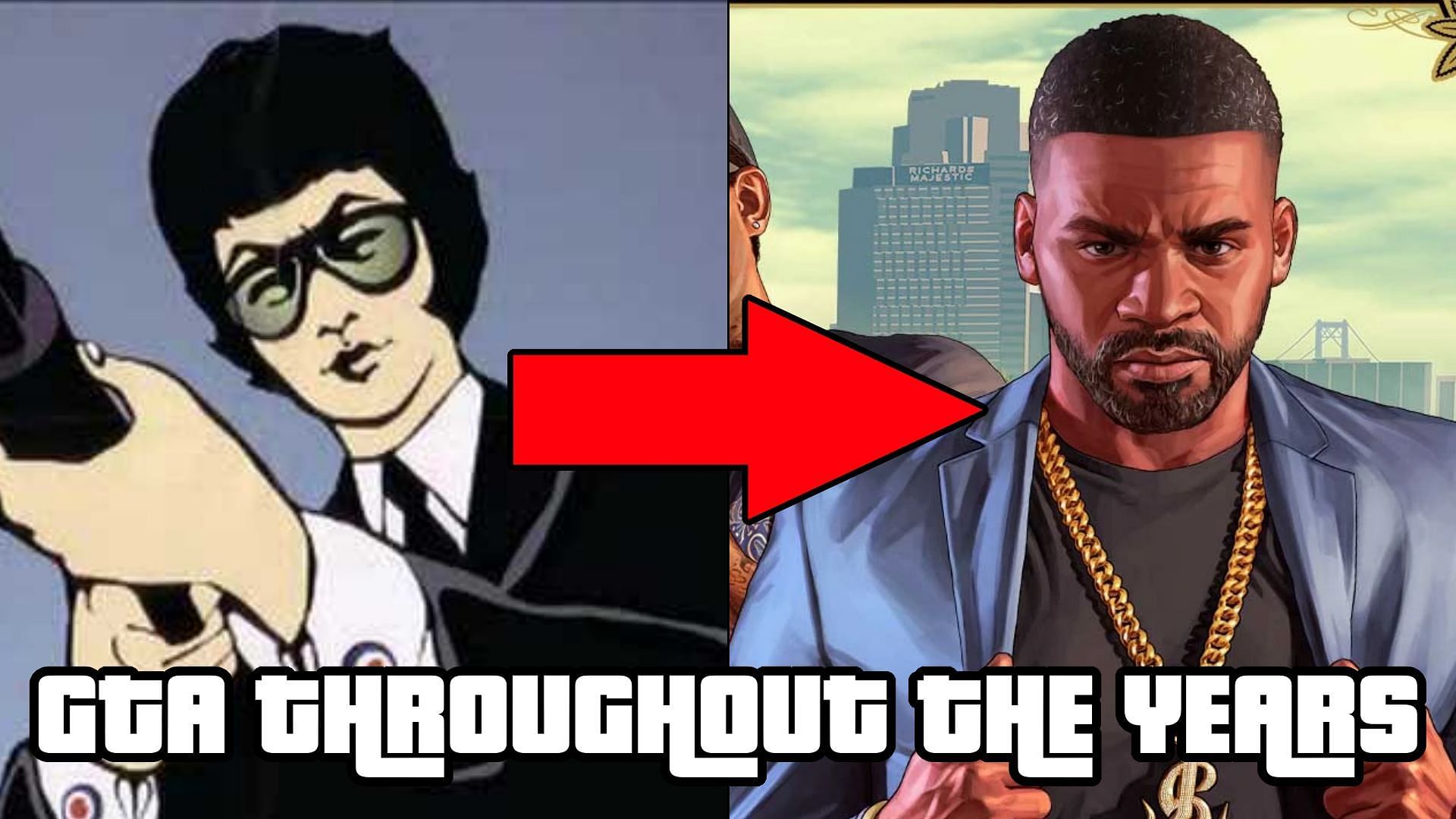
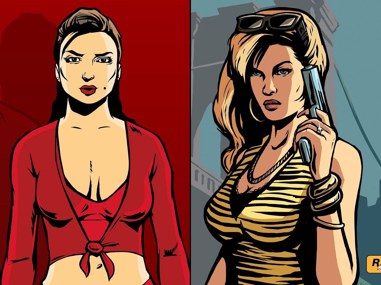
GTA 5 and Online's artwork is the most recognizable for most fans. They're the most recent games in the series, with the former having sold over 155M copies. Hence, one can say that millions of players have seen these photos on the game's loading screens.
However, the GTA series didn't always look so realistic in these drawings. If anything, it started off far more cartoon-like.
The art style of the 2D Universe
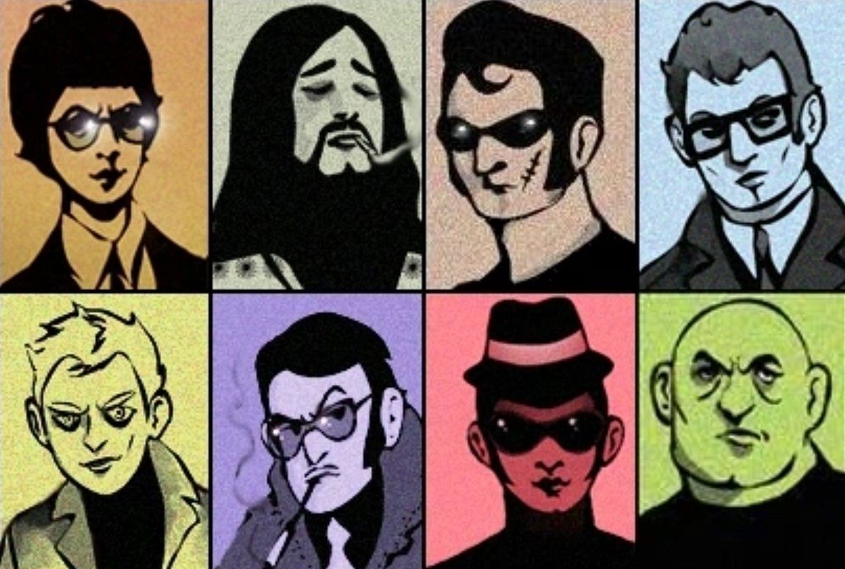
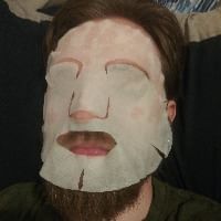
The earliest GTA games didn't have too much artwork for players to view. From what players could see, the colors were very simplistic. One interesting thing to note is that GTA London's artwork resembled real-life celebrities, albeit in a semi-caricature style.
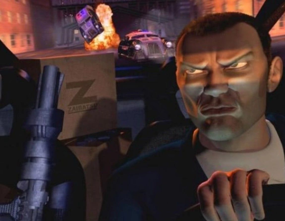
GTA 2 had official artwork in the form of 3D CGI. No other GTA game had done that, even when the technology had become substantially better. It's also worth mentioning that the games in the 2D Universe didn't have nearly as much artwork as later generations came to have.
The 3D Universe continues the cartoon-like look
GTA 3 continued the stylized drawings but to varying degrees. Minor NPCs like the random Mafia member shown above didn't look realistic (with his ears being all the way down his neck). The technique and shading were still well-done, but it was especially jarring when these characters were compared to more realistic ones like Claude.
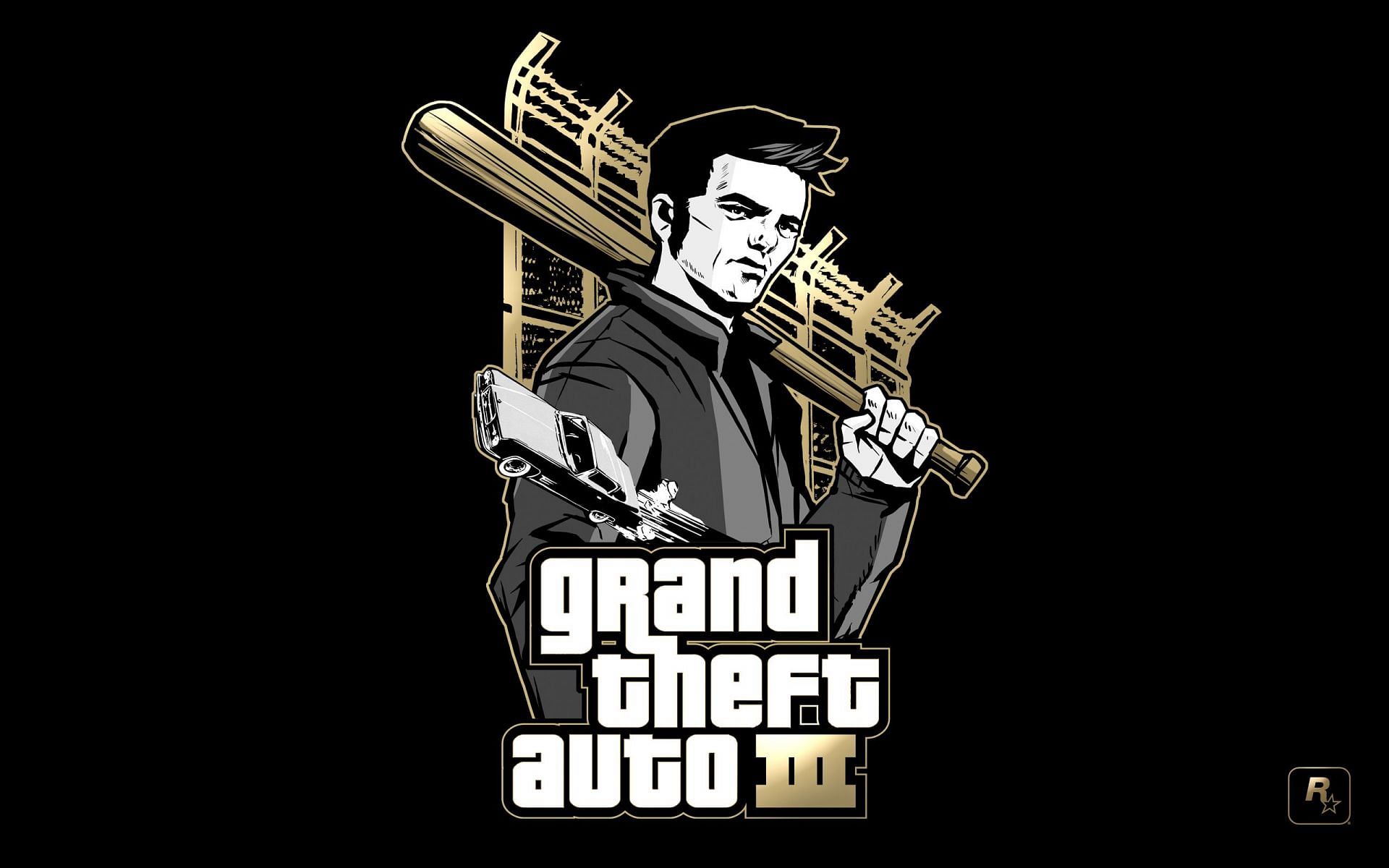
It's also worth noting that GTA 3 continued the trend of having incredibly simplistic backgrounds. The trend expanded to other major games in the series, such as GTA Vice City and GTA San Andreas. It wasn't until GTA Liberty City Stories that the backgrounds consistently became more than a few simple colors splashed together.
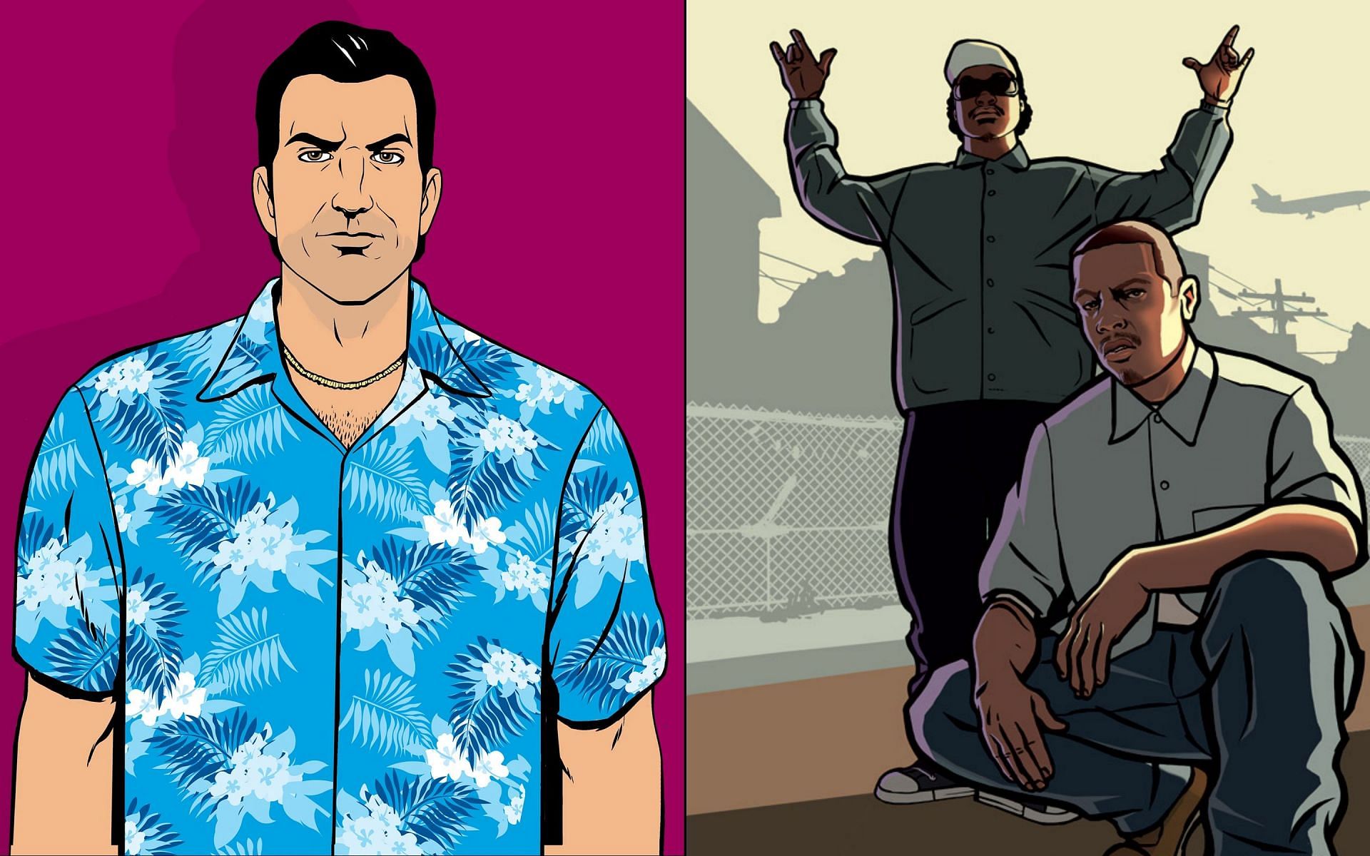
Most fans will notice that GTA Vice City's official art looks more realistic compared to the prior games. The shadows weren't as dark as in GTA 3 and also focused more on vibrant colors as a whole.
GTA San Andreas didn't change much compared to its predecessor, except that its shading and lighting were noticeably more detailed. Otherwise, it continued the vibrant color dynamic from the previous game.
Liberty City Stories and Vice City Stories shared a similar art style. Notably, both games looked more realistic than their predecessors. At the same time, they showed how much more detailed the backgrounds could be (even in a minimalist format).
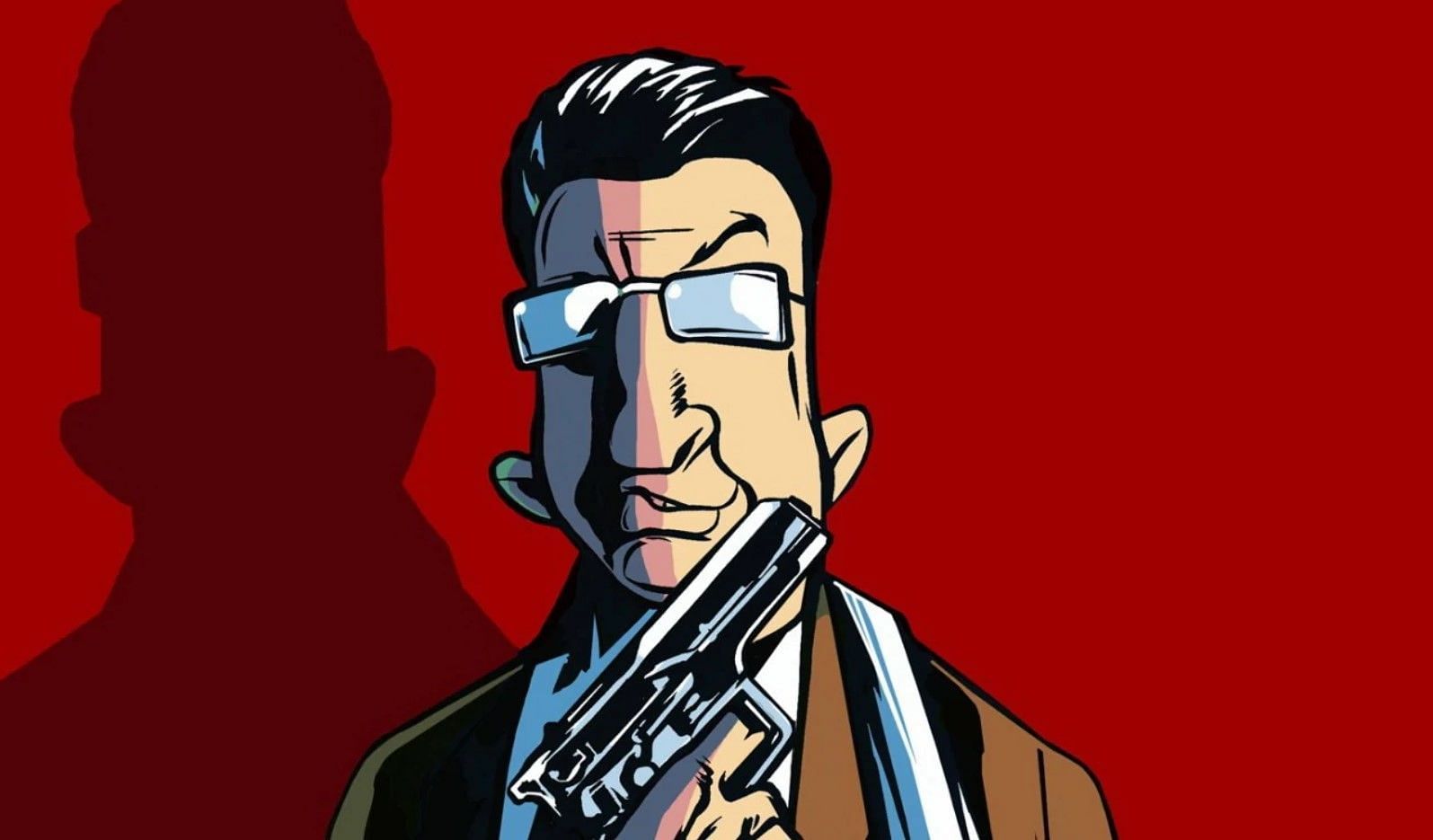
Although GTA Chinatown Wars is a part of the HD Universe, its artwork resembles these games' artwork more closely than it does GTA 4's.
The HD Universe's approaches realism
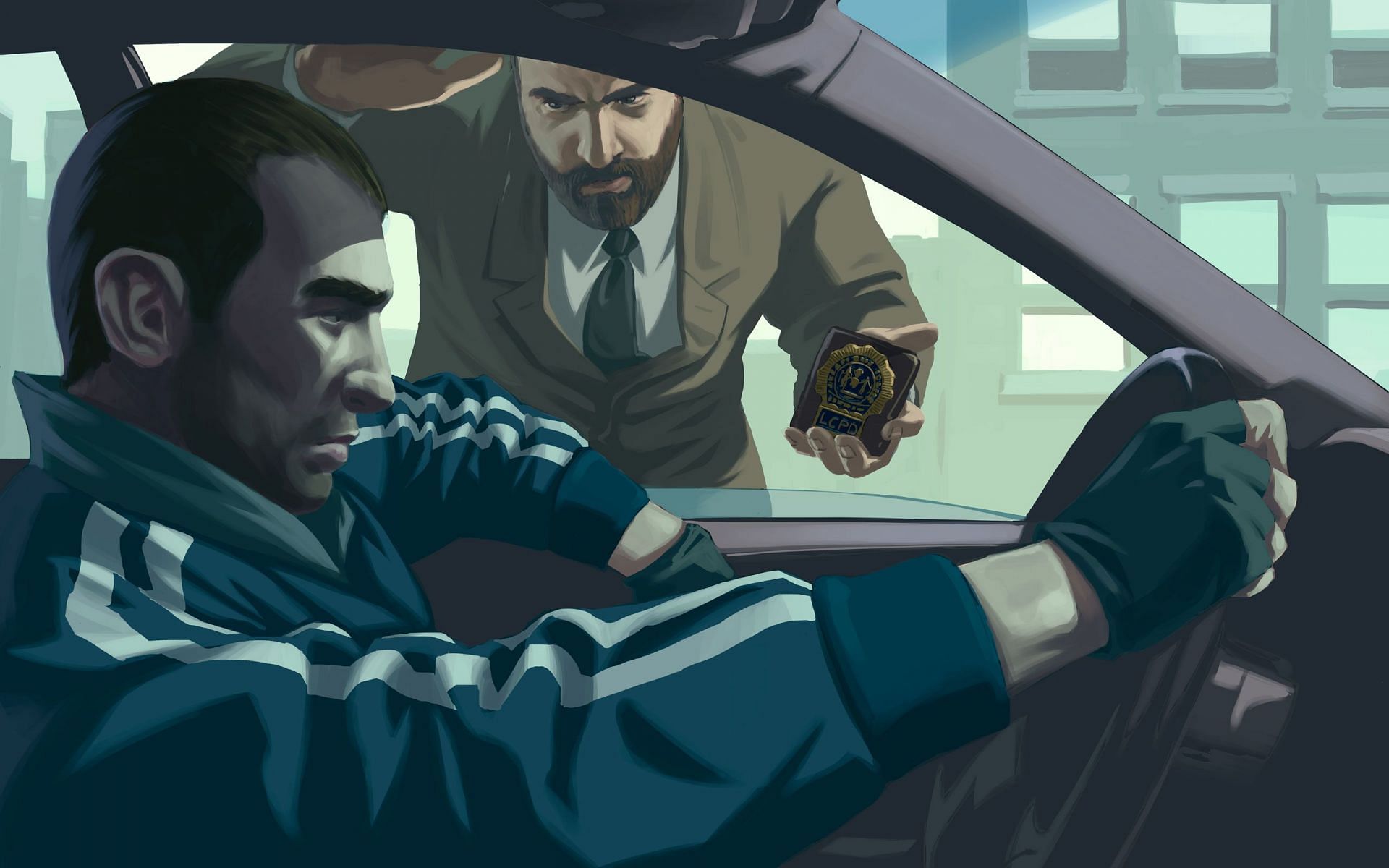
The painted but realistic style that modern fans are accustomed to, debuted in GTA 4. Naturally, the Episodes From Liberty City continued this trend, except with The Ballad of Gay Tony being more vibrant by comparison.
Speaking of vibrancy, GTA 4's official art was less vibrant than its predecessors. The backgrounds also looked good but weren't always as detailed as GTA 5's.
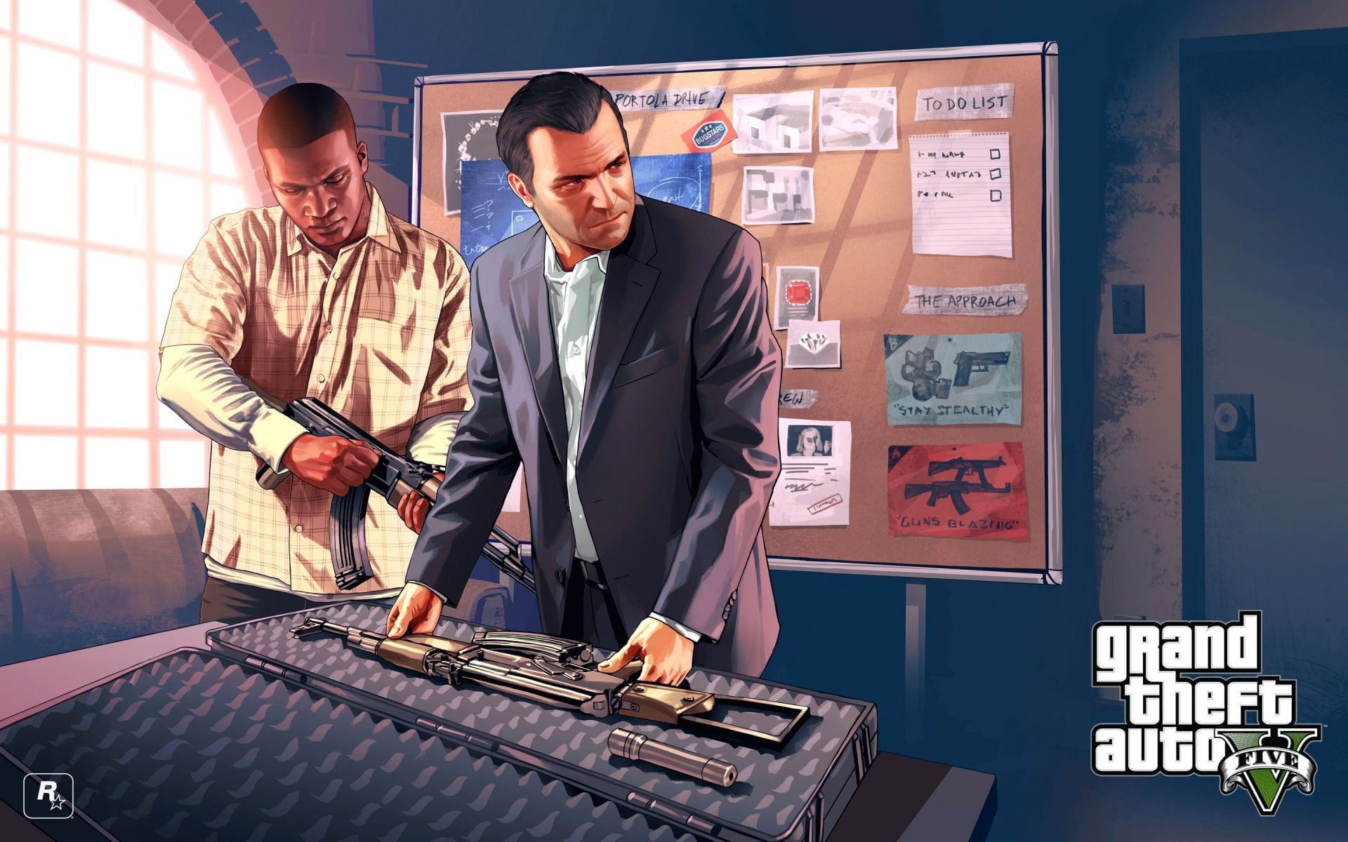
GTA 5 and Online's artwork is a massive improvement in terms of quality, when compared to other games in the series. The backgrounds are usually more realistic than before, while the characters maintain a good balance between realism and vibrancy.