
'%20x='0'%20y='0'%20height='100%25'%20width='100%25'%20%0A%20%20%20%20%20%20%20%20%20%20xlink%3Ahref='data:image/jpg;base64,/9j/4AAQSkZJRgABAQAAAQABAAD/2wCEAAMDAwMDAwQEBAQFBQUFBQcHBgYHBwsICQgJCAsRCwwLCwwLEQ8SDw4PEg8bFRMTFRsfGhkaHyYiIiYwLTA+PlQBAwMDAwMDBAQEBAUFBQUFBwcGBgcHCwgJCAkICxELDAsLDAsRDxIPDg8SDxsVExMVGx8aGRofJiIiJjAtMD4+VP/AABEIAAYACgMBIgACEQEDEQH/xABjAAEBAQAAAAAAAAAAAAAAAAAABQcQAAIBAgYDAAAAAAAAAAAAAAECAwAEBQYHEhMhERUxAQEAAAAAAAAAAAAAAAAAAAAGEQEAAgEEAwAAAAAAAAAAAAABAhEDAAQFEhMhUf/aAAwDAQACEQMRAD8AyXTvOMV7lbMF+ImT0UMt5GOMbgZJuFAjKVHSk+dwIqyuomHzKJGguyzgMe1+mlKLcvWGW3ljCLOOXsgW1kQt0i2J5IzJew6UfLiOv//Z'%3E%3C/image%3E%3C/svg%3E)
NFL franchises are often at the mercy of their owners, irrespective of what fans want, and this has led to some truly horrific rebranding decisions.
Unlike other sports where a team is attached to an area, NFL franchises can be moved across the country or even rebranded completely.
Most of the time, it is a simple redesign of a logo, which is seen as a way to modernize a franchise… especially if they are struggling on the field.
Some redesigns just work, and the new logo becomes iconic, like the Philadelphia Eagles logo or the Atlanta Falcons emblem.
Looking to predict NFL playoff Scenarios? Try our NFL Playoff Predictor for real-time simulations and stay ahead of the game!
Yet, for every redesign which works… there are three which fall completely flat, leaving fans bereft of an identity for their team…
But which 5 NFL rebrands sucked the most?
5. New England Patriots
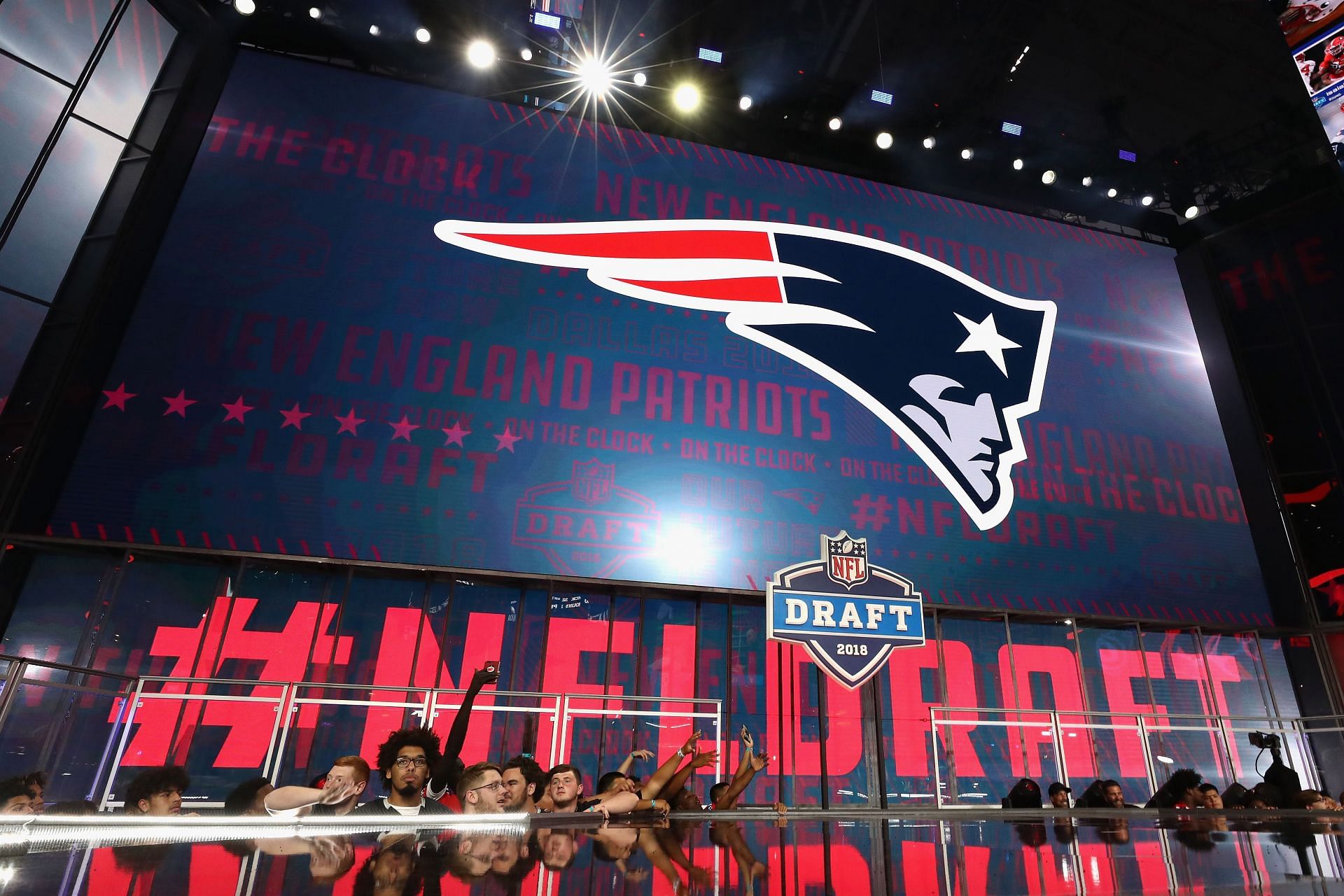
While the current New England Patriots logo has become synonymous with an era of unprecedented success, the team's 2000 rebrand was horribly received.
Dubbed as ‘Flying Elvis’ at the time of release, the modern Patriots logo arrived in the NFL as a replacement for Pat Patriot.
The fondness and nostalgia for the old logo has forced Robert Kraft and his staff to implement retro jerseys to be used by the team at certain times of the season.
As the world changed at the turn of the millennium, it became more technology centric and logos became Disneyfied. That is exactly what happened to the Patriots, and it was one of the first modern logos.
It’s easy to forget how bad it was at the time, especially since Tom Brady’s success softened attitudes to it over time.
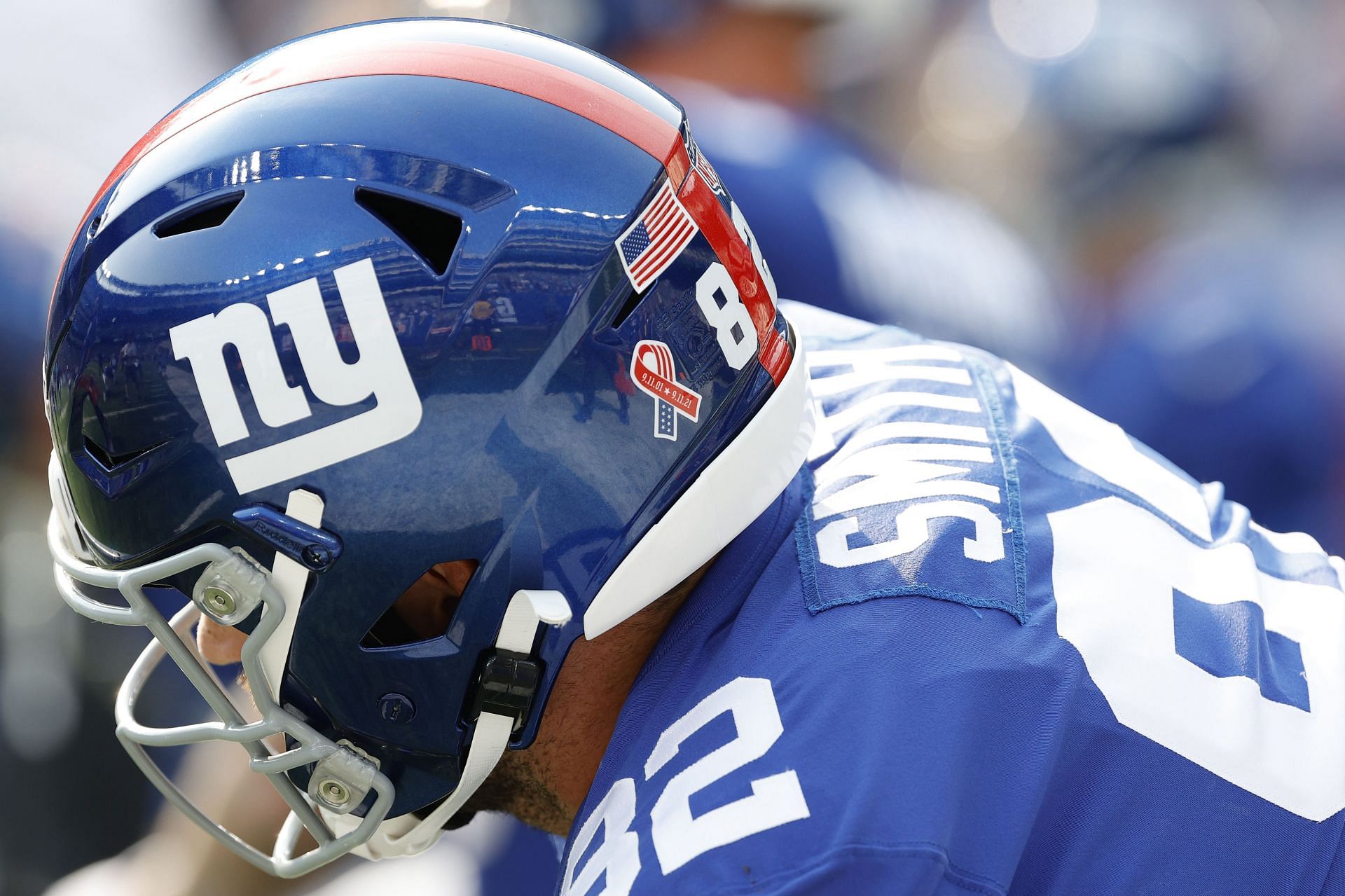
4. New York Giants
The everlasting image of the New York Giants' greatness comes from their Super Bowl wins with Bill Parcells.
The photograph of Parcells being hoisted onto the shoulders of his players after a Super Bowl triumph features the beautiful New York Giants logo of a bygone era.
Replaced by the rather cold-looking NY lettering, the previous logo was simple and iconic.
It was the word Giants in slightly italic letters and the franchise colors of blue and red.
We often harken back nostalgically to a time when things were simpler. In our minds, that equates to them being better, but the old Giants logo was just easier on the eye.
It was recognizable and good for the brand, it was also synonymous with Lawrence Taylor and success.
Fans have often petitioned to return to the old logo, but it seems unlikely with the intellectual property of a team now closely linked to its modern, embossed logo.
3. Miami Dolphins
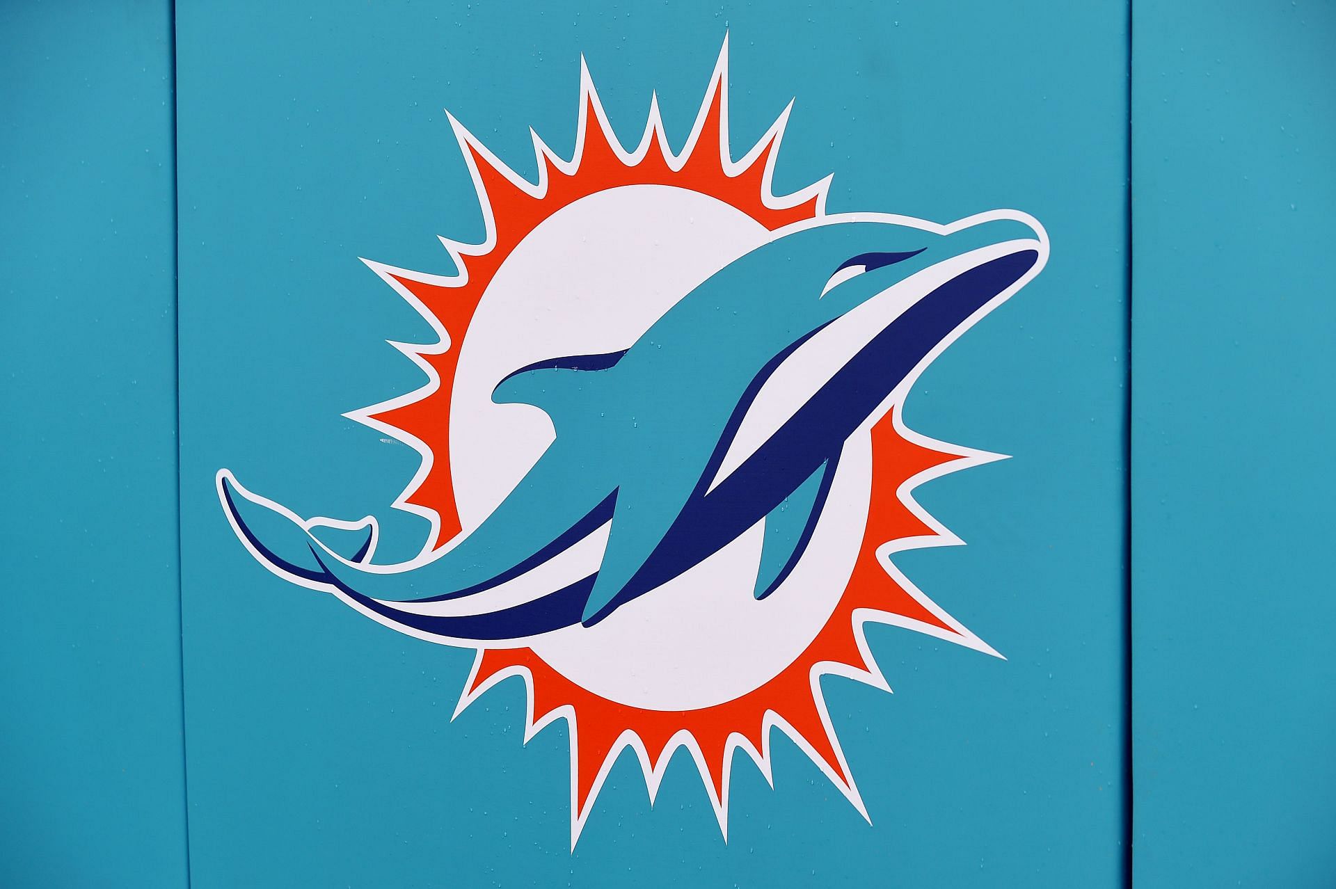
The Miami Dolphins’ logo rebrand in 2013 was a disgrace to the NFL.
The colors were updated, and the dolphin itself was no longer depicted wearing the team helmet.
Instead, we got a soulless image of an expressionless dolphin jumping through a ring of sun. Why?
There is no indication on the new logo that the Miami Dolphins are an NFL franchise, nor is there any lettering on it.
In the pursuit of trying to find an instantly recognizable logo like the one held by the New York Yankees, the Miami Dolphins fell into the trap of forgetting their own history.
It’s bland and lacks the character of the cartoon dolphin from the Dan Marino era. Ironically, this is a complete juxtaposition with how Miami is as a city. Just take a look at the neon pink and blue color scheme adopted by the Miami Heat, that is what Miami is.
2. Los Angeles Rams
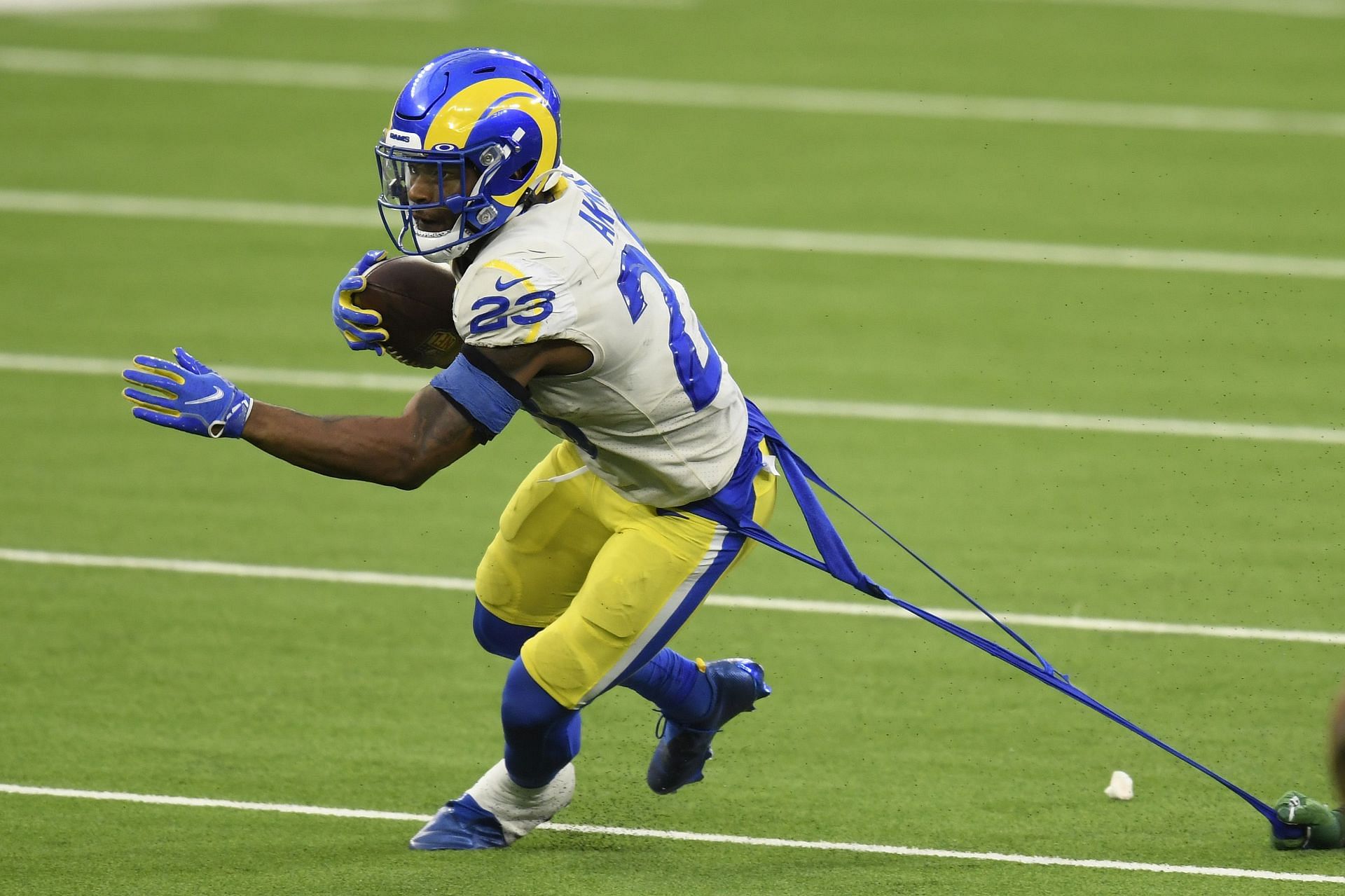
The Rams moving back to Los Angeles just felt right. It meant we were finally going to see the ugly gold and navy-blue colors of the St. Louis Rams ditched.
Those colors had become synonymous with failure, especially in the latter stages of their stay in Missouri.
So, it should come as no surprise that fans were both stunned and furious when the disastrous new team logo was unveiled in 2020.
Yes, the iconic Los Angeles colors were back, but gone was the ram. Instead, it was a rather overproduced yellow curved C.
If you’d have been told this was a practical joke done to make the logo appear to belong to the Los Angeles Chargers, you would have believed it.
It was confusing and unnecessary. It didn’t represent Los Angeles, and it didn’t represent the Rams.
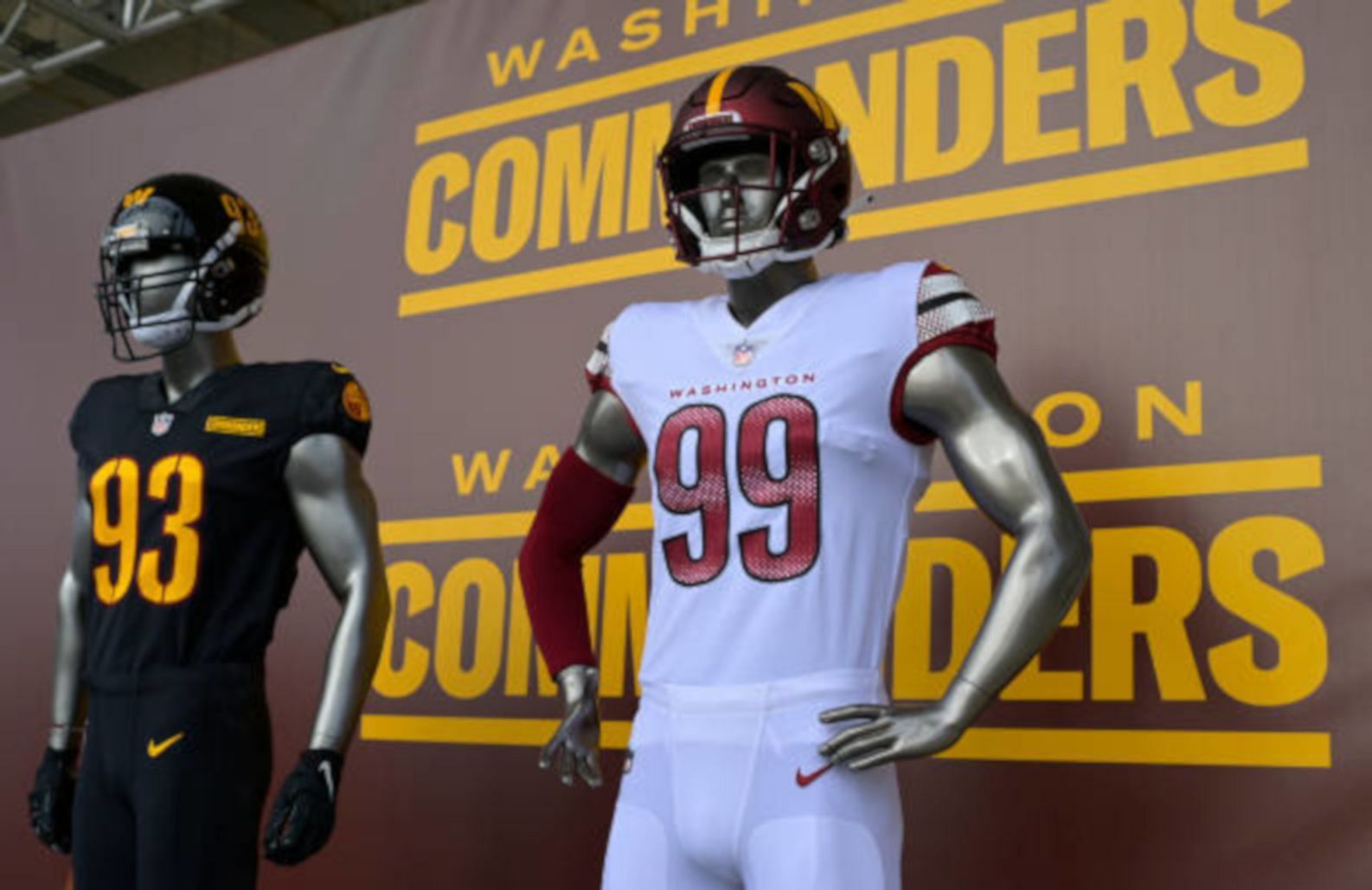
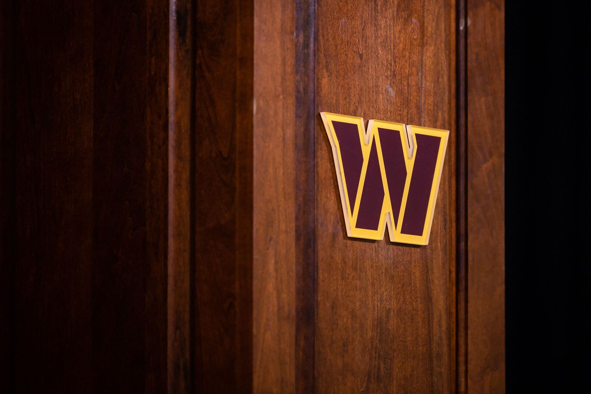
1. Washington Commanders
People widely accepted the need for modern reform in the case of Washington’s NFL franchise.
Being called the Redskins was culturally inappropriate, and the rebrand was a long-time coming.
Yet, what made this particular 2022 rebrand simply awful was how long it took to come up with a simply awful brand, bereft of feeling and originality.
Having gone by the moniker of the Washington Football Team for two seasons, people had sort of gotten used to that.
It was an off-cuff name, it sounded sarcastic and grew on people. Calling a football team ‘the football team’ was ingenious.
Yet, two years of consultation brought us the Washington Commanders, as they are now known.
Their logo is a pitiful W shape. It’s almost as if those in charge of the rebrand picked the most inoffensive and boring logo they could after the criticism their previous identity received.
There is nothing interesting about the Washington Commanders. Their uniforms are dull, the logo is basic and doesn’t relate to anything, and it’s so lifeless, rather like the team on the field.
NFL brands should reflect the market they are in and the franchise’s own history.
In the case of the latter, this wasn’t possible for Washington in 2022, but if you can’t come up with a cool concept for the CAPITAL city of the United States, you’re not a creative person.

Miami Dolphins Nation! Check out the latest Miami Dolphins Schedule and dive into the Dolphins Depth Chart for NFL Season 2024-25.