
'%20x='0'%20y='0'%20height='100%25'%20width='100%25'%20%0A%20%20%20%20%20%20%20%20%20%20xlink%3Ahref='data:image/jpg;base64,iVBORw0KGgoAAAANSUhEUgAAAAoAAAALCAMAAAEGt9y8AAAA8FBMVEX////V1dX5+fkAAADv7+8wMDDLy8339/fz8/P7+/uXl5eLi4VgYGCxsa9qamihoZtkZlzJycs2Nja3uberq6lkZGJ+fn56enLp6elISEabm5siIiJUVFSNjY0UFBSBgXo4ODiJiYeHh4H9/f+jo6OPkYlycmytrauLiY2Hh4cODg6dnZe5ubmNj4mrq6vFxcdkZGQkJCR6enSNjYlQUkrb292BgYEICAiDg3zNzc86Ojrl5eW/v8GBgXzV1dcCAgLFxcP5+ftmZmafn596fHZYWFiPj4twcG4YGBhqbGJMSkr19fWdnZ94eHDRz9HPz9FTuWKUAAAACXBIWXMAAA7DAAAOwwHHb6hkAAAAfUlEQVQImQ3M5Q6CUACA0Y9LXcEWO3DWxFaMGagzZo/3fxv5f3ZAQACkoVFDCKaS5QJm9TtIt+WfMTPHUMGMkGBj5S4l1PVAB+dW7GoMf69em9DYGh/QT/PdU7XYQzM7QstXlRh4k863vzpcI1B4P5LlihePrkTKtsd+4Mg/48YMkuRWDKEAAAAASUVORK5CYII='%3E%3C/image%3E%3C/svg%3E)
Have you ever wondered what the modern F1 logo signifies? Before the advent of the modern logo which we see nowadays, the Formula 1 logo looked something like this:
The modern F1 Logo was designed in early 2000 and till date it is ranked amongst the most creative logos ever created. But ironically, most of the F1 fans have never actually paid enough attention to see what is involved in the design.
Surely most of you out there think “F” signifies ‘Formula’ and the red-coloured design signifies “1″. But in reality it is not the red-coloured design, it is in fact the white space between the black coloured “F” and the red-coloured design that signifies “1″.
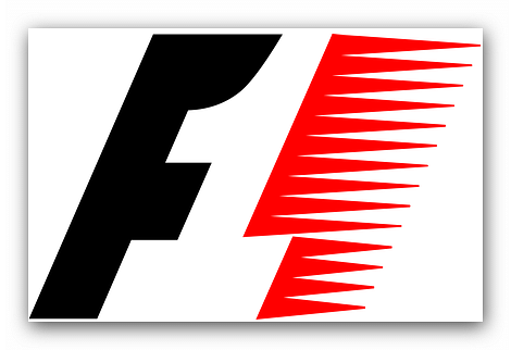
Meaning of the colours:
The red color represents passion and energy, while the black color represents power and determination.
Why was the F1 logo changed in early 2000?
To understand as to why the logo was changed after the end of the 20th century, we have to dive back into the history of Formula 1. During the early 20th century and through the 1970′s and 80′s, Formula 1 wasn’t a global sport and it was mainly restricted to Europe and South America with just one race taking place in Asia at the Suzuka Circuit, Japan.
As Bernie Ecclestone took hold of Formula 1 in the 90′s he started globalizing the sport and as the 20th century came to an end, F1 had become a worldwide business platform. Companies like Coca-Cola, Master-card, Marlboro, etc started funding the teams.
And so it was decided that F1 needed a logo, which would signify the main ethics of the sport.
