
The English Premier League is only a few weeks away and the players are trotting the globe getting ready for the upcoming season. The fans are eagerly waiting for top flight football to return whilst they scour through transfer rumours and any news piece they can get their hands on.
The new kits for the upcoming season have been released and that has fuelled debates of which one looks the best as we head into the new campaign. Here, we look at the strips in order of worst to best.
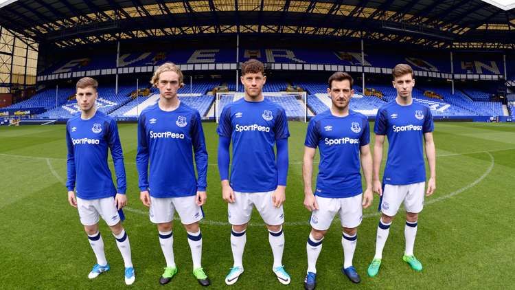
#20 Everton
We are no strangers to last minute submissions and it most definitely looks like Umbro isn’t either. For Everton’s 2017-18 campaign, Umbro seems to have whipped up an old training kit template and added the kit sponsor’s name, club crest and their own logo and sent it straight into the mills.
The end product is as mundane and lazy as that sounded. For all the money they’ve invested in the summer signings, Everton seem to be close-fisted on the rest of their expenditure, resulting in their kit looking like something one would pull out from the bottom of a pile of t-shirts to wear for a friendly 5 on 5 with their mates on a Thursday.
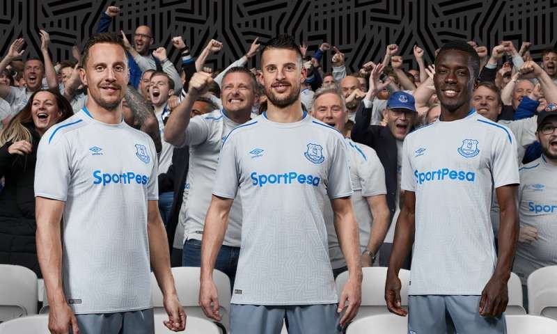
If you thought it couldn’t get any worse you should check out their away kit. Simply put, it’s awfully dull.
#19 Southampton
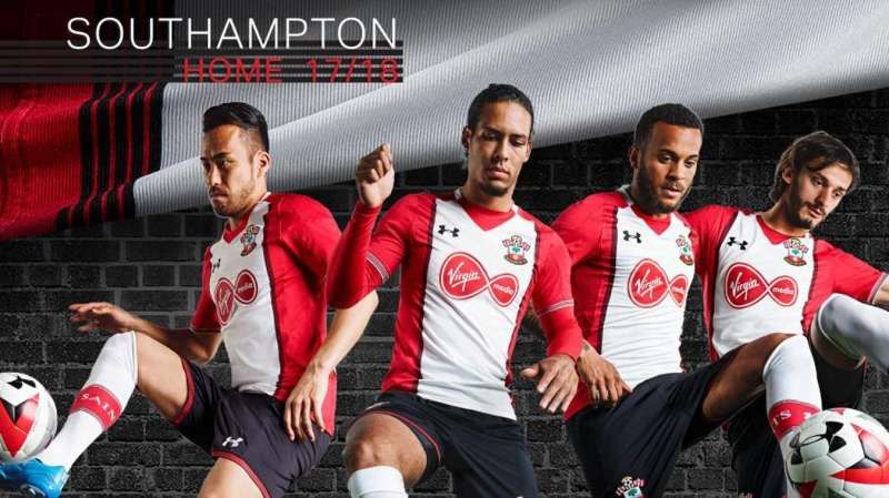
The Saints have kept their traditional red and white but they have revamped it slightly this time around. Inspired by a 1980s design; replacing the classy stripes with an abomination to orchestrate a change in tune is perhaps a poor idea. In what could be an attempt to let the kit sponsor’s (Virgin Mobile) name be discernible, Southampton seem to have gone the extra ‘as plain as a pikestaff’ mile.
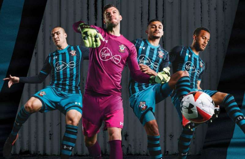
The Saints’ away kit is way better than their home kit but that really is not saying a lot. The stripes on the stockings are a fine touch.
#18 Huddersfield
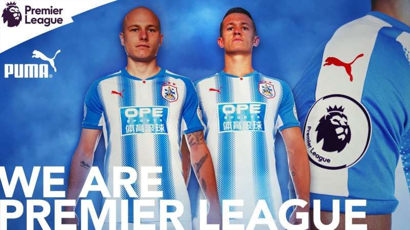
The stripes are a good ol’ classic design and Huddersfield have maintained their traditional colours for their home kit. But somebody in the design team at PUMA decided that the stripes withering away into something vaguely reminiscent of polka dots ought to look classy on a football kit.
They might just be able to induce a sort of feverish frenzy in the eyes of the beholders and could prove to be a worthy strategy on the football ground provided their own players can cope with the headache.
#17 Stoke

Nah, nothing new. Macron have decided they want to keep the kit almost exactly the same just in case the cold rains have any qualms about knowing where to drop. The only changes are the additions of a red, blue and white strip on the collar and plain white nothingness on the back of their shirt to give the names the accentuation they deserve.
A painfully stale product.
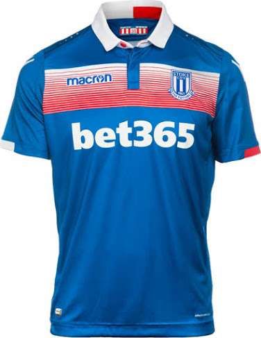
For the away kit, Macron have gone for a strip with red lines across the chest. While the blue is captivating, the strip in the centre looks like someone doodled with crayons on a white sheet of paper.
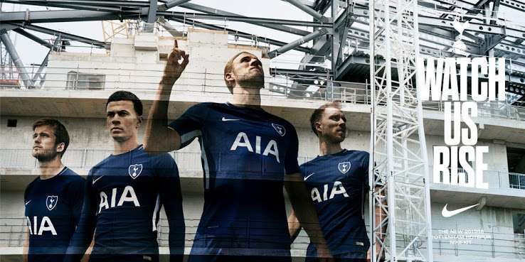
#16 Tottenham Hotspur

As awfully plain as it is unimaginative, Tottenham’s new home kit by Nike is straight outta dullsville. Spurs’ oversized sponsor name which very evidently craves acknowledgement should have been ideally 5 font sizes smaller. The crest is a fascinating throwback though.
The away kit is dark blue with a white strip running from the sleeve to the side of the torso. The basic design is that of the home kit’s and it is none too eye-catching to warrant intricate analysis.
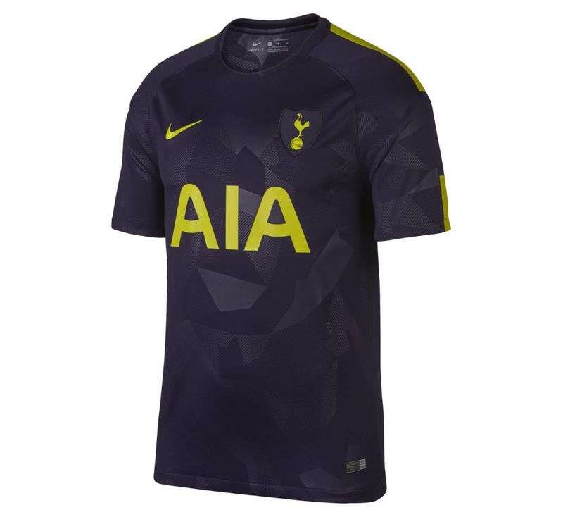
For Tottenham’s third kit, Nike has added a little bit of detail in what looks like scraps of paper arranged asymmetrically. The detailing is different from the other two kits. There is a yellow strip running from the shoulder to the deltoids and another one that runs towards the sleeve.
#15 Leicester City
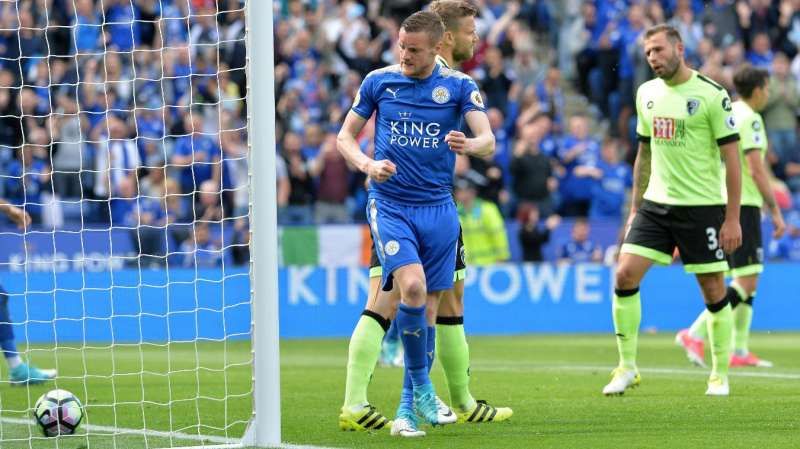
Leicester’s new home kit seems to have shown up an entire season after it was due. If it was at all, that is. They have pretty much kept the same design but have also added golden bits which look like nothing but an unfortunate afterthought. It’s difficult to understand why they have gone for gold when they were anything but that in the previous season. Overall, it’s a strictly average looking home kit.
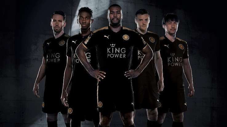
The golden strips are present even in the away kit. There are no telltale differences except for the fact that it comes in black.
#14 Chelsea

The Nike kit designers look like they have been forced to work while on sabbatical. The absolute lack of effort or imagination that has gone into the designs is baffling. It’s nothing but the Nike logo, the club crests and the sponsor’s name aligned left, right and centre respectively. What’s that, a word document pasted on a t-shirt?
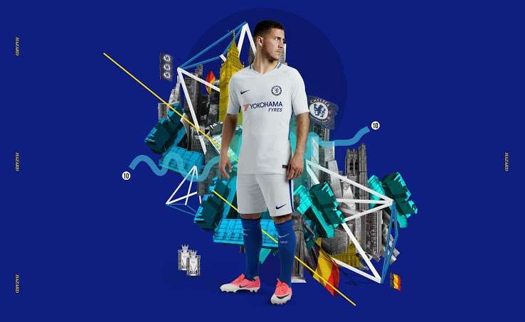
Chelsea’s away kit is bright silver with a little bit of blue on either side and on the back of the neck. The detailing makes it slightly better than the home kit.
#13 Manchester City

Nike does not seem interested in putting in any effort as far as designing is concerned. They have kept it plain, simple and annoyingly uninteresting.
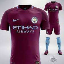
Man City’s away kit is claret in colour. A sky blue line goes around the neck and there are lateral insets which have been done in navy blue. It is definitely an upgrade on the home kit.
#12 Burnley
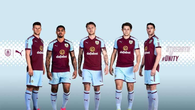
Burnley have retained their traditional claret and blue colours. While most Premier League sides seem to have decided to leave the shoulders a bit plain in general, Burnley felt the need to be creative in that space. It looks like they sprinkled tiny spots from a near-empty spray can all over the shoulders down to the arms. While their primary colour combination is just as pleasing as it has always been, the new changes are like stones weighing them down on this list.
#11 Bournemouth
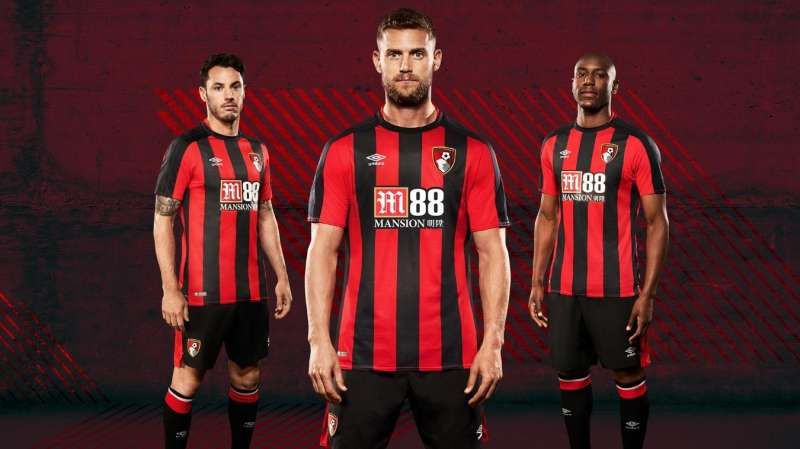
Even though Umbro have taken over Burnley's kit designing department, they have simply made the stripes narrower and extended the stripes on to the sleeve. There is very little change and the sponsor name and logo at the heart of the t-shirt look as hideous as ever.
#10 Newcastle
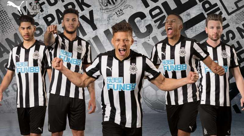
The Toons have made their stripes narrower and added a buttoned collar to their home kit. But the sponsor name is in a bizarre blue and hideously huge which is such a let-down in an otherwise solid design.

While the design is similar to that of the home kit, the third kit is leaps and bounds ahead of the former. It has tonal jacquard stripes. The PUMA and sponsor logos are golden in colour. The third kit is regal and you could almost forgive PUMA for how they got the home kit all messy.
PUMA is yet to unveil the Magpies’ away kit.
#9 Crystal Palace
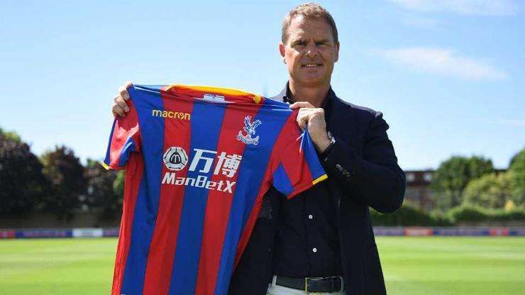
Crystal Palace have kept the vibrant blue and red stripes for their home kit with a gold trim around the neck and on the edge of the sleeves. However, their kit is yet another case of a hideous sponsor name messing with the allure of a fine design.
#8 West Bromwich Albion
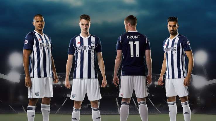
West Brom’s traditional colours of navy blue and white are quite a captivating combination. The back of the kit is in navy blue as opposed to the white from last year. Even though the sponsor logo looks bloated, they’ve at least kept it in sync with the theme of the kit. But the red colour Adidas logo looks a bit odd and could’ve been aligned better with a small portion of it barging into the adjacent blue stripe.
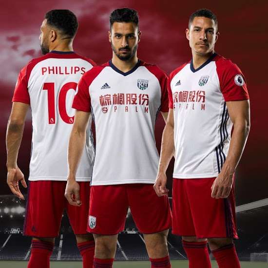
White is the base colour of WBA’s away kit. The sleeves and the shoulders are red and the collar is navy blue in colour. The navy blue collar and stripes on the side look ill-fitted on what is an otherwise decent looking kit.
#7 Brighton & Hove Albion
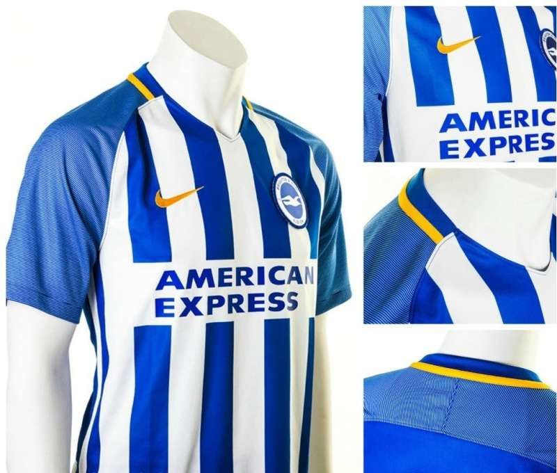
In touch with the Brighton tradition, blue dominates the kit with white as the secondary colour.
The yellow trim and the stripes are quite pleasing. The classic stripes look good but they could’ve toned down the brightness just a tiny bit. Okay, maybe a bit much. The long sponsor name has been nattily dealt with which is an aberration from the usual course taken by clubs these days.
#6 Watford
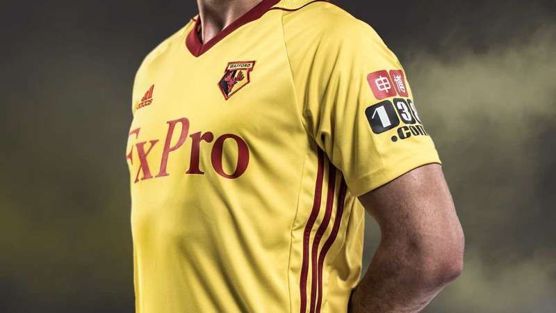
The Adidas kit with the stripes and the Crimson addition around the neck give the kit a classy feel. The sponsor logo (name) is red now and it’s a welcome change. But the name still looks stretched out.
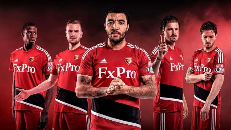
Watford’s away kit is primarily red, complete with a black-white diagonal strip around the waist and the iconic Adidas stripes. It is reminiscent of Bayern’s kits in the recent past. The black-white diagonal stripe could have been done away with. Sometimes plain might be the way to go, eh?
#5 Manchester United
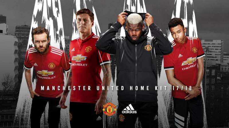
The classic Adidas stripes are back on the shoulder and the red colour is uniformly stretched across the entire jersey, unlike last year. The black bits on the sleeve are worthwhile additions. The collar looks overdone and is a bit of a disappointment and so is the stretched out Chevrolet logo. But all in all, United’s home kit looks classy.

The Manchester United away kit is inspired by the cult classic blue jersey of 1990-92. It is black in colour with three stripes on each side on the body.
#4 Swansea
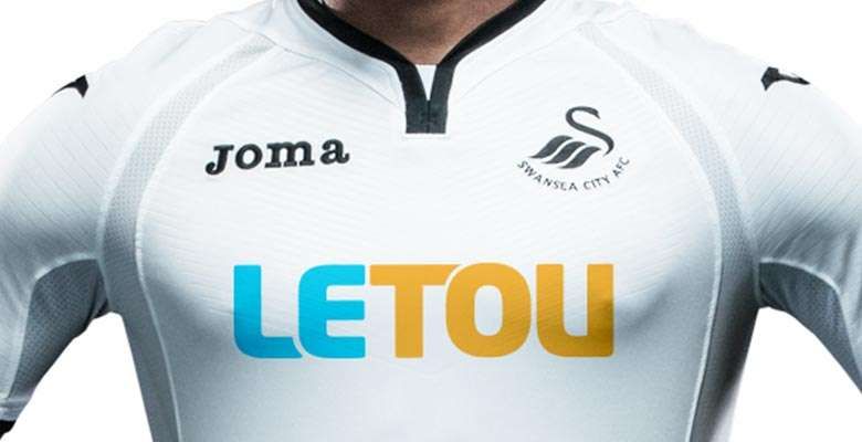
White is the primary colour of Swansea and it has always been a source of worry when it comes to kit sales. The black strips on the collar and sleeve are welcome additions. The detailing on the chest and arms give the kit an elegant look.
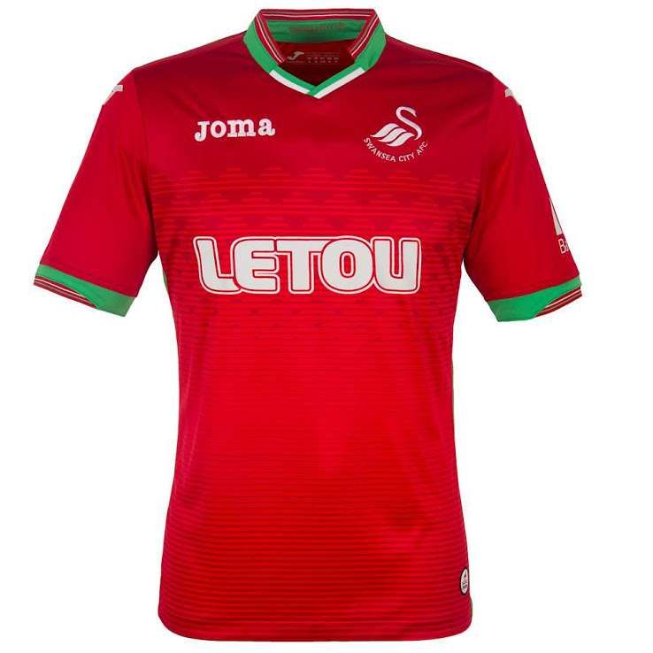
The Swansea away kit is red, green and white in colour and resembles Portugal’s international kits of the recent past. There are greens stripes along the sides of the body and there is more detail on the cuffs.
#3 Arsenal
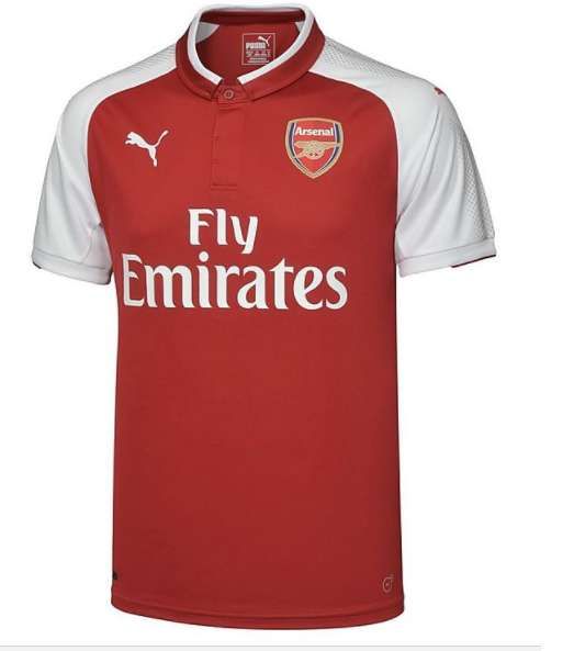
PUMA have stuck with Arsenal’s traditional red-torso white-shoulder design and the new kit is inspired by the 2005/06 kit. They have incorporated a new collar which looks refined. Like Liverpool, Arsenal have also gone with a darker shade of red.

The jersey that comes in black, dark grey heather and pink, Arsenal’s third kit is supposed to reflect the ‘dark London days’.
#2 Liverpool

Keeping it delightfully classy, Liverpool’s kit can divide people’s opinions with the excessive application of white. But their slightly darker red colour and traditional design are graceful. What is noteworthy is the aesthetically charming manner in which the sponsor name and logo have inhabited the heart of the kit.
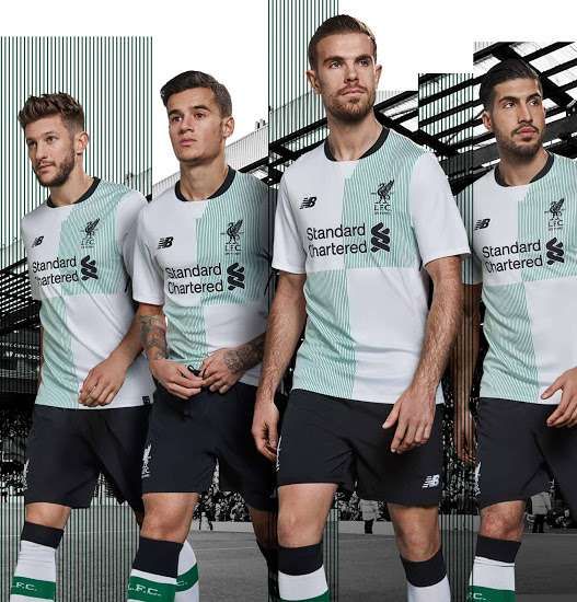
Liverpool’s second kit has the ‘quarter-design’ and is inspired by the 1996 classic. There is a pattern of green stripes on the upper left and lower right quarters.
#1 West Ham United
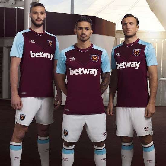
The colour combination, the chevron pattern, the font and the logos. Umbro have got all four spot on with the Hammers’ kit for the 2016-17 campaign. It has a retro charm and looks a suave-kinda-sophisticated.
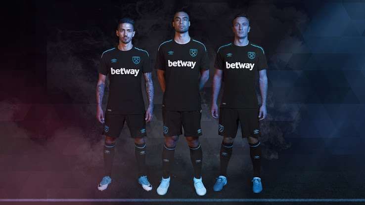
For their away kit, Umbro have combined Black with Turquoise Blue in what is West Ham’s first ever black away jersey. It’s certainly enthralling but the home kit will take home the trophy this time.
